Weird gallery display on iPhone 14

I have a gallery of photos for an art school website. The gallery is a div with a flex-row-wrap display. Each image is contained in it's own div with a fixed height, a width of fit-content and a display of flex (centered). 
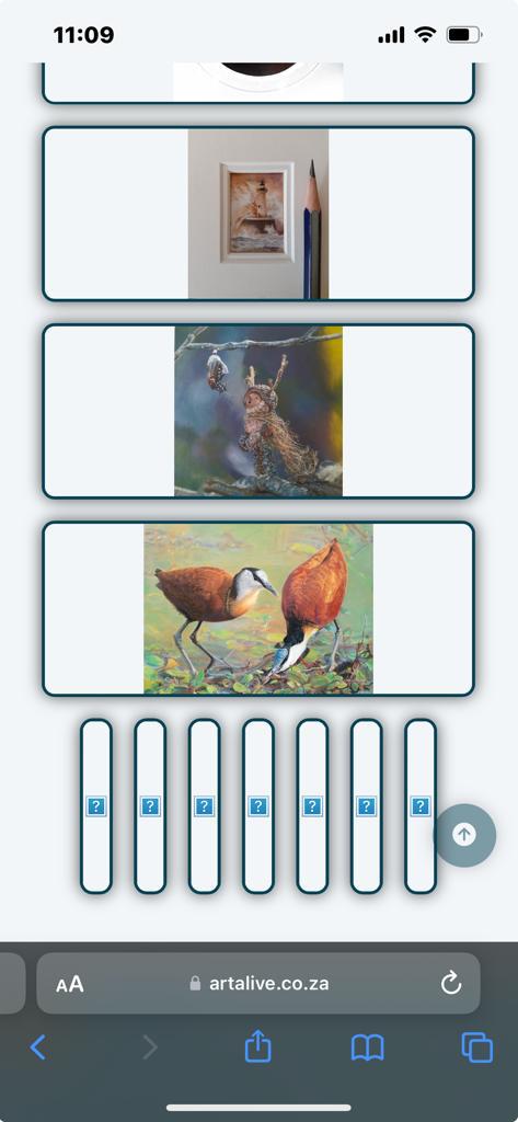
When I use emulators to look at this on different devices, the gallery looks normal, but I was sent a screenshot of some weird behavior on iPhone 14. It seems the div containing the image stretches to fill the screen, instead of fitting the content. CODE: HTML
<div id="gallery">
<div class="painting">
<img>
</div>
</div>
<div id="gallery">
<div class="painting">
<img>
</div>
</div>
CSS
#gallery {
display: flex;
flex-direction: row;
justify-content: center;
flex-wrap: wrap;
}
.painting {
width: fit-content;
height: 18rem;
display: flex;
justify-content: center;
position: relative;
border: 0.15rem solid black;
border-radius: 0.6rem;
}
#gallery {
display: flex;
flex-direction: row;
justify-content: center;
flex-wrap: wrap;
}
.painting {
width: fit-content;
height: 18rem;
display: flex;
justify-content: center;
position: relative;
border: 0.15rem solid black;
border-radius: 0.6rem;
}
The relative positioning is to facilitate an overlay div that contains icons (but that is not being used in the current version of the site. 
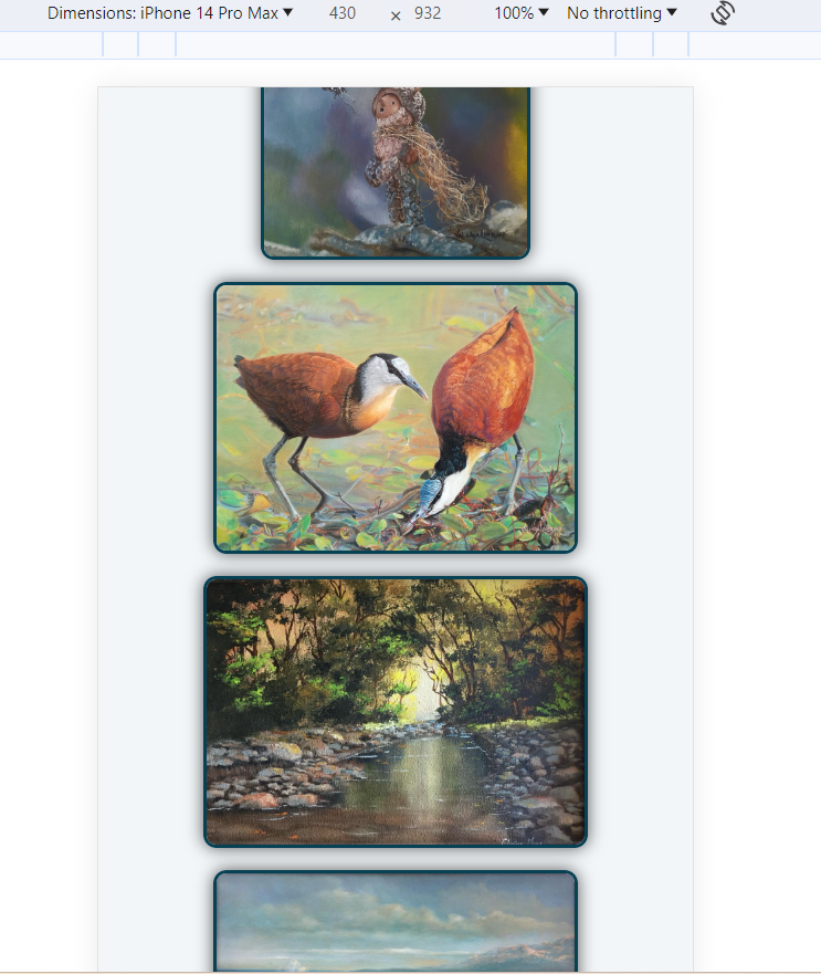
I've attached images of the iPhone 14 screenshot of the problem vs a screenshot of the gallery as appears on Chrome's developer tools for iPhone 14 Pro Max. Does anyone see what I've done wrong?
No description
No description
8 Replies
vince
vince•7mo ago
Try putting a width: fit-content on your #gallery or a max-width on your img Though your css seems a bit convoluted - I'm not sure your exact requirements (I see your requirements now but hopefully this might give you some ideas), but can you try something like this? https://codepen.io/vince1444/pen/xxMeoPz
butterfly0408
butterfly0408•7mo ago
Oh, thanks I will try that! The idea behind the div containing the image is so I can have an icon overlay over the images to indicate you can click it and if it is sold or not. Do you know of a better way to do that?
vince
vince•7mo ago
I'm about to go on lunch in ~30 minutes so I can help you then 🙂
butterfly0408
butterfly0408•7mo ago
Okay cool, thanks, I'm about to have dinner now myself.
vince
vince•7mo ago
Okay so since you can't have psuedo elements on images, you'd need to have some container element, so div should be fine if you can't find anything more semantic From a UX perspective though, clicking on the painting to see if it's sold or not doesn't make much sense to me. Why not have some element that's on top of the image to indicate that it's sold, so the user doesn't have to complete an extra action for no reason I've updated the codepen with an example. I used good old chatGPT to help me with the JS code so I'm sure it could be better, but all the JS code does is sort the paintings: the paintings that aren't sold are moved to the top, while the paintings that are sold are moved to the bottom. This comes with a visual bug though - since the elements are already in the DOM, they flash quickly on load before sorting and moving in their correct positions. There are ways to counter this too but there are drawbacks. All of this is just for fun though to give you ideas. You could even put the image in a figure and have the .sold-banner in a caption. Actually now that I'm writing that that would probably be the best approach. But yea, lots of ideas
butterfly0408
butterfly0408•7mo ago
Oh yes, that's what ive got. A div that contains the image and another div that contains the icons and sold sticker. The icons are then set to position absolute and z-index 2 so it displays over the image.
vince
vince•7mo ago
Oh nice! That's basically what I have as well
butterfly0408
butterfly0408•7mo ago
I've never actually used a figure, so I'll definitely look into that. In terms of the JavaScript, my project is in Django, so that handles all that business.