Grid layout system for 1300px
Hello, I have to create a design system based on a mockup that follows a grid. Designers provide a mockup for the widest desktop format at 1440 pixels (container 1300px 12 columns), and a mobile.
For the example i talk about the desktop grid.
Currently, I'm using the same structure but without a grid system, based on flexbox. To adhere to the mockup, I take a block with a fixed pixel value, then set the others as auto flex (depending on the section, of course).
I would like to find a more modern approach using recent CSS rules, so that a backend developer or front-end can more easily define their blocks just by counting the number of columns used, without having to inspect the mockup with precision.
I'm turning to grid because it is becoming more widely used and accessible, especially with subgrid. It allows, thanks to the web inspector, an easy visualization of elements on the grid. I find it pleasant and user-friendly.
I would like to find the best approach for code that is maintainable in the long term.
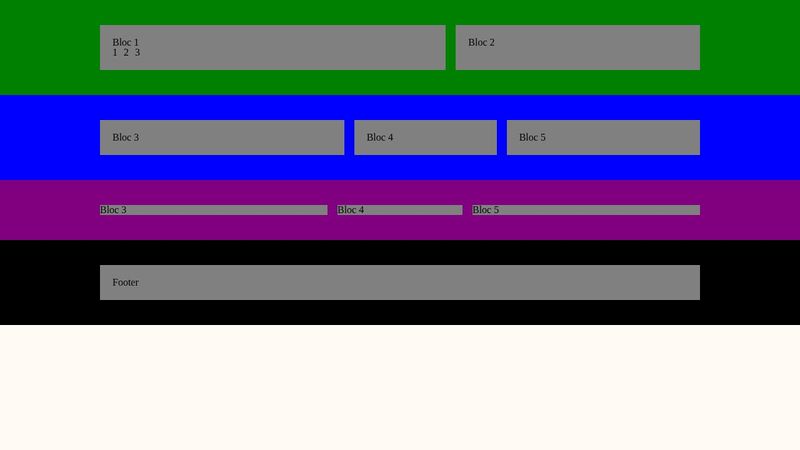
 Wireframe screenshot explain :
Section fullwidth > Container grid 12 > bloc > item(content)
- A body that contain infinite rows where I can, if needed, move #the-section-3 to 1 for example
- Multiple sections that contain a .container 12 columns and blocs inside
- Items inside a bloc is not subgrid to 12columns I don’t see a usecase of that.
 Problems :
- There are a lot of .container grids in the page which are potentially heavy to load ?
And hard to find the right .container in the Chrome inspector list to display the grid
- I had thought I could use @container query based on a block so that each item content fits in that block, but it doesn't work with subgrid
- every tutorial I watch for the grid system is always based on a full width grid, if you have an ultra wide screen you see content that fits full screen, I'm curious why no one applies the classic rendering of a web page with a page container.
https://codepen.io/VictorUx/pen/GReZxQb
For the example i talk about the desktop grid.
Currently, I'm using the same structure but without a grid system, based on flexbox. To adhere to the mockup, I take a block with a fixed pixel value, then set the others as auto flex (depending on the section, of course).
I would like to find a more modern approach using recent CSS rules, so that a backend developer or front-end can more easily define their blocks just by counting the number of columns used, without having to inspect the mockup with precision.
I'm turning to grid because it is becoming more widely used and accessible, especially with subgrid. It allows, thanks to the web inspector, an easy visualization of elements on the grid. I find it pleasant and user-friendly.
I would like to find the best approach for code that is maintainable in the long term.
Wireframe screenshot explain : Section fullwidth > Container grid 12 > bloc > item(content)
- A body that contain infinite rows where I can, if needed, move #the-section-3 to 1 for example
- Multiple sections that contain a .container 12 columns and blocs inside
- Items inside a bloc is not subgrid to 12columns I don’t see a usecase of that.
Problems : - There are a lot of .container grids in the page which are potentially heavy to load ?
And hard to find the right .container in the Chrome inspector list to display the grid
- I had thought I could use @container query based on a block so that each item content fits in that block, but it doesn't work with subgrid
- every tutorial I watch for the grid system is always based on a full width grid, if you have an ultra wide screen you see content that fits full screen, I'm curious why no one applies the classic rendering of a web page with a page container.
https://codepen.io/VictorUx/pen/GReZxQb


A friendly place for developers to meet other devs, ask questions, get help, and just have a good time 🙂.
36,263Members
Resources
Was this page helpful?