Having trouble adding a sidebar to my grid system

I'd really love help here if someone can dissect and figure out my dilemma. I have this WordPress site which is built using Advanced Custom Fields' flexible content fields. It's not using Gutenberg/the block builder. The user can add a section (<section>). They have some basic options, like class and background colour ↳ Inside each section they can nest what we're calling blocks, several if desired. Think text block (<div>), image block (<figure>), infobox (<div>), etc.). The blocks have some basic options, like class, background colour, and importantly width - narrow, standard, or wide. I set up a CSS grid to automatically give the children a width, whether the chosen narrow, standard, or wide. Standard is default. See here:
--grid-spacing-full: minmax(0px, 1fr);
--grid-spacing-wide: clamp(0px, 2.5vw, 100px);
--grid-spacing-standard: clamp(0px, 5vw, 100px);
--grid-spacing-narrow: clamp(1px, 70vw, 750px);

--section-grid: [full-start] var(--grid-spacing-full) [wide-start]
var(--grid-spacing-wide) [standard-start] var(--grid-spacing-standard)
[narrow-start] var(--grid-spacing-narrow) [narrow-end]
var(--grid-spacing-standard) [standard-end] var(--grid-spacing-wide)
[wide-end] var(--grid-spacing-full) [full-end];

> * {
grid-column: standard;
}
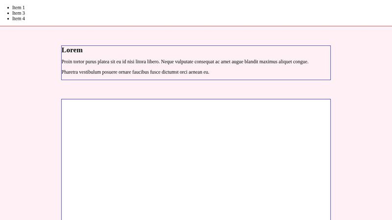
🚨🚨🚨 So, my actual issue here is that I want to also incorporate a sticky sidebar on some pages. How on earth can I do that? It feels like I need an entirely new grid system but I'm dizzy running myself in circles now. The sections span the full width of the page, and they need to continue to so that I get the full-width background colours per section, while the content should take up the left 3/4 of the content-container.. but then how am I do actually make a sticky sidebar stay atop those on the rightmost 1/4? So that it can scroll down along the page? Is this explanation even making sense? πŸ₯² 🚨🚨🚨 Pen here: https://codepen.io/emsixteen/pen/dyrmZJN
4 Replies
EmSixTeen
EmSixTeenβ€’10mo ago
Example markup:
<div class="content-container">
<section class="section" style="background-color: lavenderblush">
<div class="text-only">
<h2>Lorem</h2>
<div>
<p>Proin tortor purus platea sit eu id nisi litora libero. Neque vulputate consequat ac amet augue blandit maximus aliquet congue.</p>
<p>Pharetra vestibulum posuere ornare faucibus fusce dictumst orci aenean eu.</p>
</div>
</div>
<div class="video-embed" style="background-color: white">
<iframe src="https://player.vimeo.com/video/123456789" width="1280" height="720" frameborder="0" allow="autoplay; fullscreen; picture-in-picture"></iframe>
</div>
</section>
<section class="section" style="background-color: lavender">
<div class="text-only">
<h2>Fermentum laoreet</h2>
<div>
<p>Phasellus fermentum malesuada phasellus netus dictum aenean placerat egestas amet. Ornare taciti semper dolor tristique morbi. Sem leo tincidunt aliquet semper eu lectus scelerisque quis. Sagittis vivamus mollis nisi mollis enim.</p>
</div>
</div>
</section>
<section class="section" style="background-color: lavenderblush">
<nav role="navigation" class="prev-next">
<ul class="prev-next__list" role="list">
<li class="prev-next__list-item prev-next__list-item--next" role="listitem"><a class="prev-next__next button" href="#">Next</a></li>
</ul>
</nav>
</section>
</div>
Example sass:
.section {
--grid-spacing-full: minmax(0px, 1fr);
--grid-spacing-wide: clamp(0px, 2.5vw, 100px);
--grid-spacing-standard: clamp(0px, 5vw, 100px);
--grid-spacing-narrow: clamp(1px, 70vw, 750px);

--section-grid: [full-start] var(--grid-spacing-full) [wide-start]
var(--grid-spacing-wide) [standard-start] var(--grid-spacing-standard)
[narrow-start] var(--grid-spacing-narrow) [narrow-end]
var(--grid-spacing-standard) [standard-end] var(--grid-spacing-wide)
[wide-end] var(--grid-spacing-full) [full-end];

display: grid;
grid-template-columns: var(--section-grid);

padding-block-start: var(--_p-section);
padding-block-end: var(--_p-section);
--_p-section: var(--p-section, 4em);
--_m-between: var(--m-between, 4em);

// Every child of .section unless given a class
> * {
grid-column: standard;
}

// All direct children of the .section, except the first
> * + * {
margin-block-start: var(--_m-between);
}
}

/* tripe */
html,
body {
margin: 0;
padding: 0;
}

h2 {
margin: 0;
}

iframe {
max-width: 100%;
height: auto;
aspect-ratio: 16/9;
}

section {
padding: 1em;
outline: 1px solid red;

> * {
outline: 1px solid blue;
}
}
clevermissfox
clevermissfoxβ€’10mo ago
A sticky sidebar or a fixed sidebar ? Can you give the page a padding of 25% or whatever the width of that sidebar is? Or do you want the content to go underneath/be hidden by the sidebar ? And what element in your pen is the sidebar in question ?
EmSixTeen
EmSixTeenβ€’10mo ago
Sticky sidebar! The sections need to be under the sidebar, rather than beside, else the background wouldn't go fullwidth The sidebar isn't in the pen, that's just the example grid set-up I'm free to add the sidebar markup anywhere in that markup, other than between sections πŸ˜„ I think that's kinda where my biggest problem is - That the background colours for each section need to stretch full-width of the page, so I don't think it can just be like,
<container>
<sidebar></sidebar>

<section></section>
<section></section>
<section></section>
</container>
<container>
<sidebar></sidebar>

<section></section>
<section></section>
<section></section>
</container>
clevermissfox
clevermissfoxβ€’10mo ago
I’m not seeing a class called sticky-sidebar in your markup… So it’s hard to say without seeing the element in question and the styles Do you want the sidebar to stick on the top or on the left of the page? And do you want it to always be there or should it scroll away with one of the sections at some point ?
Want results from more Discord servers?
Add your server