Trying to make a simple grid layout
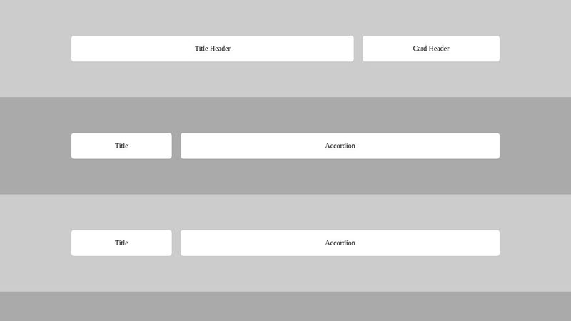
I would like to create a grid layout to simplify the creation of sections on my site for devs through a simple layout.
Each section would contain a .container grid which adds 2 columns by default (and forces it to 1 on mobile).
the idea is to define custom layout columns per section (iso wireframe ratio) without specifying the pixel size of the cells.
As most sections contain 2 columns, I would like to be able to set the size of the first block only, and the second is auto fill (IF POSSIBLE ?).
and the block component inside would adapt with @container query based on that column.
My question, Is it possible to make the construction faster and simpler ?
For example .section-1 which is in 2 columns, is it possible to define only block-1 (span 4) and block-2 to take all of the remaining space automatically
(without having to specify grid-column: 5/-1;) ?
(like a flex-grow would do)
thank you
Source code : https://codepen.io/VictorUx/pen/JjzZrwm


A friendly place for developers to meet other devs, ask questions, get help, and just have a good time 🙂.
36,263Members
Resources
Was this page helpful?