My site is not being responsive

can someone help me make my website mobile responsive 
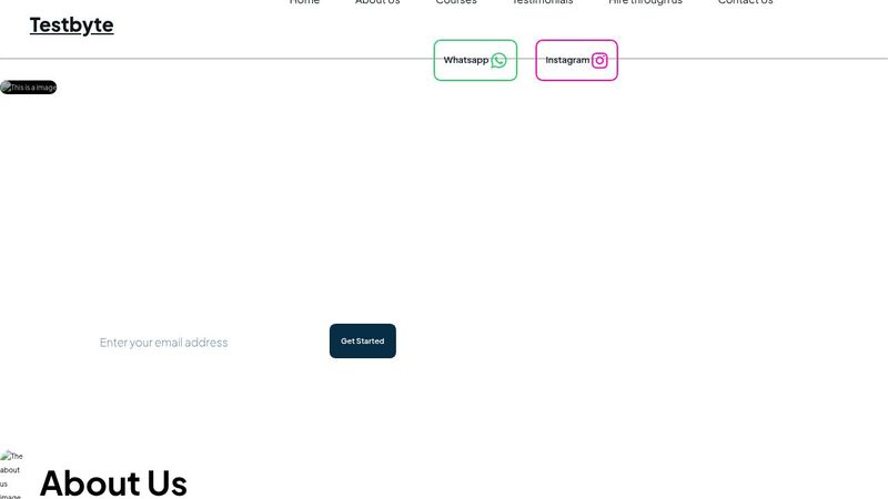
beginner here. I tried using media queries but they don't seem to work, maybe it's me idk https://codepen.io/haamid673/pen/yLwdKQE
Haamid
CodePen
Testbyte
...
4 Replies
vince
vince4mo ago
no one is going to port this into wordpress and run it to help you out can you put it in a codepen please so people can view it easily and give you feedback? #how-to-ask-good-questions
haamid673
haamid6734mo ago
ohh okk
clevermissfox
clevermissfox4mo ago
You should be good to use range syntax in you queries now so you don’t even have to worry about min-width or max-width. It’s confusing, I know because it seems backwards. You also need to be mindful of overwriting yourself with media queries. They need to be in the correct order. But just use range syntax:
@media (width < 500px) {
.about-us{
flex-wrap: wrap;
}
}
@media (width < 500px) {
.about-us{
flex-wrap: wrap;
}
}
Flex-wrap is your friend too. And a lot of these elements would work well with grid vs flex. I suggest starting with watching some of KPows videos on media queries so you understand them better. There are a ton of resources out there. You have a bit of work to do to get this responsive and cleanly. Prepare to buckle up and get learning and coding!’ Start with @media queries, container queries, and grid. Also be mindful of putting text on top of images; you’ve lost some on some of the images you’re using. I would use as a bg image with a gradient with background-blend-mode or use a pseudo element on top of the image (images can’t use pseudo elements so it will need to be for a wrapping container; that’s why I recommend background image instead in image tag) https://youtu.be/2KL-z9A56SQ?si=bYdR4Gdte5a1s1ig https://youtu.be/BvB8kSmgMcM?si=5z8tFGY2H0X3mwes https://youtu.be/x4u1yp3Msao?si=wHYTPGW98xJas23q https://youtu.be/2rlWBZ17Wes?si=Y2RWhtZRnvhU4g44 https://youtu.be/3_-Je5XpbqY?si=Ma-DlGxTz4FDMQFa
Kevin Powell
YouTube
Tutorial: Learn how to use CSS Media Queries in less than 5 minutes
Start creating responsive layouts with confidence with my free responsive layouts course: https://courses.kevinpowell.co/conquering-responsive-layouts Quickly learn how to using CSS media queries. In this video, I explore what media queries are and how you can start using them right away. If you know how to write your own CSS, you'll be able ...
Kevin Powell
YouTube
A new way to write media queries is coming to CSS: range syntax
A lot of people have been asking about the shirt! Here it is: https://making-the-internet-awesome.creator-spring.com/listing/api-by-day-ipa-by-night Heads up, this is only working in Firefox right now, and even then, only partially supported! This video is a part of my looks ahead at what's coming to CSS 😊. As I mention in the video, I also rec...
Kevin Powell
YouTube
A practical guide to responsive web design
I have a FREE COURSE on conquering responsive layouts 👉 https://courses.kevinpowell.co/conquering-responsive-layouts 🔗 Links ✅ Width auto vs. 100%: https://youtu.be/-st14lUQD3U ✅ Responsive layout practice for beginners: https://youtu.be/JFbxl_VmIx0 ✅ Position absolute and responsive layouts: https://youtu.be/H04P5YXVssE ⌚ Timestamps 00:00 - I...
Kevin Powell
YouTube
Learn how to use Media queries & Container queries
A dive into the world of media queries and container queries, covering the basics of how each works, the differences between them, when you might want to use one over the other, and more. A big thanks to Geoff Graham for his help in making this video. https://geoffgraham.me/ 🔗 Links ✅ Practical guide to responsive web design: https://youtu.be/...
Kevin Powell
YouTube
Container Queries are going to change how we make layouts
While media queries that look at the viewport size can be useful, today’s web is very component-based, and having to rely on the size of the viewport is pretty limiting. Luckily, container queries are now a thing! 🔗 Links ✅ Browser support for container queries: https://caniuse.com/?search=container%20query ✅ New media query syntax support ...