Media Queries
Hello, could somebody please tell me what I am doing wrong?
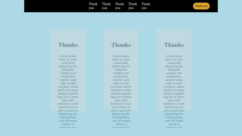
I have been learning media queries and I do not understand why the video, and 3 floating things are not staying together,
is it the set 75vh? I have tried to changing the height at the break point but it does'nt seem to do anything, also creates gaps within other divs.
please help. please and thank you. im really just asking on advice for media queries, ive looked at a lot of videos mostly Kevins, simply cannot grasp all the concepts.
But how would I make widths and heights look simlar through all screen sizes, like I know what I want, I just cant put the pieces together. thank you.
the video can't be seen because its on my local storage and I don't know how I can put the video in it in code pen.
https://codepen.io/Eddiev10/pen/zYXYYBw


A friendly place for developers to meet other devs, ask questions, get help, and just have a good time 🙂.
36,263Members
Resources
Recent Announcements
Similar Threads
Was this page helpful?