Buggy grid with container layout.
I've setup a site with the container layout as shown in https://youtu.be/c13gpBrnGEw?si=y7HnB4eeG-uhUsds.
But I had to include a sidebar. So I've added that in.
The issue comes now with a .full class it won't flow all the following elements anymore. And enabling the grid debug lines it shows many lines.
It happens in Firefox. I'm not sure why it happens.
https://beta.ohlijf.com/methode
Code: https://github.com/dxlbnl/ohlijf/blob/develop/src/app.css#L161
YouTubeKevin Powell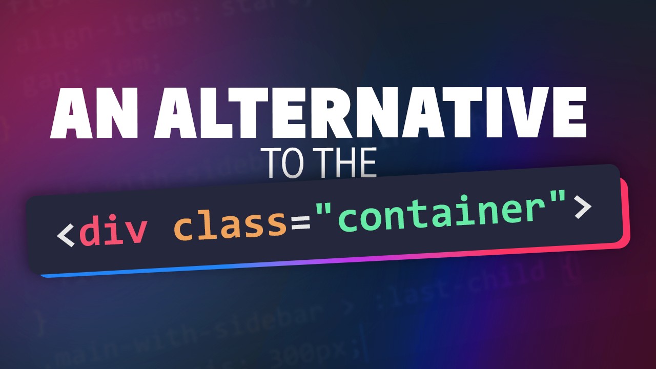
The wrapper or container is probably the most common design pattern around, but after coming across an article by Stephanie Eckles looking at how we can use a grid to emulate a container, and have simple breakouts — https://smolcss.dev/#smol-breakout-grid — I had an idea of how we could do this to completely drop the idea of containers, and then...
Ervaar de vrijheid van een lichter leven met OhLijf. Ontdek hoe wij mensen met chronische klachten begeleiden naar een leven vol energie en vrijheid.
GitHub
De website van ohlijf. Contribute to dxlbnl/ohlijf development by creating an account on GitHub.

A friendly place for developers to meet other devs, ask questions, get help, and just have a good time 🙂.
36,263Members
Resources
Similar Threads
Was this page helpful?