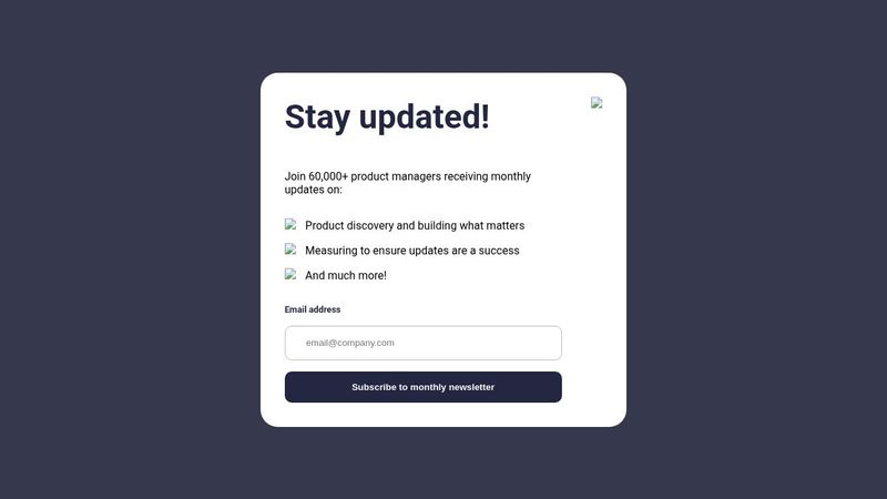
I need help with responsive
I'm trying to make the mobile responsive, and I truly need your help. Also, I would like some advice to get better at doing responsive, thanks! Note: The image is not showing in code pen. https://codepen.io/Jonah-the-lessful/pen/mdgmOrE
14 Replies
Which specific aspect would you like help with? It looks pretty good already. You do need to remove the border-radius on the container on mobile.
The image I'm using is desktop image, the file comes with both, the desktop and mobile image. I want the image to be the same as the photo on mobile. I think I have to get rid of the desktop image to be replace of the mobile. This is my project.
Use a media query to change from row to column or reverse column with the two elements , content and imageWrapper as direct children
I use it on my container and the image, it didn't work.
You can put the image as a background image. Then change the background image on mobile.
Didn’t work in what way? The direction didn’t change or..?
It still remains the same.
I had use flex-direction on my container.
So, is the issue the direction/order of elements, or is the issue that you want to use a different image on mobile vs desktop?
It’s switching from row to column for me
Give me a second, I'm going to review my code.
Yeah, I already have it in column. I use column-reverse to place the image at the top. But the issue is, The height of the image is too big, and I need to increase the width of it so, It can cover the spaces.
Like this
I'm going to try to use the mobile image
You’ll need to remove the padding from the parent element and add the inline padding back into the “left” element (which is not left when it’s on the bottom. Would suggest a class name like “content” or something, as an aside on naming conventions 🤣)
And as Sven suggested using a bg image instead of an html img element
Okay, thanks