help with positioning

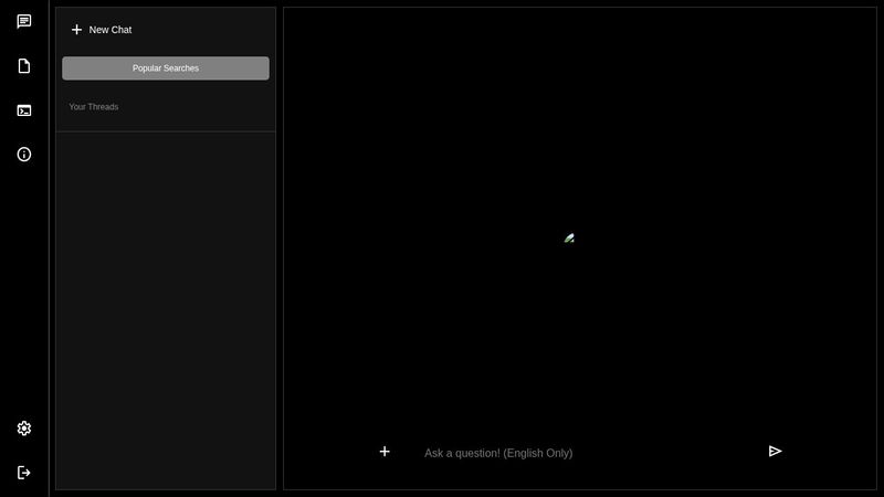
I’ve been working on this project and it’s displaying perfectly on my device but when I try out the online code editor (Codepen) the positioning is off and is all the way to the right. I’d like to know if it’s going to be an issue going forward or if I should overlook it. https://codepen.io/thatboybubu/pen/mdgmVRY
No description
9 Replies
clevermissfox
clevermissfox3mo ago
Which element is not positioned correctly /is all the way to the right ? I’m not seeing anything right away that looks out of place
ChooKing
ChooKing3mo ago
I don't see anything all the way to the right, but the design is not responsive at all. Also, I noticed that main-body is an empty div. I suspect you intended that to wrap all the content that comes after it.
𝕭𝖚𝖇𝖚✾
Thank you Thank you so much Such practice is making it really difficult for me to make the design responsive because instead of it to collapse as I reduce the viewport it just gets cut out
ChooKing
ChooKing3mo ago
The problem is that you have specific pixel/rem values for the widths of things. This ignores the size of the viewport.
𝕭𝖚𝖇𝖚✾
What do you suggest I do please
ChooKing
ChooKing3mo ago
The chatbox takes a lot of space and doesn't need a specific width, but you gave it 70rem. That is the best candidate for making the width variable. Don't give it any width at all. It should default to 100% of the available space. You can give it a max-width to avoid excessive stretching on wide displays, but don't give a regular width. Also, you can use media queries to hide or rearrange the sidebar on narrower screens.
𝕭𝖚𝖇𝖚✾
I did as you said still, it doesn’t collapse
ChooKing
ChooKing3mo ago
You have to do the same to all of the descendants of chatbox. For example, chat-container has a fixed width of 55rem. Also, the width has to be explicitly set to 100% on all flex containers, so chat-container should be given 100% width instead of 55rem. Note that there are other descendants. I am not going to list every one of them for you. Also, children of a flexbox should be given flex:1 or some variant instead of width: 100%.
𝕭𝖚𝖇𝖚✾
Thank you so much I finally got it to work, I would use media queries to work on the sidenavs/to make it responsive