Need Help with a Responsive grid display
I'm working on a press page for a game me and my friends are creating and I cannot figure out how to make this section do what I need it to do for the design to work.
I've been sitting here for 3 hours trying different approaches to Display: grid using repeat, auto-fit, auto-fill, minmax and everything. Please someone shine a light on this for me.
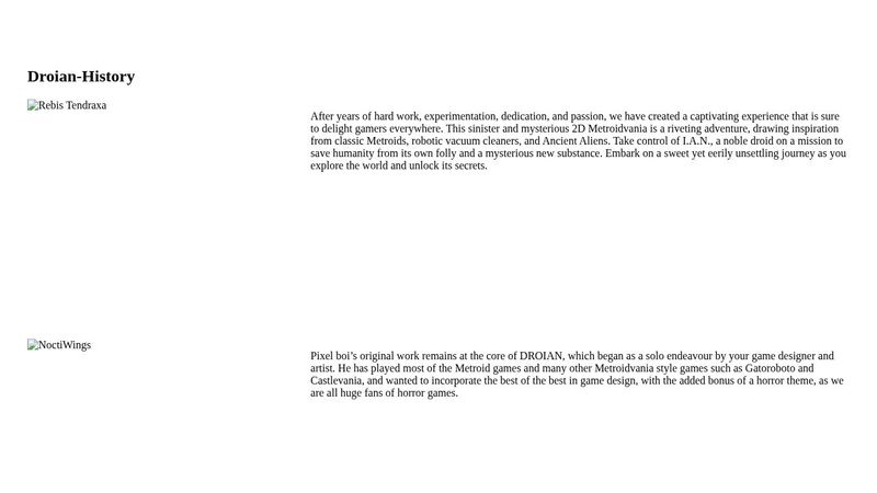
The images basically need to be by the side of their paragraph when the display has width and when smaller they need to go above (in the case of the first 2 images) or below (in the case of the last image). I feel like I am over-complicating this, but I wanted the image to only cover about 30% of the line space and the text be the rest of the 70% of the space (on desktop).
I've tried so many things and nothing is doing this correctly. In I have not been able to make it responsive, I've gotten close to it but it does not respond correctly. pls help, I've only been coding for 3 months am new to this.
This is the code: https://codepen.io/thayna-linhares/pen/OJGgYXy I've also but the image of the figma design for reference.
I've been sitting here for 3 hours trying different approaches to Display: grid using repeat, auto-fit, auto-fill, minmax and everything. Please someone shine a light on this for me.
The images basically need to be by the side of their paragraph when the display has width and when smaller they need to go above (in the case of the first 2 images) or below (in the case of the last image). I feel like I am over-complicating this, but I wanted the image to only cover about 30% of the line space and the text be the rest of the 70% of the space (on desktop).
I've tried so many things and nothing is doing this correctly. In I have not been able to make it responsive, I've gotten close to it but it does not respond correctly. pls help, I've only been coding for 3 months am new to this.
This is the code: https://codepen.io/thayna-linhares/pen/OJGgYXy I've also but the image of the figma design for reference.


A friendly place for developers to meet other devs, ask questions, get help, and just have a good time 🙂.
36,263Members
Resources
Was this page helpful?