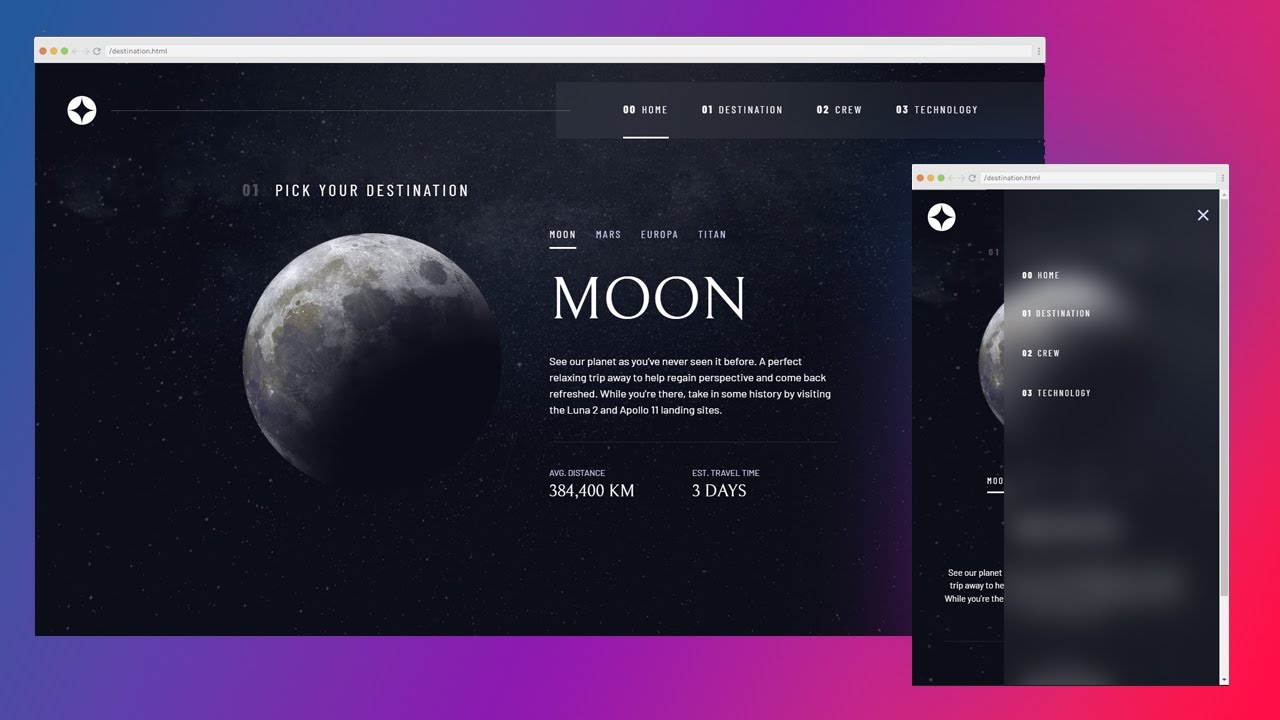
Some serious problems with my CSS
So, I have started building a site and I have got as far as the navigation, when I made it a few days ago it worked and was responsive. However, there are now a number of problems with it.
One is that in Devtools responsive mode (chrome and edge), when changing the width of the simulated screen, the size of the navbar seems to act in the same way as you zoom in (I can't even describe what it does, so I've provided screenshots), but resets when I choose a dimension pre-set from the dropdown (not the bar with common sizes).
Another is that is that when the mobile nav kicks in, the overflow-x: hidden; on the body doesn't do what it should as there is side scrolling, and you can see in the provided screenshots where the nav is retracted off the page.
The final issue is that the background of my nav in mobile mode doesn't display properly. It's height is not the whole screen as it should be, instead it is a seemingly arbitrary height.
I'm using VSCode live server, and no errors are showing up in Devtools console.
I followed Kevin's video of responsive navs, and changed it only minimally: https://youtu.be/HbBMp6yUXO0?si=CNU3oamfEttc18NG
Here is a codepen with my code (my message is too long to send with all my code here): https://codepen.io/BravoLima2k4/pen/QWPajwK
Any help on this is highly appreciated, as this problem is infuriating and I see no reason that it should happen. Thanks


message.txt5.03KB
message.txt5.03KB
message.txt5.03KB
message.txt5.03KB
message.txt5.03KB
message.txt5.03KB
YouTubeKevin Powell
You can find the Frontend Mentor project here: https://www.frontendmentor.io/challenges/space-tourism-multipage-website-gRWj1URZ3
And the free Scrimba course here: https://scrimba.com/learn/spacetravel
 Links
Links
 Why I use HSL: https://youtu.be/Ab9pHqhsfcc
 More on feature queries (@supports): https://youtu.be/wPI8CEoheSk
 More info on .sr-...
And the free Scrimba course here: https://scrimba.com/learn/spacetravel
 Links
Links  Why I use HSL: https://youtu.be/Ab9pHqhsfcc
 More on feature queries (@supports): https://youtu.be/wPI8CEoheSk
 More info on .sr-...

