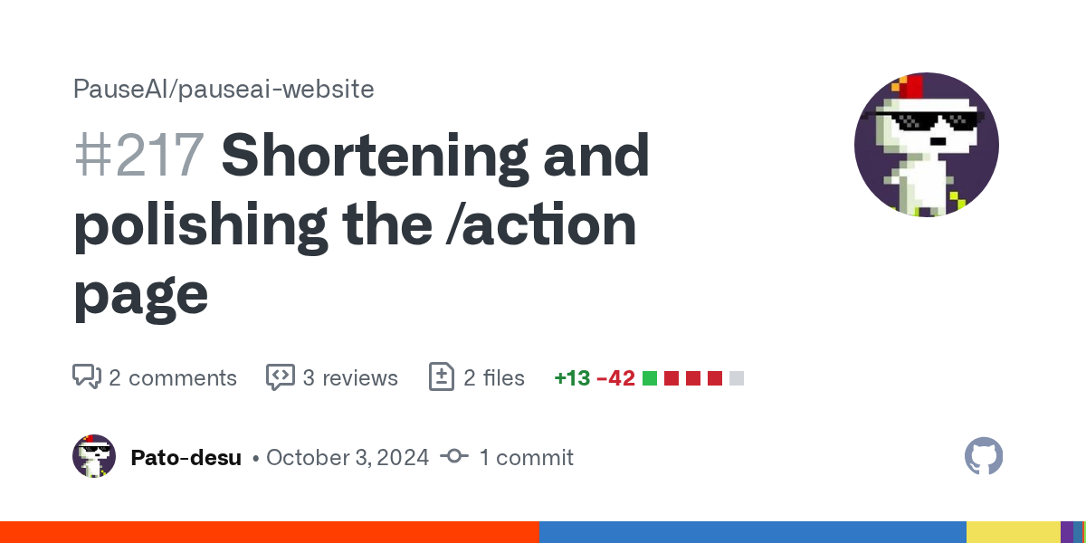
oh yeah, I like your list a lot. Now i'm feeling lost about what does it have that the page doesn't (outside the titles) and if we should then change the page somehow.
Maybe we also need to put one or two clear main actions, and put all the others as extra.
My first question would be to our 2000k members with a survey. Which other groups/forums they are actively participating in, if any, and what "platform" is used by those. Eg. forum format EA, reddit-y (?) format LW, etc.
There was an interesting experiment in psychology, if I can sum it up roughly. A gadget company made a public gathering of a focus group to ask them which colours of their gadget would they potentially most prefer to buy. The group gave a bunch of rainbowy answers. The trick was, on the way out they let everyone choose that gadget to take as a gift, any colour. Most of them chose black. Morale: judge on what people do more than on what they say. Dunno how relevant this is but felt like sharing
yeah... I mean I think people use mainly Whatsapp groups but big groups need to be separated in smaller ones. That's why local/ national chapters could be the way.
You'll find out about our current (niche) membership preferences, and that will be useful, but we should only use that in a context that recognizes we want to attract a far wider membership who may have quite different preferences.
Also, I think the color of orange we use on the homepage is slightly darker than the color we use everywhere else: # FF9416 (old) vs # E07800 (new homepage)
The latest PR seems like a pretty big change that should have been discussed longer imo, especially since the page is linked from a bunch of places. Didn’t have a chance to look through it yet so no concrete opinions for now
I'm actively working on it so we can link to the page from a flyer to draw engagement. I saw your comments and I'll go through them tomorrow when I have a few hours.
A lot of them come down to having a page that works better for one demographic tends to make it more awkward for another. I think an option to select if you're in the US or EU or somewhere else would be best, but I don't have those skills.
Okay, I think now I know why I wasn't sure where to add it. We discussed making the action page actually simpler and more concise and this would be the opposite. I also think it's better to keep the page specific about how to increase the chances of a moratorium. Not other AI Safety interventions.
But we could add it to https://pauseai.info/learn#other-websites. And, tbh, I think your website should be linked in AISafety.com instead of ours in the section about taking immediate action.
@James Norris quick note in passing that https://existentialsafety.org/ clips text off sides of screen on my pretty standard Chrome-on-Android. I tried viewing source but the approach looks very framer specific.