Dynamic header
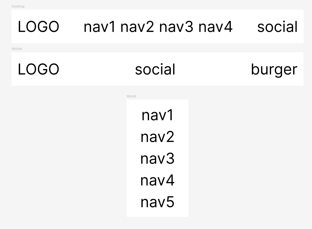
I want to make header that automatically switches between desktop/mobile modes.
Logo is constant size. Social buttons are constant size.
So everything depends on size of nav links and screen size.
If all nav links fit into single line, keep them. Otherwise show burger button and put nav links into modal window.
I managed to solve it for single fixed breakpoint (classic responsive approach). So in theory some js could help to make it automatic.
But here comes most hardcore part.
It is react app. So using raw js to handle dynamic behavior is kinda bad.
It is ssr app. So running raw js to give some css classes or inline styles on page load will break hydration.
It is critical style (first screen of landing page). So waiting for react to load, pick up page and calculate sizes is not realistic approach.
What can I even do in this situation?
Are there established patterns for this exact flow?
Is it even possible with modern tech?

A friendly place for developers to meet other devs, ask questions, get help, and just have a good time 🙂.
36,263Members
Resources
Similar Threads
Was this page helpful?