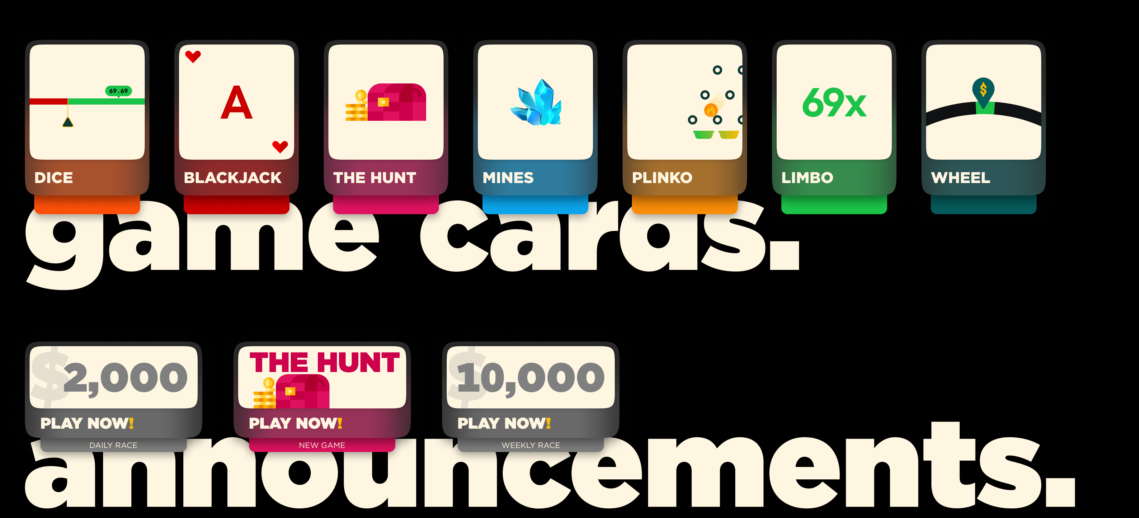
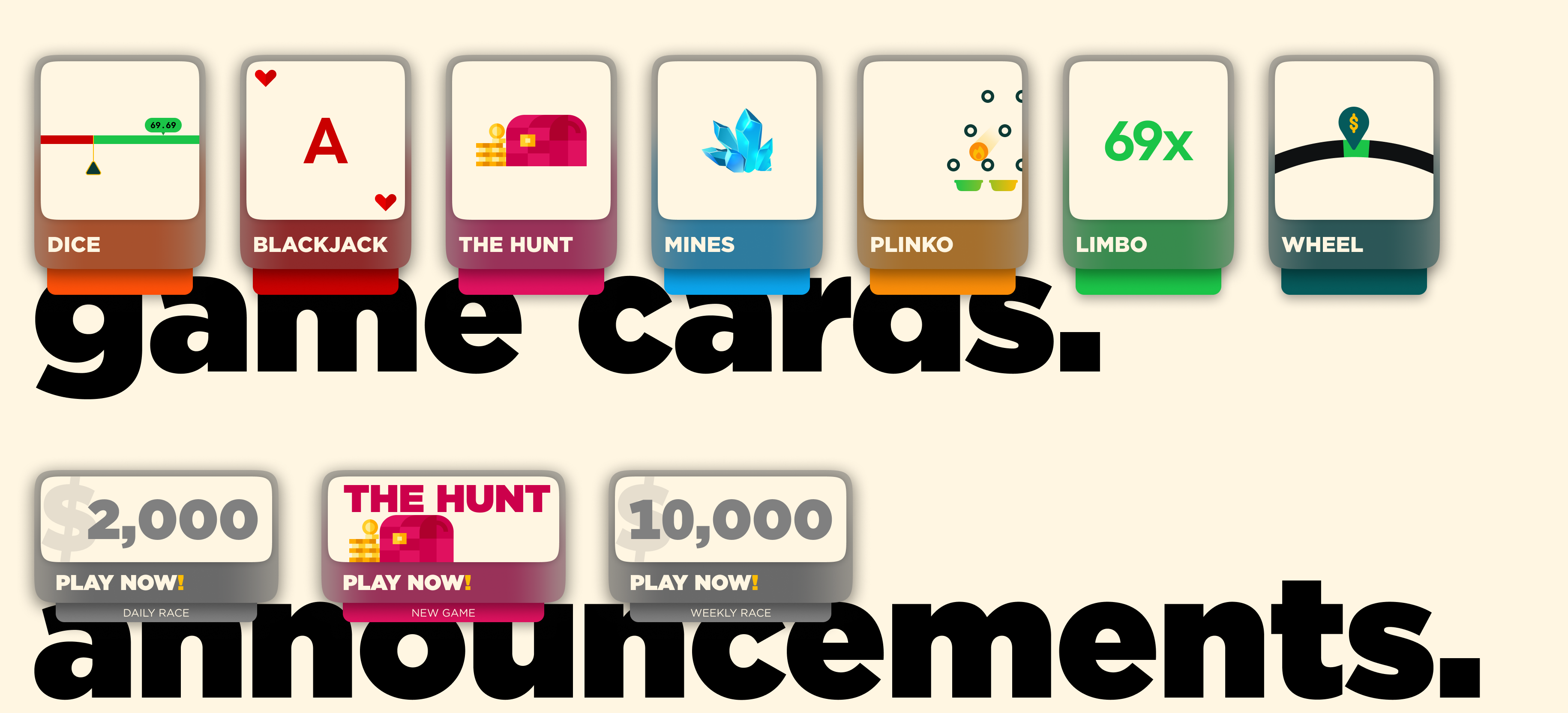
design feedback on my casino game/announcement cards. i did something different.
yo i'm back, the project is almost finished i just have to finalize this cards/thumbnails. so some context why i decided to go for colorful cards it's cause every casino has same kind of cards and gaming companies also use same thumbnail for all the casino's as it's the same game (talking bout slots e.g : sugar rush) but i wanted to do something different. as it's a luxury casino, other aspects i loved it and i'm super sure bout my design but i'm not super sure bout this cards so i'm here to collect the feedback and review. if you have suggestions feel free to give me i would really appreciate it.
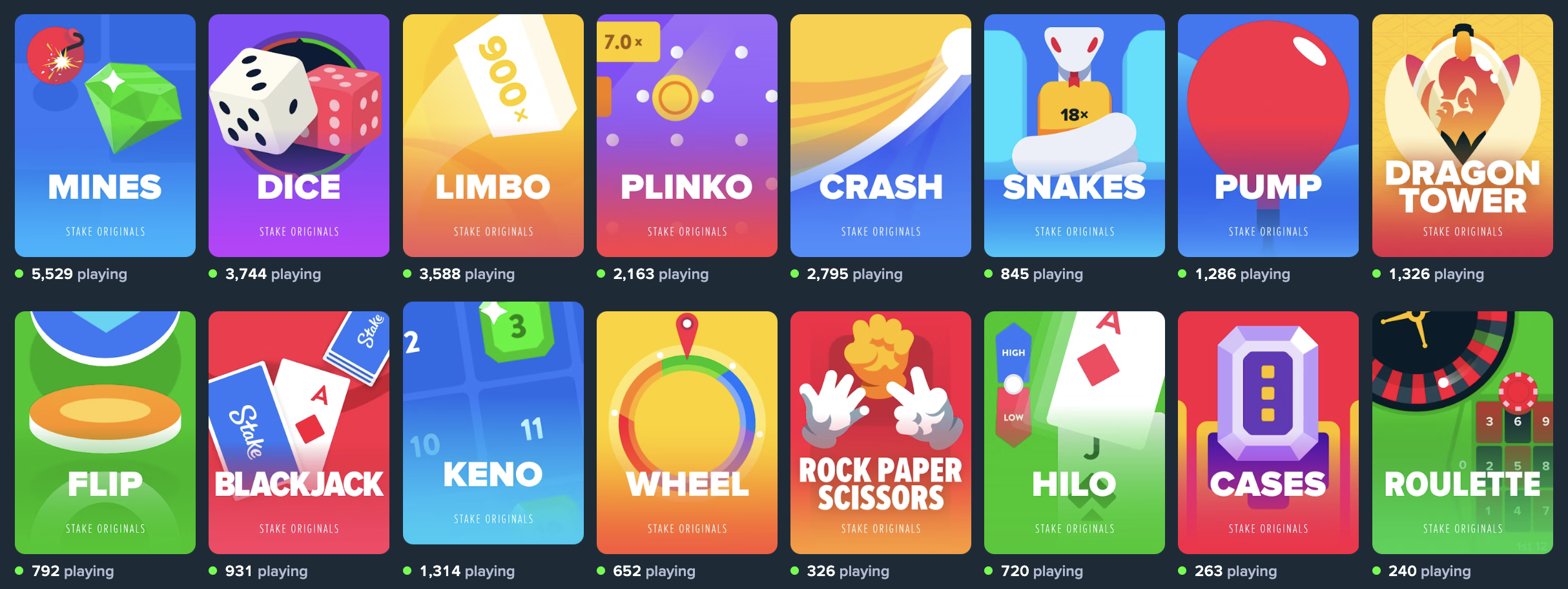
3rd image is the stake's for reference. my images are there just for you guys to see i didn't put it on website design like that. the text underneath just to indicate which card is for which.
3rd image is the stake's for reference. my images are there just for you guys to see i didn't put it on website design like that. the text underneath just to indicate which card is for which.

A friendly place for developers to meet other devs, ask questions, get help, and just have a good time 🙂.
36,263Members
Resources
Similar Threads
Was this page helpful?