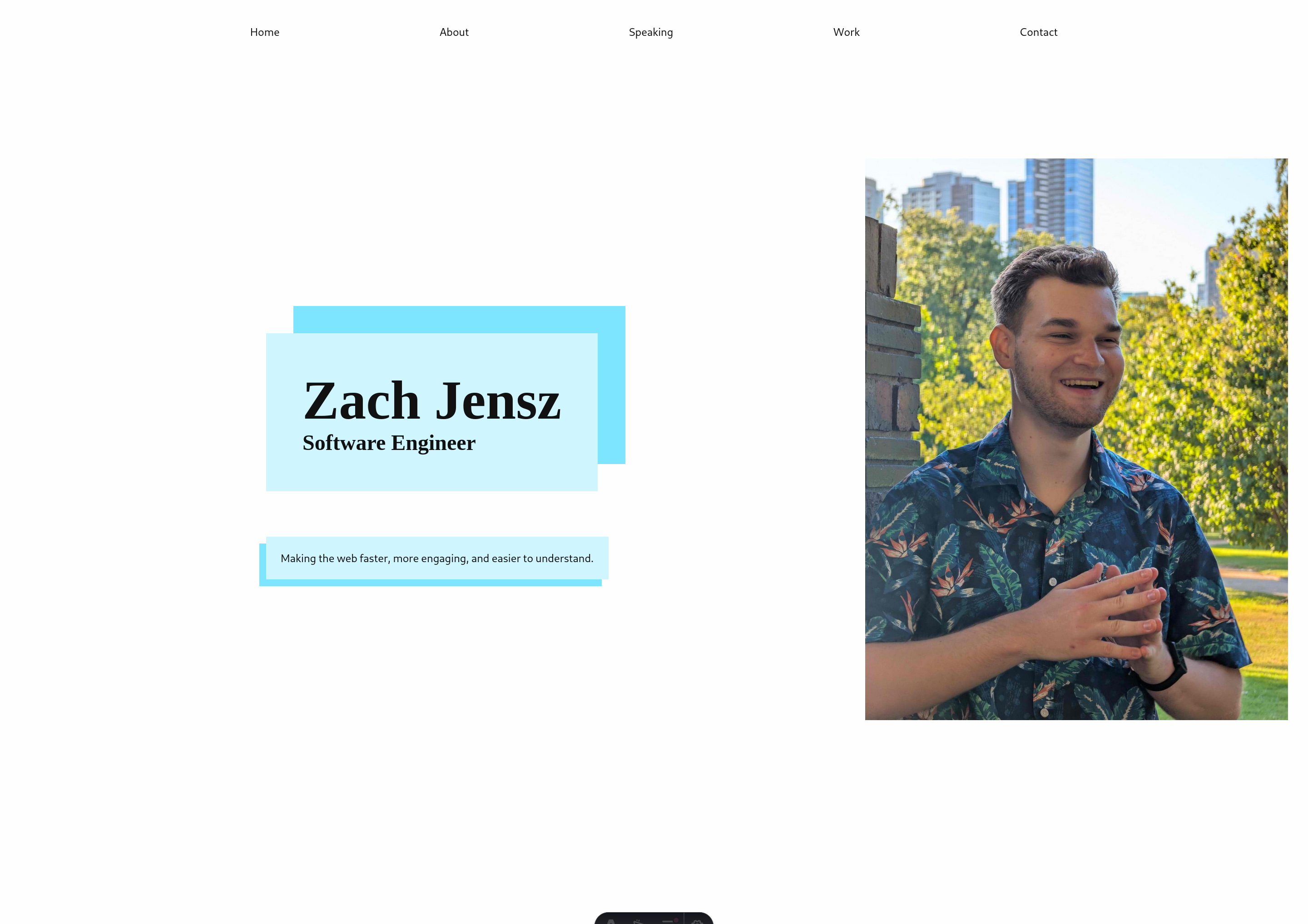
Not sure how I feel about these blue boxes, but it was a bit boring without them

No description
64 Replies
Zach Jensz
Zach JenszOP3mo ago
No description
Zach Jensz
Zach JenszOP3mo ago
and yes I gotta slap a max width on the nav
13eck
13eck3mo ago
Blue boxes better, confirmed
Zach Jensz
Zach JenszOP3mo ago
@Jochem ?
No description
13eck
13eck3mo ago
🤢
Zach Jensz
Zach JenszOP3mo ago
😅
Jochem
Jochem3mo ago
Don't like it either it looks like there's a saturation filter on the entire thing, makes me want to check my monitor >_>
Zach Jensz
Zach JenszOP3mo ago
fair
Zach Jensz
Zach JenszOP3mo ago
No description
13eck
13eck3mo ago
Bad-eyesight-man no likey that…uhh…green?
Zach Jensz
Zach JenszOP3mo ago
No description
13eck
13eck3mo ago
More soothing to mine eyes
Zach Jensz
Zach JenszOP3mo ago
dufuq my a11y contrast meter gone?
No description
Zach Jensz
Zach JenszOP3mo ago
I swear it was here
13eck
13eck3mo ago
It took the day off. Y'know, contractual obligations and whatnot? lol
Zach Jensz
Zach JenszOP3mo ago
ah nvm, the a11y tool was in the colour picker... logic
No description
Zach Jensz
Zach JenszOP3mo ago
@Jochem @13eck.c I'm really happy with this
No description
Zach Jensz
Zach JenszOP3mo ago
what do yall think?
Jochem
Jochem3mo ago
I still think it feels a little desaturated. The picture might be contributing, with you in the shade and the background in the sun? it's a nice photo, though
ἔρως
ἔρως3mo ago
the left side looks like it has the brightness turned down, the right side is sunny bright maybe it's the gray-ish background tricking our eyes?
Zach Jensz
Zach JenszOP3mo ago
I still think this is very saturated
No description
Zach Jensz
Zach JenszOP3mo ago
Picture I'm happy with for now, I I will take some more portraits soon This was the best business one I had on Photofeeler lol hawaiian shirt
ἔρως
ἔρως3mo ago
the photo looks good
Zach Jensz
Zach JenszOP3mo ago
dark theme
No description
13eck
13eck3mo ago
Photo looks great, yeah. But the boxes on the left need more colour. They just look bland next to the brightness of the picture
Zach Jensz
Zach JenszOP3mo ago
@13eck.c this bright enough? left side needs to be brighter still? oof ok
13eck
13eck3mo ago
My eyes have a hard time seeing very light/muted tones. So it's physically painful for me to look at as my eyes try to see a colour they just can't The first one you shared looks really good. Not too loud but bright enough to not hurt my eyes This one, too, looks pretty good. And the light/dark dichotomy helps to "unmute" the main colour
Zach Jensz
Zach JenszOP3mo ago
@Jochem first one or the one Beck just mentioned? first one is much brighter but more desaturated iirc
Jochem
Jochem3mo ago
The photo looks much brighter in this message than in this one
Zach Jensz
Zach JenszOP3mo ago
it is more zoomed out tbf
Zach Jensz
Zach JenszOP3mo ago
No description
Zach Jensz
Zach JenszOP3mo ago
@Jochem
No description
Zach Jensz
Zach JenszOP3mo ago
No description
Zach Jensz
Zach JenszOP3mo ago
No description
Zach Jensz
Zach JenszOP3mo ago
omg I'm so indecisive
13eck
13eck3mo ago
That’s pretty obvious lol
Kevin Powell
Kevin Powell3mo ago
what about the dotted shadow effect to add some texture? 🤷 https://codepen.io/kevinpowell/pen/wBaxORJ/07a889c771fb734ca14029b7df33b1c2
Kevin
CodePen
Untitled
...
Kevin Powell
Kevin Powell3mo ago
or is that trend too old now? 😆
Zach Jensz
Zach JenszOP3mo ago
oooo could work I'm trying something new rn
Zach Jensz
Zach JenszOP3mo ago
No description
13eck
13eck3mo ago
F’in sexy
Zach Jensz
Zach JenszOP3mo ago
um is there a way to put text shadow behind
Zach Jensz
Zach JenszOP3mo ago
No description
Zach Jensz
Zach JenszOP3mo ago
cause this aint gon work
Zach Jensz
Zach JenszOP3mo ago
and the contrast is not the best without
No description
ἔρως
ἔρως3mo ago
like a stroke?
Zach Jensz
Zach JenszOP3mo ago
yea
ἔρως
ἔρως3mo ago
MDN Web Docs
-webkit-text-stroke - CSS | MDN
The -webkit-text-stroke CSS property specifies the width and color of strokes for text characters. This is a shorthand property for the longhand properties -webkit-text-stroke-width and -webkit-text-stroke-color.
Zach Jensz
Zach JenszOP3mo ago
🤔
No description
ἔρως
ἔρως3mo ago
yikes! that font is bad
Zach Jensz
Zach JenszOP3mo ago
it's a feature not a bug I doubt they thought of someone doing this
ἔρως
ἔρως3mo ago
try another font, and it shouldn't happen
Zach Jensz
Zach JenszOP3mo ago
brightness filter is not too bad
No description
13eck
13eck3mo ago
That’s cool on the big text but g*daweful at small size
Zach Jensz
Zach JenszOP3mo ago
@media (prefers-color-scheme: dark) {
filter: brightness(150%);
}
@media (prefers-color-scheme: dark) {
filter: brightness(150%);
}
amazed this works:
@media (width > 20rem) {
background-image: linear-gradient(63deg, red, blue);
background-image: linear-gradient(in oklch 63deg, red, darkblue);
background-clip: text;
color: transparent;
@media (prefers-color-scheme: dark) {
background-image: linear-gradient(in oklch 90deg, red, rgb(0, 68, 255) 50%, red);
}
}
Kevin Powell
Kevin Powell3mo ago
You can use paint-order to fix the stroke now
ἔρως
ἔρως3mo ago
oh that i dont think i knew about
Kevin Powell
Kevin Powell3mo ago
That type of thing happens on a lot of fonts, so adding text strokes is often useless... Or was until they added that As a bonus, by the stroke being painted first, it doesn't cut into the font either.
ἔρως
ἔρως3mo ago
maybe it's best to fake it with a text shadow? or svg?
Kevin Powell
Kevin Powell3mo ago
for browser support, yeah
Rägnar O'ock
Rägnar O'ock3mo ago
wait... there's a thread here too ?
Jochem
Jochem3mo ago
Yeah, Zach's breaking all the rules today
Rägnar O'ock
Rägnar O'ock3mo ago
he talks here every once in a blue moon, gotta make it count
Zach Jensz
Zach JenszOP3mo ago
only 1

Did you find this page helpful?