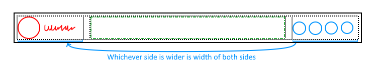
3 column layout where outer columns are the same width with middle taking up rest of space?

This is for a header, I have a logo and logotype on the left, buttons on the right, and I am planning to have a search box in the middle and I want it to be central which does mean that I need left and right to be the same width even though content on one side will have empty space I can use grid to make all columns the same width but I can't then specify that the middle column should be super wide. Also tried flexbox but that appears to be a dead end. My usual front end person is dealing with stuff so I can't ask her I've tried: - grid with 1fr auto 1fr and making the middle column try and be 100% - flexbox trying to see if I can make the flex basis the same for left and right - grid with 3 columns that are the same and trying to push middle to be wider Current solution: - Duplicate left and right so each side has a copy of both within the same grid cell, but on the left the right clone is opacity 0 and pointer-events none. They will have to grow to the largest https://codepen.io/skylarkx/pen/ZYGMzYE
No description
123 Replies
JustALittleHeat
JustALittleHeat3mo ago
Will the right side with buttons be dynamic and vary in how many buttons are on the right?
Skylark
SkylarkOP3mo ago
Depending on if a user is logged in or not, but I'm likely only going to have 3 buttons on the right and logo will be longer but at smaller widths the logotype may disappear I have considered hard coding widths for different screen widths and logged in/out, but I figured there might be a magic solution Another solution was to duplicate left and right on both sides but hide one and do pointer-events: none;
JustALittleHeat
JustALittleHeat3mo ago
Well with grid you can play around with the center column fr amount. You could say I the grid center column takes more fractions of the container. 1fr 4fr 1fr
Skylark
SkylarkOP3mo ago
That doesn't respect the widths of the content
JustALittleHeat
JustALittleHeat3mo ago
I have been working on similar problem. I did solve it. Let me look at my code
b1mind
b1mind3mo ago
Auto 1fr auto?
Skylark
SkylarkOP3mo ago
Left and right would be different widths
b1mind
b1mind3mo ago
You can set them on the child if you need
JustALittleHeat
JustALittleHeat3mo ago
Yeah I used grid and set them to as specific rem value. Nothing clever I guess. lol To avoid queries you could use clamp. A balanced column width feature would be nice
Rägnar O'ock
Rägnar O'ock3mo ago
have you tried grid-template-row: 1fr max-content 1fr; with a width: 100vw; on the center item ?
Skylark
SkylarkOP3mo ago
https://codepen.io/skylarkx/pen/ZYGMzYE this is what I've got so far trying to duplicate the contents but it's not happy with the text and I'm not sure why
Skylark
SkylarkOP3mo ago
I'll try that It overflows
Skylark
SkylarkOP3mo ago
No description
Skylark
SkylarkOP3mo ago
Also, grid doesn't like the text for some reason
JustALittleHeat
JustALittleHeat3mo ago
grid-template-columns 3fr 10fr 3fr;
Skylark
SkylarkOP3mo ago
But that doesn't respect the content width
JustALittleHeat
JustALittleHeat3mo ago
I am not sure what you are meaning by respecting the content width. If I put grid-template-columns 1fr 10fr 1fr; and then increase the button sizes from 2rem to 6rem. Both columns will grow to the same size that fits the button sizes.
JustALittleHeat
JustALittleHeat3mo ago
No description
Skylark
SkylarkOP3mo ago
Huh
Skylark
SkylarkOP3mo ago
https://codepen.io/skylarkx/pen/zxGJONK do you happen to know why the text is overflowing?
Skylark
SkylarkOP3mo ago
No description
Skylark
SkylarkOP3mo ago
This front end stuff is confusing
Rägnar O'ock
Rägnar O'ock3mo ago
do you really need the 2 side column to change width? can't you have a fixed width ?
Skylark
SkylarkOP3mo ago
Ideally yes, it should be less effort than using magic numbers
Rägnar O'ock
Rägnar O'ock3mo ago
not really... mixxing intrinsic sizing and extrinsic sizing in the same template is pretty hard to do with grid
Skylark
SkylarkOP3mo ago
But if it's as simple as just doing 1fr 20fr 1fr but making it respect the text I don't have to worry about updating the numbers
Rägnar O'ock
Rägnar O'ock3mo ago
I'm not even sure if what you are lookin for is actually doab;e
Skylark
SkylarkOP3mo ago
Also, red and blue aren't the same width in that
Rägnar O'ock
Rägnar O'ock3mo ago
I was thinking more about something like 200px 1fr 200px (or whatever the largest side column width is)
Skylark
SkylarkOP3mo ago
But I would like the middle to have all of the remaining space
Rägnar O'ock
Rägnar O'ock3mo ago
that would do it
b1mind
b1mind3mo ago
I don't get it xD
Skylark
SkylarkOP3mo ago
But the 200px may leave additional gaps
b1mind
b1mind3mo ago
ya you either set a width on both or on the children or respect the content to set width
Rägnar O'ock
Rägnar O'ock3mo ago
you would need to find the value that fits the space your button or icon uses like if the icon is 150px but the icons need 200px, you set 200px on both and you can set the button ocntainer width with a custom prop in JS/PHP depending on if the user is loggedin or not
Skylark
SkylarkOP3mo ago
I would like 3 columns, left and right should be the same width and be the widest content of the 2, if left is 176px and right is 155px then they're both 176px, with the centre being the remaining width My plan was to just duplicate left and right and place them in the same cells so they have to be the same width, it kinda works but grid doesn't seem to care about text https://codepen.io/skylarkx/pen/ZYGMzYE
Skylark
SkylarkOP3mo ago
I don't get why it's ignoring text
Rägnar O'ock
Rägnar O'ock3mo ago
it's actually ignoring the image 'cause images are wierd
Skylark
SkylarkOP3mo ago
Huh So I'll put that in a div and set the div size
b1mind
b1mind3mo ago
should have attrib with width/height xD
Skylark
SkylarkOP3mo ago
Ah
Skylark
SkylarkOP3mo ago
CSS is wild Thank you all, I'm about to eat but I may have further questions in a bit I hope what I was trying to achieve is now clear
Rägnar O'ock
Rägnar O'ock3mo ago
the fact that you duplicate the buttons will bite you with accessibility
Skylark
SkylarkOP3mo ago
It's aria-hidden But I can do more if needed I can use placeholders for the elements. I just want things to be automatic and not have to worry about changes
Rägnar O'ock
Rägnar O'ock3mo ago
you know the number of buttons in the template you use to generate your HTML, and you know their width and spacing. you should use that to compute the with (and I would assume the logo would not change size too much if at all)
JustALittleHeat
JustALittleHeat3mo ago
Cool glad you got a solution. I tend to wrap images in divs in flex and grid containers.
Rägnar O'ock
Rägnar O'ock3mo ago
that would be less error prone and more futur proof than duplication markup
Skylark
SkylarkOP3mo ago
I will consider it
b1mind
b1mind3mo ago
you still need the attributes on <img> Browsers will be wonky with intrinsic values for images also helps render them faster and change the values in CSS after same with svg (specially in grid)
JustALittleHeat
JustALittleHeat3mo ago
Another thing with images is I always set the width and height attributes to match the image aspect ratio. so if it is a square image width="1" height="1"
b1mind
b1mind3mo ago
I typically set them the actual size 😄 or if in a layout and I need that layout shift* to not break I'll put the size I need really just have something seems to help lol such a oddity imo
JustALittleHeat
JustALittleHeat3mo ago
Well I handle that in css with width 100% height auto. It will infer the reserved space. Also aspect ratio css for good measure
Skylark
SkylarkOP3mo ago
I so prefer the backend to avoid bodges like that :catSweat: I’m likely going to hand over this project to a friend once they’re available I just want to give them an idea of what I want for them to do it properly
Skylark
SkylarkOP3mo ago
Well, I am happy with it, although the effect is far less noticeable than I had originally thought
Rägnar O'ock
Rägnar O'ock3mo ago
if it's not noticeable it mean it works
Skylark
SkylarkOP3mo ago
At what point is there too much backdrop-filter blur? I'm probably going to change the cards to not use a gradient as it feels like a bit much https://codepen.io/skylarkx/pen/ZYGMzYE
Skylark
SkylarkOP3mo ago
(the website is for my shop on a Minecraft server as I'm stocking 614 chests and players need guidance, the money is of course not real)
Rägnar O'ock
Rägnar O'ock3mo ago
look alright
Skylark
SkylarkOP3mo ago
Before and after
No description
No description
Skylark
SkylarkOP3mo ago
(I am getting help from a friend now) It would be killer if there was CSS property which could define a length like get-height: card-height; and then elsewhere can do set-height: card-height; right now the full width cards have a fixed height but thinking about having a hidden square under it to get it to have the same height I doubt this would help with the header as otherwise it would depend on itself unless the get-width was the width prior to set-width so you can do get-width: left; set-width: max(left, right); and get-width: right; set-width: max(left, right);
Rägnar O'ock
Rägnar O'ock3mo ago
if you used a grid for the... well grid, you can just set the rows to be 1fr that way all the rows will be the same size no matter their content
Skylark
SkylarkOP3mo ago
Oh that's perfect, thank you
Skylark
SkylarkOP3mo ago
Skylark
SkylarkOP3mo ago
Is there a good way to cut off the last row on a grid? I don't care about how many items there are (it may be completely filled) but it would be nice to always have a filled grid. The row height is flexible so I can't just make the container shorter by a row and have overflow: hidden, I also thought that I could just shift the footer up to cover the last row but again I don't know by how much to shift it, I could have the footer be in the grid and set to the last row but that would still leave a gap. So the only option I can think of is have another container which is the same size as the parent with subgrid and then have a footer at the bottom which covers the last row, but that may be overcomplicated but I assume would work
No description
Rägnar O'ock
Rägnar O'ock3mo ago
No you can't
Skylark
SkylarkOP3mo ago
Ah
Rägnar O'ock
Rägnar O'ock3mo ago
You would need js for that
Skylark
SkylarkOP3mo ago
ty, thank you for saving me hours of trying
Kevin Powell
Kevin Powell3mo ago
Does the number of columns stay consistent?
Skylark
SkylarkOP3mo ago
No Now to go and find whoever I need to suggest :first-row :nth-row :nth-last-row :last-row and same for column
Kevin Powell
Kevin Powell3mo ago
There would be a way, but it's probably not worth it 😄
Skylark
SkylarkOP3mo ago
I can do it with JavaScript hiding the last however many tiles but it'd be nice if there was a CSS only option just .card:last-row {display:none} sorted
Kevin Powell
Kevin Powell3mo ago
but if you did that, would the row before it become the :last-row? 🤣 but yes, some pseudo-things for that would be nice
Skylark
SkylarkOP3mo ago
No, the cards on the last row still exist but are display none, same as if you do div:first-child {display:none}
Rägnar O'ock
Rägnar O'ock3mo ago
It will be possible with style queries someday, but no browser support the part you would need.
@container style(grid-row: -2 /-1) {
display: none
}
@container style(grid-row: -2 /-1) {
display: none
}
Skylark
SkylarkOP3mo ago
Ouh
Kevin Powell
Kevin Powell3mo ago
ah, yeah, i see what you mean. that would be cool
Skylark
SkylarkOP3mo ago
And style() accepts a computed style, not a defined style?
Rägnar O'ock
Rägnar O'ock3mo ago
More likely scale: 0; or visibility: none would be better because of the "is that the last row now?" As pointed by kevin
Kevin Powell
Kevin Powell3mo ago
I think tab atkins was talking about something like this when I saw him at css day last year...
Rägnar O'ock
Rägnar O'ock3mo ago
For now chromium only support and only for custom props (and IIRC it's behind a flag?)
Kevin Powell
Kevin Powell3mo ago
safari supports it too, its only ff that doesn't behind a flag in ff
Skylark
SkylarkOP3mo ago
I did catch Kevin's video about it today and it appears that it still needs to be defined, but with CSS variables it's not clear either way Not clear if you can extract grid-row: -2/-1 without it being set on the elements
Rägnar O'ock
Rägnar O'ock3mo ago
Nope I'm not even sure .getComputedStyles() would give it to you, especially if you use an implicit grid
Skylark
SkylarkOP3mo ago
Yeah
Rägnar O'ock
Rägnar O'ock3mo ago
'Cause that would not work in an implicit grid with a style query either BTW
Skylark
SkylarkOP3mo ago
Aha Ohhh it just clicked, yeah that’s tricky, there may end up needing to be an exception that a row or column selector is selected prior to display but that may be tricky
Kevin Powell
Kevin Powell3mo ago
I found a way that would work with CSS, but it would require covering basically every potential situation, in terms of number of elements, that it's definitely not worth exploring.
Skylark
SkylarkOP3mo ago
Ah, neat that it is possible
Skylark
SkylarkOP3mo ago
Doesn’t work on mobile so can’t take a look rn
Kevin Powell
Kevin Powell3mo ago
I'm in a crunch to make some videos, so I know what I'll be recording tomorrow 🤣
Skylark
SkylarkOP3mo ago
Oh that is cool It actually breaks for smaller widths, so I went back to my fix of sticking a square under the row Stylus doesn't support @container nor color-mix, I really should stop using it, I started because a friend used it and it looked so much quicker :catExhausted: SCSS apparently doesn't either
Kevin Powell
Kevin Powell3mo ago
preprocessors can't keep up with css anymore, lol. Sucks, because they still do have use cases, but it can definitely be annoying
Skylark
SkylarkOP3mo ago
Ah
Rägnar O'ock
Rägnar O'ock3mo ago
I feel like I know why it works but I can't understand how it works xD
Kevin Powell
Kevin Powell3mo ago
haha, yeah even as I was writing it I was having a hard time wrapping my head around what exactly I was doing 😄
Rägnar O'ock
Rägnar O'ock3mo ago
it's a case of : &:nth-child(an) : for containers with a multiple a of children :nth-last-child(-n + a + 1) : find the first element that has less than a - 1 following siblings ~ * : select all children after it I think...
Kevin Powell
Kevin Powell3mo ago
what
Rägnar O'ock
Rägnar O'ock3mo ago
sucks that you need the hard coded container queries on the with trinna decompose your weird selectors xD
Kevin Powell
Kevin Powell3mo ago
yeah, custom props/media/whatever would be nice there
Rägnar O'ock
Rägnar O'ock3mo ago
that's were being able to extract a computed style value would be nice xD tho I have no idea how you would even begin to write a syntax for extracting the number of columns in an implicit grid :/
Kevin Powell
Kevin Powell3mo ago
with the minmax, it's all very predictable, which is why I can hard code it.
Rägnar O'ock
Rägnar O'ock3mo ago
something like this maybe ?
--nb-col: style(grid-template-column: repeat(any, infer --nb-col));
Skylark
SkylarkOP3mo ago
The container queries check how many columns, and then the selector finds the last of the row above and then selects all siblings after
Rägnar O'ock
Rägnar O'ock3mo ago
yeah but that only works if all the columns are the same width
Kevin Powell
Kevin Powell3mo ago
yeah... though as long as you're using repeat() I feel like you could do it, but if you were repeating different sizes, it's just more complex.
Rägnar O'ock
Rägnar O'ock3mo ago
the cq only checks the container width, the number of columns is infered from that because math
Skylark
SkylarkOP3mo ago
Yeah, but because of the values, they select for the number of columns
Rägnar O'ock
Rägnar O'ock3mo ago
BTW @Kevin Powell you might want to add a warning about the viewport being too wide for the example to work, I was trying to understand why nothing worked at first cause the preview defaulted to just above your last queried size
Kevin Powell
Kevin Powell3mo ago
I'll clean it up 👍
Skylark
SkylarkOP3mo ago
https://codepen.io/skylarkx/pen/ZYGMzYE thank you, it's perfect, and it can be tweaked to work with some of the wide tiles I've got (just changing nth-child to nth-of-type and then making the types different)
Kevin Powell
Kevin Powell3mo ago
cleaned it up, commented it up, and added a part that breaks down the selectors a little to try and explain what's happening
Rägnar O'ock
Rägnar O'ock3mo ago
missing the article link for <!-- thanks to this article by Keith Clark setting me down the right path --> xD
Kevin Powell
Kevin Powell3mo ago
haha, oops added, thanks. Also made a version looking at getting columns, but it's so much easier 😄 (also linked in the codepen) his article is only 13 years old 😄
Rägnar O'ock
Rägnar O'ock3mo ago
I forgot you can't use custom props in container queries :/ this no worky
/* 600px -> 800px wide (plus the associated gaps) === 4 columns */
@container (calc(4 * var(--min-width) + 3 * var(--gap)) <= width < calc(5 * var(--min-width) + 4 * var(--gap)))
/* 600px -> 800px wide (plus the associated gaps) === 4 columns */
@container (calc(4 * var(--min-width) + 3 * var(--gap)) <= width < calc(5 * var(--min-width) + 4 * var(--gap)))
Kevin Powell
Kevin Powell3mo ago
I really wish you could.
Rägnar O'ock
Rägnar O'ock3mo ago
and we still don't have a child-count() do we ? would have made all that way """easier"""
Kevin Powell
Kevin Powell3mo ago
we have sibling-count() (in Canary) I'm guessing you could do something with :has() to pass it to the parent actually, I'm not sure we could 🤔 if we have sibling-count() i dont know why we can't have child-count() though
Chris Bolson
Chris Bolson3mo ago
I have been following this thread with interest. Using style queries has been mentioned and, as I needed an excuse to practice using them following your (Kevins) previous video , I wanted to have a go to achieve a similar result. Of course, style queries (currently) require custom properties so I had to define a custom property to define the number of columns for each breakpoint. I know that the original doesn't use breakpoints as such but the end result is very similar. https://codepen.io/cbolson/pen/xbGyONy
Kevin Powell
Kevin Powell3mo ago
so, sibling-index() and sibling-count() would work... as long as you know calculus, anyway - https://codepen.io/t_afif/pen/QwbZKPB oh, he's also using an if() in there to then apply the style... (which means latest version of chromium only)

Did you find this page helpful?