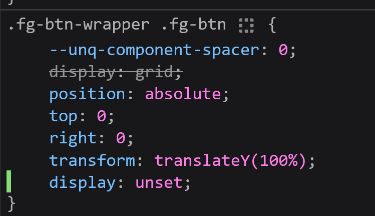
`position: absolute` issue
Hey guys! Having a really weird position absolute issue. Parent
.fg-btn-wrapper
has position: relative
on it. Child .fg-btn
has position: absolute
on it with top: 0, right: 0
. Instead of it being to the right of the container inside of it, it's outside of it to the left.
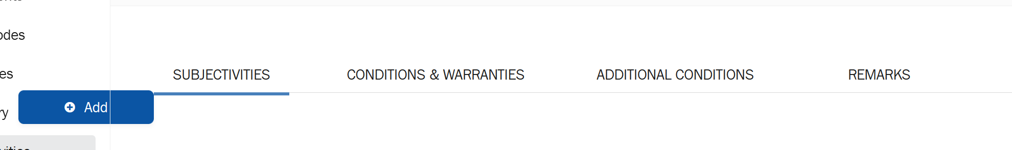
This is unfortunately behind authentication so I can't show a live link but I have no idea why it's doing this. Just looking for ideas
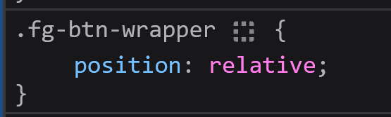

53 Replies
Ohhh works on Chrome but not Firefox... what
why the
transform
?So it goes underneath the tab panel, but toggling that doesn't affect it
that 100% is based off the element size, not the container
so it'll break when you add more items
you want
top:100%
as for the horizontal issue hard to say without seeing more code/domIt's a bit hacky but what we want is for the button to go underneath the tabs - I'd place it like that in the DOM but that would require us to put it on every tab panel (and this is added via a CMS not HTML so it's tricky to do that, hence positioning it) -- the transform works correctly but not the position
On Chrome it works as expected

what's working as expected?
That the button is positioned to the right of the container and inside of it
oh i assumed this was some kind of dropdown my bad
without context, it's just bad assumptions
On Firefox it's outside of its container and to the left

whatever your container is presumably has 0 width in firefox
hence why right:0 is aligning it to the left
No worries, hard to show without a live example 😄
i bet it is a float
yeah could be something like that
floats without a clear cause this issue
Hmm let me see thank you for the idea guys 🙂
i'd remove every bit of styling you can and just add your button as a child of a div right below the tab bar with
position:relative
and nothing elseUnfortunately not that easy when we're building enterprise web applications via a CMS 😂
not easy at all
But it's a good shout, all the styling there is default styling.
It seems in Firefox when I untick the default
display
, it'll snap into place correctlyythe
display:unset
?Even though the default display is
inherit
i have no idea why that is there
the default of a div is
block
Sorry no, this:

it's there to override the grid
angular?
I've tried manually setting
display
which is why you see display: unset
I think that's what it's built on under the hood yea, but the way we add elements is all done via the CMS and everything is wired by someone else
So that 'Add' button has all this logic wired to it and I don't know how to move it around
Otherwise I'd move it inside each tab panel and be done with it rather than absoluting ithow about grid?
you can set a grid like auto 1fr, with 1fr auto for the rows
I tried that too - it seems whenever I untick the
.form-field-type-field-group
display it'll snap into place correctly but not if I set it manually 🙁
Oh you mean make the whole container a grid?yes
or just the 2nd row
Hmmm maybe if I have no other options haha
I'd have to make the whole container a grid and there's a lot of elements inside of it
do you have control of the whole div that the button is in, that whole row i mean with the whitespace to the left of it
The 'Add' button?
Oh I see
https://cdn.discordapp.com/attachments/1385707399028932628/1385712242749608068/image.png?ex=68571097&is=6855bf17&hm=bb45ec057d39d33e67ddf4baf96c20f43aba8c125aa65d17f949eddd17cc038f& where the add button is an all the space to the left
Yea the button is what I'm position: absoluting so it's not really so much in a div just absolute-d
It's not like it's in a div itself and I can
display: grid, place-items: end
yeah but then why isn't this just
am i missing something
It's hard to show without a live page haha
so then you dont control the area it sounds like to me, thats why im a bit confused
if you could write a really short bit of dom markup with the relevent nodes it might help
Okay I see what you're saying. So this is how it is by default:

oooh so your thing is ABOVE the toolbar
and youre manually forcing it down below
But the issue is this:

Yes!
I tried placing the button in between in the CMS but it doesn't work 🙁
so wait, you can put it between?
I tried it but let me try it again
as in
<tabs><your thing><textarea>
?Okay thank you a ton guys for walking through this with me
So I tried placing it in between before but it wasn't working, I decided to try it inside the tab panel and it works
I thought it was going to be a lot harder, but I think I can just duplicate the button for each tab
whatever works lol
so you want an add button for each tab?
and by that do you mean it just shows 1 button for each tab when you change between tabs
😂 yea I think that'll be easiest, yea it'll just have the same 'Add' button for each tab
It just adds a row to the table
oh right that big blocked out area is a table
i assumed it was just a text area
Nah sorry I'd post it but it's got sensitive data 😨
It's a dashboard for an insurance company
yeah i get it just didnt realise at first lol
oof my condolences...
make sure you get some insurance for when you want to hurt yourself after working in insurance
fr 😭