Same code but different results??

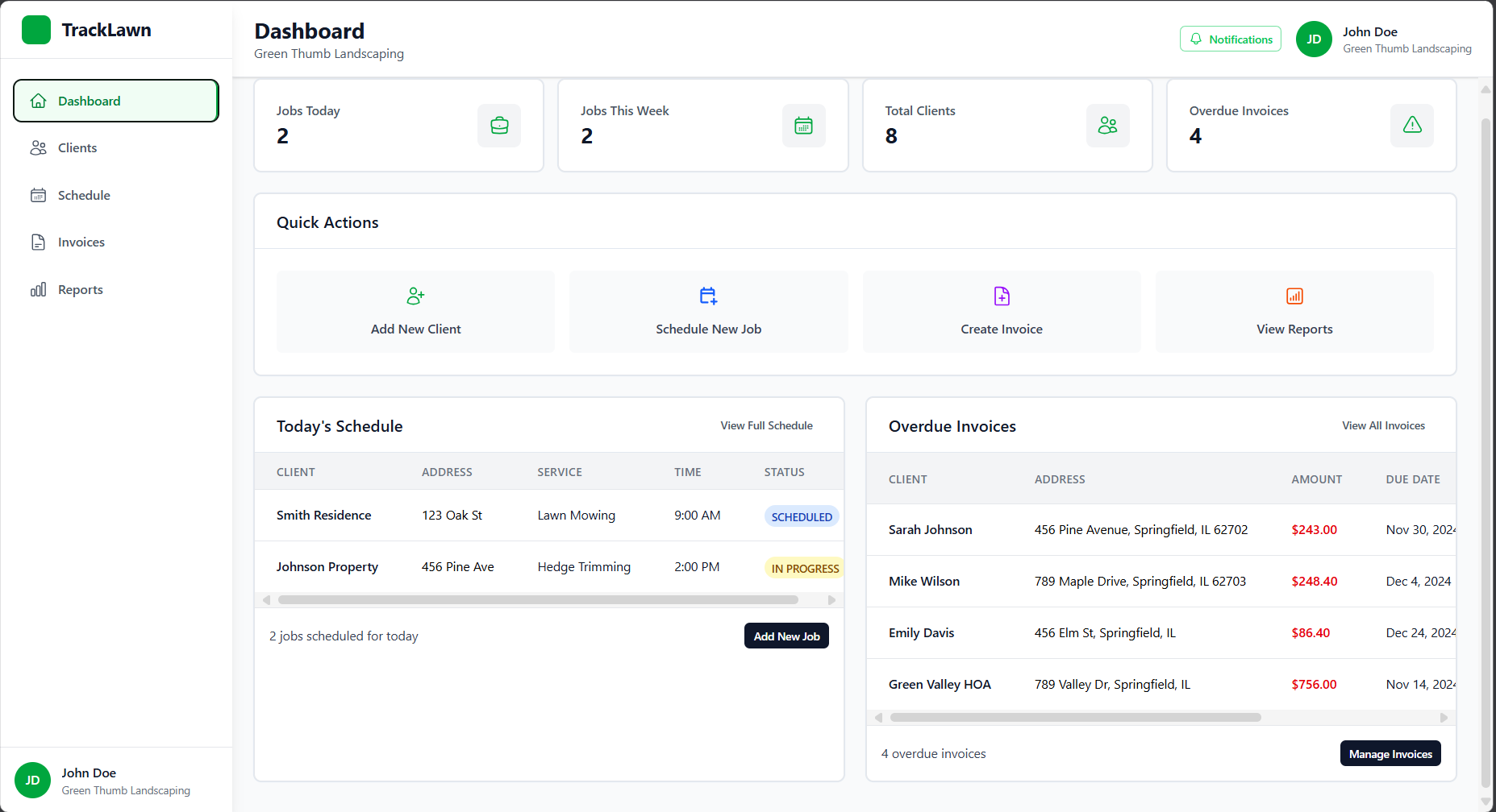
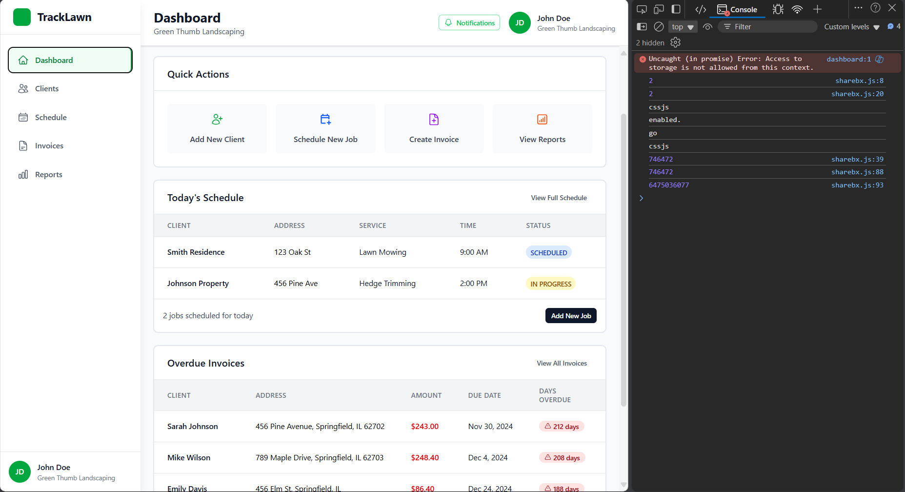
Im building a dashboard (responsive) and in the main dashboard page, the TodaysSchedule and OverdueInvoices are responsive (when sized down they go to new lines and the contained content is scrollable), heres what I mean: 
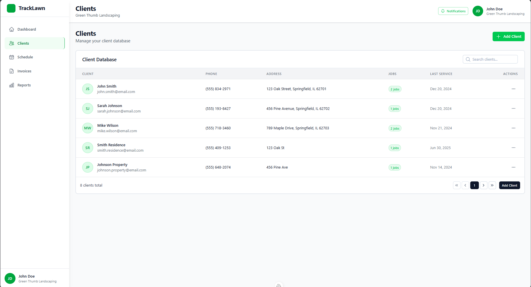
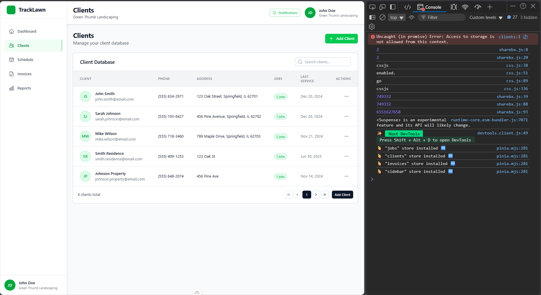
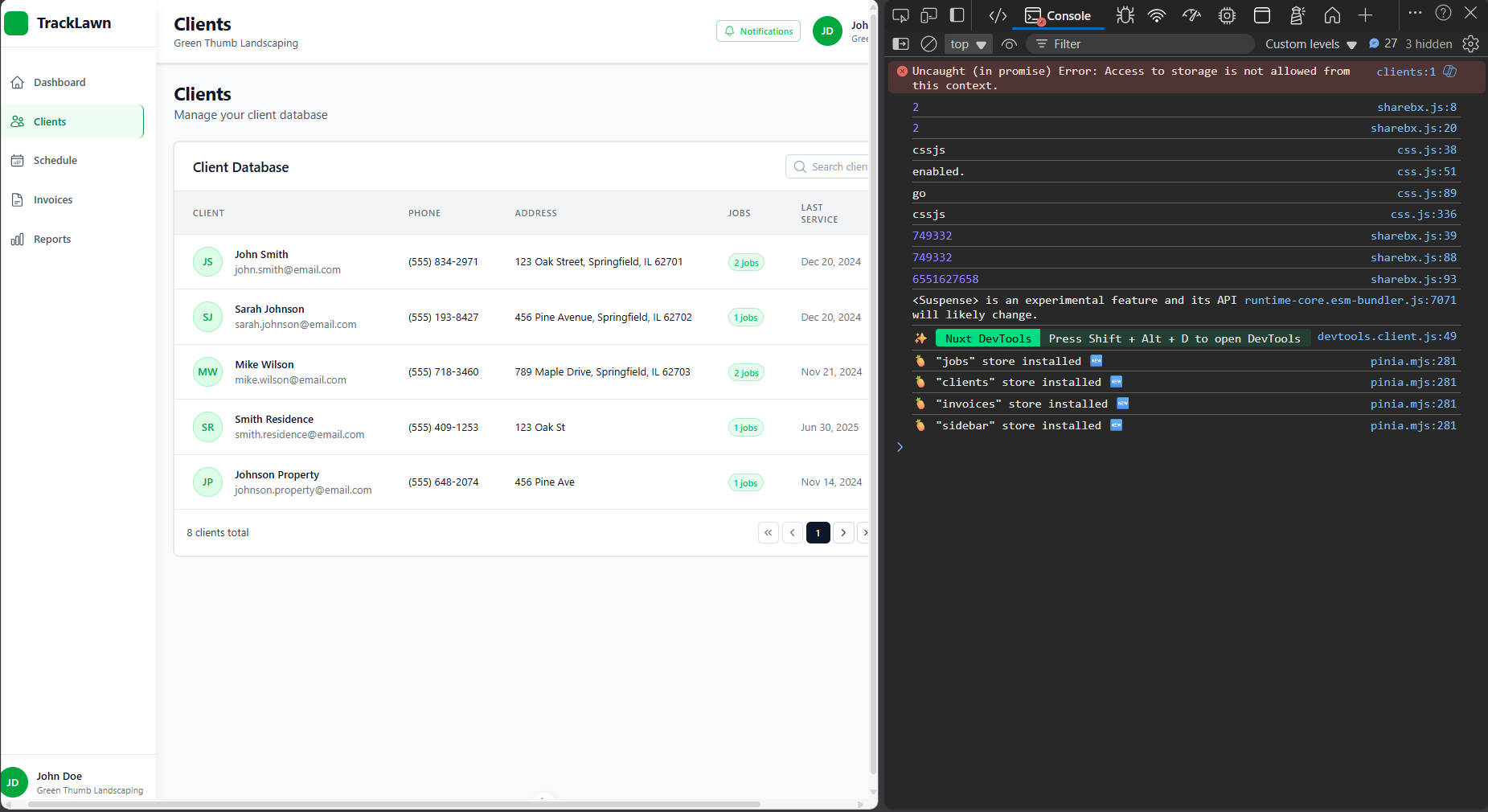
But in the Clients page, I also have a table and the issue is that on a smaller screen (it works on md, this is whatim trying to achieveon a smaller device), the whole table components goes off the device width and is not making the content scrollable, can someone please help:
No description
No description
No description
No description
No description
7 Replies
Kevin Powell
Kevin Powell•2mo ago
How are they becoming scrollable now? without knowing how it's currently being done, it's pretty hard to say why it might not be working in different situations 🙂
Yung PP
Yung PPOP•2mo ago
sure, let me show you what the code looks like real quick so I have a layout and this is what it looks like:
<template>
<div class="min-h-screen bg-gray-50">
<DashboardMobileHeader />

<div class="flex h-screen lg:h-screen">
<DashboardSidebar />

<div class="flex-1 flex flex-col min-h-0 lg:ml-0">
<DashboardDesktopHeader />

<div class="flex-1 overflow-y-auto p-4 lg:p-6">
<slot></slot> // main dashboard content goes
</div>

</div>
</div>

</div>
</template>
heres the main dashboard page:
<template>
<div class="space-y-6 pb-3">
<DashboardStats />
<DashboardQuickActions />

<div class="grid grid-cols-1 gap-6 xl:grid-cols-2">
<DashboardTodaysSchedule />
<DashboardOverdueInvoices />
</div>

</div>
</template>
<template>
<div class="space-y-6 pb-3">
<DashboardStats />
<DashboardQuickActions />

<div class="grid grid-cols-1 gap-6 xl:grid-cols-2">
<DashboardTodaysSchedule />
<DashboardOverdueInvoices />
</div>

</div>
</template>
and here are the code for the DashboardTodaysSchedule and DashboardOverdueInvoices: this is what they mainly look like, just somedifference in the actual content
<template>
<!-- This UCard is the main container for the table -->
<UCard class="bg-white border border-gray-200" :ui="{'body': 'p-0 sm:p-0', 'root': 'p-0 sm:p-0'}">
<!-- The header (search and add client section -->
<Header ....></Header>

<!-- actual table -->
<div v-else class="overflow-hidden">
<div class="overflow-x-auto">
<table class="min-w-full divide-y divide-gray-200">
</table>
</div>
</div>
</UCard>
</template>
and heres my code for the clients page (it uses the dashboard layout the first code block i snet):
<template>
<div class="space-y-6 pb-3 max-w-full">
<DashboardClientsHeader />
<DashboardClientsTable />

<DashboardClientsModal />
</div>
</template>
<template>
<div class="space-y-6 pb-3 max-w-full">
<DashboardClientsHeader />
<DashboardClientsTable />

<DashboardClientsModal />
</div>
</template>
the DashboardClientsTable is whats causing the issue (i think, maybeit could be the formatting of the parent elements) but the DashboardClientsTable is really similar to these but it still goes off of the device screen on smaller devices instead of the container element taking up around 90% of the width and table inside being horizontallyscrollable please help, ive been stuck on this for ages im happy to give the full code if needed
Kevin Powell
Kevin Powell•2mo ago
not a ton to go on, but my initial thought is the schedule and overdue invoices are inside the grid with 2 columns... the table has the overflow-x-auto on it. The grid is controling the size, and then they are fitting in the available space. When it's by itself, there is nothing to limit the size of it? If I understand ,its's just living in this area: (??)
<div class="flex-1 overflow-y-auto p-4 lg:p-6">
<slot></slot> // main dashboard content goes
</div>
<div class="flex-1 overflow-y-auto p-4 lg:p-6">
<slot></slot> // main dashboard content goes
</div>
Like, this is a very simplified example, but even though my table has an overflow-y: scroll on it, it never overflows, it's the parent that does. https://codepen.io/kevinpowell/pen/KwpLwGK/2e6d48a609a7035bb25ede5123e904d3 This is just me guessing right now though.
Kevin
CodePen
Untitled
...
Yung PP
Yung PPOP•2mo ago
havent tried it yet cuz im afk but you actually responding and taking time out of your schedule to help me out really touched me bro no homo legend, subcribingto u on myother accs oncei get back ill try it out and let u know
Yung PP
Yung PPOP•2mo ago
yup its working now!
No description
Yung PP
Yung PPOP•2mo ago
i added grid to the parent container of the table do you know why this happened?
Kevin Powell
Kevin Powell•2mo ago
Flex children will shrink to as small as they can get, and then the parent sees that as it's minimum size, so it overflows, rather than the child overflowing. With grid, the cells define the size the children have, so it's much easier to "invoke" overflow of the children.

Did you find this page helpful?