Font Scale(s) Input
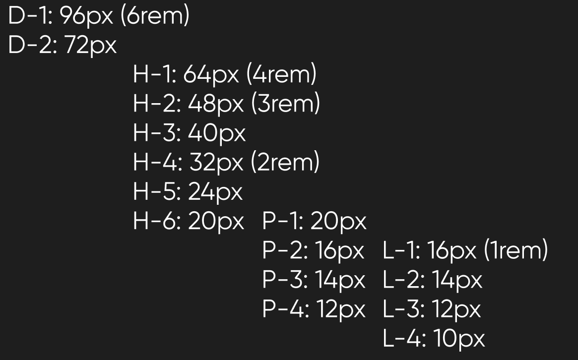
Simply put, do you guys think my font scale is good to abide by? Going from Display (which will never be used on the web), headings (h1-6), paragraphs, and then labels. I really like even numbers, and roughly based it on the Major Third with some rounding. But please, if there is a better way or something I'm missing point it out (I'm not sure if there's an exact science to this).

5 Replies
So…why did you make this scale? What part of the defaults don't you like? What didn't work for you?
Arbitrary sizing is bad. So if you just made it up then I think it's awful and shouldn't be used. All changes should be made with purpose. So I ask: what's the purpose of this?
Also, why are there 4 paragraph sizes? All paragraphs should be the same, since they're of the same importance.
And what's L1–L4? Why are there so many?
Oops, sorry, this is for a branding style guide that will primarily be used on the web and for other items. I have yet to use any of it in any capacity, so I don't have any "defaults" or any application where I could provide feedback on.
Regarding the multiple sizes, I've noticed that a few branding style guides include them (both paragraphs and labels "L"), unless I've misunderstood their purpose (which could be for mobile breakpoints, then).
In terms of purpose, I want something I can generally follow that allows me to establish a clear hierarchy of font scaling, so I can convey the meaning and emphasis of the text. I've seen some people use constants for this, or more widely, the musical ratio-based approach (e.g., Major Third).
And you got me thinking about the sizings. If I want this clear purpose and elements that actually stand out, when am I going to ever use an H6? Do any known websites even use them? Should I go more on a t-shirt-sized system with:
I guess what I'm asking is, what's a good system for creating my font scale? Do I look at the generators online and just try to find one that I like? Major Thirds seems to be a good fit, neither too big nor too small. Maybe use a constant? How do I make my system not arbitrary, and serve a purpose of distinguishing text in a manner to any user?
Bit of brand background: The brand is my personal own, where a common theme is circles, space, openness, and a somewhat modern approach to it. I want to expand, but I want to do it in a manner that is clear and has guidelines, which is why I started to make this brand style guide to put my thoughts into more structured forms.
i can't see any use for anything bigger than the "h3" that you have there, as everything else will be just way too huge
but whatever you do, DO NOT use pixels for the font size
I guess what I'm asking is, what's a good system for creating my font scale? Do I look at the generators online and just try to find one that I like? Major Thirds seems to be a good fit, neither too big nor too small.No. Don't do that. Just because it works for music doesn't mean it works for visual font sizing. Most of the generators out there just pick random shit and say, "hey this is good!" and other, non-designers, look and say, "sure, why not! I don't know any better!" Then it just grows and grows. As far as font size defaults on the web, this is what the major browsers use (and lots of smart people were behind them, so it's a great starting point): As I mentioned above, you need to be purposeful in your decisions and make them with good reasons in mind. "A major third sounds nice" is, honestly, a really bad reason. More like a lack of reason. Here are some blog articles by a long-time UI designer that might be illuminating for you: * Why Beginning Designers Don't Need to Learn Grids, Type Scales, or Color Theory (and other “Designer Dogma”) * Font Sizes in UI Design: The Complete Guide
Yep. I've been watching videos about that, so I'll be sticking to EM and REM. Figma just uses pixels natively so that's why they're in pixels there, and I haven't done much in the sizing yet.