Looking for UI help, tips, or advice
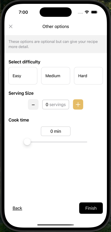
I am working on a recipe app and i have this page as one of the create options. I feel like this page isn't as clean as it could be, any advice appreciated!

45 Replies
the design is not very human
easy, medium and hard is what many websites use, usually
but, what's hard for you can be super easy for me
what even is a serving? a scoop? a small plate? a bite? a tray?
the cooking time shouldn't have a top limit
and should be input as hours and minutes
a slide to input time is like those meme ui to put phone numbers
here's what i would do:
- scale of 1-5 for home cooks and for cooks
- allow setting an option to do not recommend something for home cooks (like deep-frying a turkey or other dangerous foods)
- the scale can have "easy", "medium" and "hard" as labels
- yes, it is arbitrary, but a bit less
- replace servings with the range of people that it can serve
- the time needs to allow hours and minutes to be set, without the slider
okay thank you so much, this is really helpful
@ἔρως what would you suggest the UI component look like for setting the time? Would you suggest just the apple clock one for the style of it.
https://developer.mozilla.org/en-US/docs/Web/HTML/Reference/Elements/input/time <-- this is a decent start
it works amazing on mobile, it works like ass on desktop
i doubt you will have anything that takes more than 1 day to make, so, that should be enough
but if you want to input more than 23h59m, you might need something super custom
or check if there's something else that does it for you
Honestly while nothing super special, this is passable. As a v1 it's very solid. Of course I don't know all the context and details here but on a first glance this is fine. No need to hyperpolish at this stage. The only thing that sticks out to me is the wording "these options are optional"
In fact it's helpful to not overinvest a lot of time in the visual microdetailing because you may just waste time if the feature ends up getting cut or changed
true, but the ui isnt fit for the purpose, in my opinion
in terms of style and everything, this is fine
but the slider for minutes is ... unergonomic, frustrating and diabolical, specially if it doesnt span to whole minutes
serving sizes are what you find on boxes of ingredients or meals, not on a recipe
on a recipe, you find how many people it feeds - a maximum and a minimum
the dificulty is fine, but can be better
I'm not sure if they're asking for feedback on that though
probably, but it is needed feedback
in terms of style, it needs a tiny tiny bit of work, but not a whole lot - if any at all
maybe the banner needs more contrast because i didnt notice it at all
I don't know what the problem with servings is. "Serves 3 people" sounds reasonable. The slider also seems fine if the min and max ranges are sensible and as long as the number input is editable
the terminology and it is a single number
a serving is different than how many people can be served
Call it portions then
okay, how much is a portion?
a meal that fills you, like a restaurant portion size
nobody eats a pudding or a cake as a meal
the portion sizes are smaller in those cases
I really don't see what the problem is here
If you're putting a cake up there you just adjust with how many average pieces of cake the recipe produces
until a barbaric soul cuts it in 5 slices 🤣
but the problem is the term itself, and the input
That's not your concern. It's not about a precise amount. It's about getting a feeling of how many people this feeds
There's a difference between a meal that serves 8 vs one that serves 2
yes, and portions is not a good way, because it isnt a useful amount anyways
something for 2-4 people can have 2 portions or 20 portions
Could add a second enum dropdown to choose what type of serving
then you have to fill in every single type of serving
There are extreme cases where that might be more helpful like showing "20 pieces" for a cookie recipe vs "1 pizza"
now, that is a good argument
have an option to pick people or portions
i can see that
It'd certainly help with some non-meal recipes like cookies or drinks
yes, it would
and number of people helps with dishes like soup, pasta stuff, rice stuff, something grilled and so on
One thing i am wondering is how to reset the values to be unset. Since these are all optional, I assume that if you dont change a value, it will be excluded on the page itself. But once you touch it, how can it be reset again?
To me it sounds reasonable to make them required but hey it's not my design
well, i would argue that the number of people/portions and cooking time shouldnt be optional
that is one of the deciding factors on picking something to do
a meal for 2-4 that takes 30 minutes is more enticing than one that takes 2 hours
The Easy Medium Hard options are also a bit arbitrary. there's no scale for what they actually mean. Would be good to give creators some indicators as to which difficulty to choose. Perhaps better wording like "Complex" or "Involved" or "Intricate" for hard could be more self-explainatory
and as ive explained, an option for something you do not recommend an home cook to do
like deep frying a turkey ... yes, people do that
Call it nightmare difficulty lol
lol that would work
the doom recipe app
or "professionals only"
"Expert"
"seasoned expert" or else it will be bland
good pun
thank you, my brian woke up just for that
I tend to just ignore copy when judging ui design because usually other non-ui departments have some strong feelings about it and it's always interwoven with story, but that is probably a very gamedev mindset
what do you mean?
Directors always have strong feelings about the wording of things. UI doesn't always have control over it
yeah, but directors arent the ones with the knowledge, more often than not...
So when i'm implementing some design i dont really look at the wording
Well depends
I do request changes but i don't know the entire story context
i look at the wording because words have special meanings and/or lack of it
It looked more like temp text to me anyway so i didn't look too deep into it
i did, because this is the point where you need to catch the errors, before it is developed
it's easier to change plans than to change and re-deploy code
my rule of thumb is: if it isnt lorem ipsum, it's intentional
and that is review worthy
that's why i picked on the "portion" wording, as a portion is an unknown part of something unknown
the number of people is less unknown: an average person would be satisfied with this, but quantity variations, kids and all that then we throw a fudge factor there and kablamo! a number of people comes out of it
more magical, more useful in certain contexts
but fewer unknowns
Thank you both for the comments, Im going to take everything you guys said into consideration. Im still working on the wording of stuff and ill look into how difficulty and serving size should be implemented. However, as they are optional additional options a user can select, if a serving size of 2 doesn't quite make sense for a recipe a user can just ignore it. At least that is my thought process behind this feature
Just for the UI though, I did make some changes and would like to get maybe some opinions on the new design. It now has buttons that opens a little sheet to select the options. For selecting the time I agree that it was a weird design choice to make it a slider so Ive made it along with the other options a picker. I also paired it with the description section of creating a recipe. Again any feedback is appreciated @StefanH @ἔρως


i think it is an interesting concept, and looks a lot better
however, the serving size option doesn't make sense
that's like picking the spoon size, literally