Css problem on a FEM Challenge
Hello,
I m trying to solve another FEM challenge
And again im stuck.
I have now this : https://roelofwobben.github.io/recipe_page/
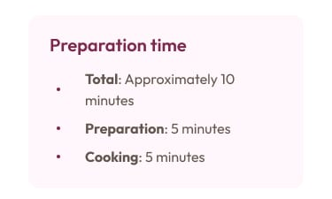
but I cannot make the preperation time like this :
Can anyone help me figure this out
15 Replies
Give the parent element a max width (based on your image, I suspect that it doesn't really need this), an inline margin of "auto" and some rounded corners.
Then replace the <dl> with <ul> as that is clearly what the design requires - as I mentioned in your previous post about the same issue, you have complicated this for yourself by using the wrong element.
<dl> is the wrong element semantically speaking
chips, then Ragnar has pointed me to the wrong direction
So with the ul and li I can make the text as the picture says it schould be
yes
but you may need some touches
to center it like that, you likely will need to use an inline grid
o, I thought I could be done with flex and
justify-content
yeah, you might be able to pull it off
i was wrong here: it needs to be grid, not inline
oke
And it still need to be a ul and li ?
yeah, to be semantically correct
oke, some work to do
and this is a beginners one 😢
that is something a novice should be able to do after some time
oke, but it does not give me the confidence I need
changed it to this :
but now I see this:

that's the correct output
Why break them into 2 <li> elements? That defeats the purpose.
Once again, I feel that you are over complicating things.
I would go with something like this:
In the CSS, remove the default list-style (as the bullet point has to remain vertically centered) and add it as a
::before
pseudo element on the <li>
Add the ":" as an ::after
pseudo element on the <strong>oke, work to do