font is going up !! very frustrating.
we're using gotham and fraunces font, but on some components like buttons the text goes little up without any reason, developer is using tailwind css, when he does leading 0.8 or 0.9 then it doesn't work what might be the issue ?
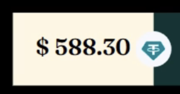

36 Replies
what do you mean "going up"?
don't you think it is little bit up and not aligned
Yea but there can be a ton of reasons for this; we'd have to see the live site
How are you/the developer centering and positioning the elements within the button?
is it aligned at the baseline?
let me share the code for that same container, in the morning
Please share a live link if possible
Fonts have extra empty space around them for things like accents and decenders. If you select the text, you'll see that extra spacing.
You probably want text-box-trim, but it is fairly new, so browser support isn't perfect
https://developer.mozilla.org/en-US/docs/Web/CSS/text-box-trim
MDN Web Docs
text-box-trim - CSS | MDN
The text-box-trim CSS property specifies which of the over and under edges of text content to trim from a text element's block container.
If you know your content and font will always be like this you can hack it with
translate: 0.1rem
or something. Ugly but sometimes you just gotta do what you gotta do. We have a similar case at work with a broken font and just have to hack it a lot :/Have you tried messing with the line-height? Or using negative margins?
but why do we have to do this much effort just to center the text ?
kevin explained it
your text only has numbers but other text might have characters like gjyqp... which have little bits on the bottom
the text aligns for that whole region to be aligned
you can probably play with
vertical-align
a bit but in my experience that also doesn't work 100% of the time
You have to differenciate between "actual / mathematical" alignment and "optical / perceived" alignment quite a bit. I know it's annoying but i hope you understand why the default is the way it is. It's optimized for the common case scenario. Aligning text like that is an edge case so we need to write edge case code for it
finally i got this from the developer
guys tell me what's the issue ?
tailwind
also, set the line height to 1
i just hate coding at this point
tried that
it's not there
also, try 0 too
your developer stinks ngl
why are they using tailwind but then hardcoding the values 😭
if it is hardcoded everywhere, it's bad bad bad bad bad
already did
so he should use tailwind properties
tailwind has configurations somewhere
he should use that
what is that exactly so i can tell him
also which is good tailwind or something else ?
and for the casino what tech stack should be used entirely ?
do you use react?
i think they're using next
then yes, but not directly
so, maybe tailwind is the choice
okay
..
you're asking a question nobody can answer for you
check with your local government to see if there's any restrictions
and all laws and regulations you have to implement
then decide on what tech stack to use
the whole project is completed almost
i'm just asking for my own knowledge
just want to know if they're doing it right or not
i can't see why it wouldn't be the right choice, as long as you follow all the laws and regulations
so why the button is doing like that ?
why the text goes up
it may be a rendering bug or is because of the missing the line-height set to 0 or 1
without a live example, it's like asking why pixie dust doesnt sparkle
Try setting line height to 0. If it doesn’t collapse check the computed tab and see what
display
value is.that's what ive been saying
either 1 or 0
Sorry didn’t mean to repeat — the thread was so long I didn’t read and I just had this issue on a website where the display was set to inline by a third party library and I couldn’t figure out why until I inspected .
no no, please, repeat it
ive said that multiple times, but all i saw was code that doesnt have it and screenshots of the issue
repeating it is good