Complex section

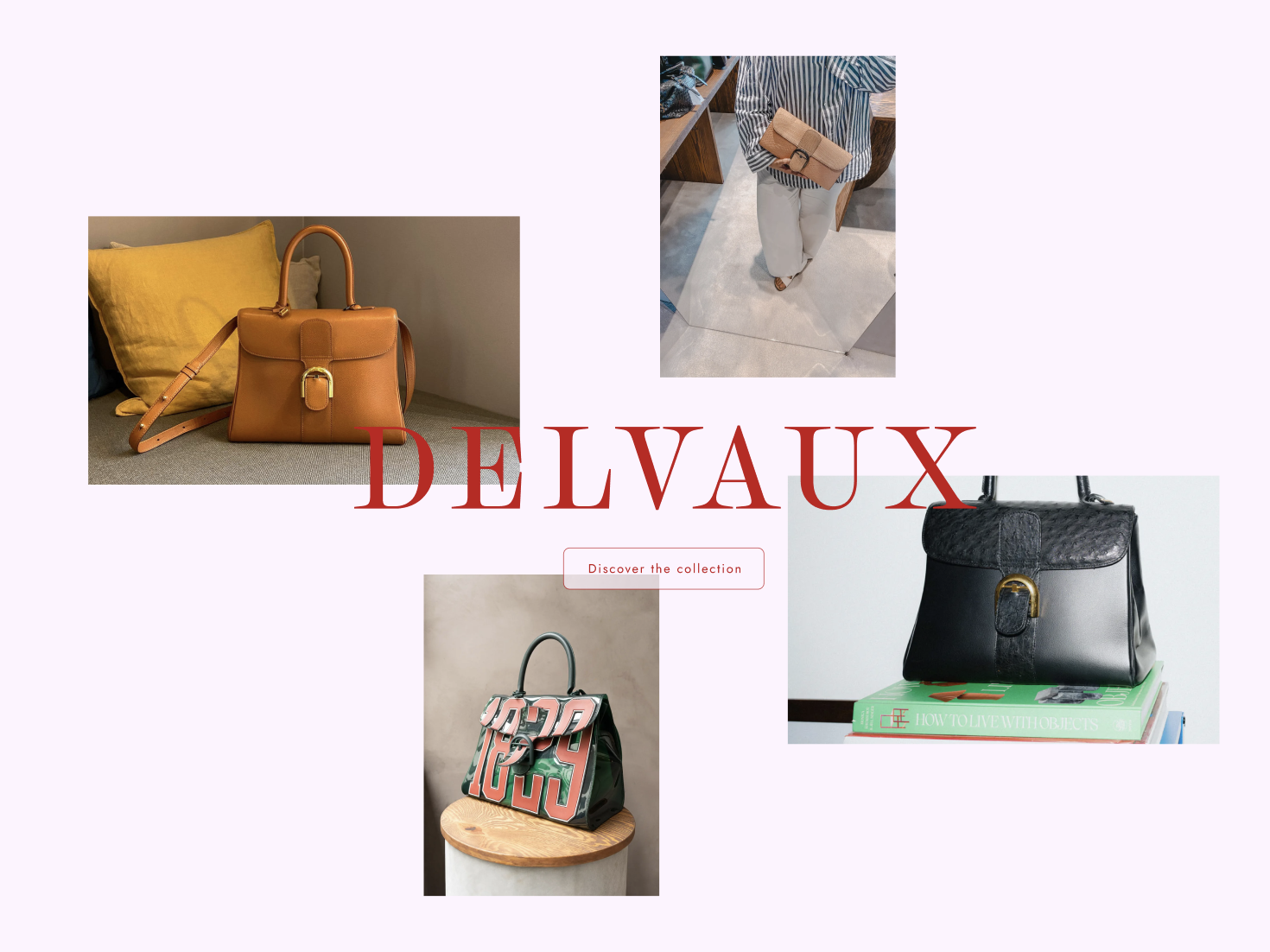
I have no real clue how to start doing this section nor do I know how to properly make this responsive that it also look good. (I did not made this design, this is a design I got from school and have to follow)
No description
28 Replies
MarkBoots
MarkBoots4w ago
i see a 2x2 grid with the images place-self: - end start - start start - end end - start end you can layer the text and images with a grid as well (same grid area) with a media query you can make it a single column for the images (or what ever you like)
Kingpin
KingpinOP4w ago
Hmmm. I think I will have the text layer positioned absolute over the images then a flexbox. This will give me freedom for each layer seperate I think.
b1mind
b1mind4w ago
grid for layers + alignment is ❤️
Kingpin
KingpinOP3w ago
I am just seeing this, will this allow me to basically have 2 different layers that act seperately?
Rägnar O'ock
Rägnar O'ock3w ago
you could do it with a grid like this one (dimensions aren't exact 'cause I'm lazy) :
css
.grid{
grid:
". . . img1 img1 . " 1fr
"img2 img2 . img1 img1 . " 1fr
"img2 img2 . . . . " 1fr
". . . . img4 img4" 1fr
". img3 img3 . img4 img4" 1fr
". img3 img3 . . . " 1fr
/ 3fr 1fr 1fr 1fr 1fr 3fr;
}
css
.grid{
grid:
". . . img1 img1 . " 1fr
"img2 img2 . img1 img1 . " 1fr
"img2 img2 . . . . " 1fr
". . . . img4 img4" 1fr
". img3 img3 . img4 img4" 1fr
". img3 img3 . . . " 1fr
/ 3fr 1fr 1fr 1fr 1fr 3fr;
}
b1mind
b1mind3w ago
I mean that is more complex than probably need but I approve Yes you can use absolute or just give them all the same space, isolate is a great feature too so then you have a clean stack.
Kingpin
KingpinOP3w ago
wait isolate?
b1mind
b1mind3w ago
Here is a simple example of just using one area you can also do like > * { grid-area: 1 / -1;} or something Or like ragnar did be very specific
Kingpin
KingpinOP3w ago
ah it's a grid thing?
b1mind
b1mind3w ago
yes isolate helps with z-index mostly but can be handy if you are in a project no isolate is not a grid thing https://developer.mozilla.org/en-US/docs/Web/CSS/isolation I always enjoy ragnars short hand grid and use of areas heh ❤️
b1mind
b1mind3w ago
another quick example.. I have some more but they seem more confusing than helpful atm LOL these are the simplest
Kingpin
KingpinOP3w ago
ah but it do anyting with positions? the isolation?
b1mind
b1mind3w ago
Yes isolation works for keeping stacking context to that parent Its not needed in this case persay just good to have in the pocket
Kingpin
KingpinOP3w ago
I have got something to work, I am just using position absolute since both "layers" have to stay at width 100% anways. and then for the images themselves prolly gonna do grid.
No description
Kingpin
KingpinOP3w ago
almost there
No description
Kingpin
KingpinOP3w ago
this is my html
No description
Kingpin
KingpinOP3w ago
woahh
No description
Kingpin
KingpinOP3w ago
aight, this is as close I can get thx a lot for the help.
No description
Kingpin
KingpinOP3w ago
responsiveness pfff, it's gonna look ugly af on smaller screensizes...
Kingpin
KingpinOP3w ago
sus
No description
haquanq
haquanq3w ago
man this is difficult to work with why not 2x2 grid
Kingpin
KingpinOP3w ago
Cuz a 2x2 grid is to small?
haquanq
haquanq3w ago
you can set the size to whatever you want, why need more than 2x grid size here is width, height not number of rows, columns
Kingpin
KingpinOP3w ago
2x1 grid doesnt fit my 4 images in the size I want. My images are slightly off centered And have different aspect ratio
vince
vince3w ago
Here's my attempt for fun: https://codepen.io/vince1444/pen/GgpmeGd

Did you find this page helpful?