How to make all list item categories have the same width while keeping bullets and aligning wrapped
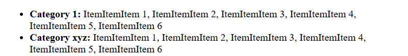
I have a <ul> with bullet points. Each <li> contains a category (e.g., “Category 1:”) and then a list of items. I want to: 1. Keep the default round bullet points (<li> markers). 2. Give all categories the same minimum width so they line up nicely. 3. Make sure that when the text wraps, the second line starts under the first item text, not under the category label. Problem: * I can give the .category a fixed width with CSS, but then the wrapped lines still align under the category instead of starting under the first item text. * Also, I’ve tried using display: grid or flex on the <li>, but that often removes the bullet points. Question: How can I style this list so that: * Bullets are visible * All categories have the same width * Wrapped lines start under the first item’s text, not the category label
<ul>
<li>
<span class="category">Category 1: </span>
<span>ItemItemItem 1, ItemItemItem 2, ItemItemItem 3, ItemItemItem 4, ItemItemItem 5, ItemItemItem 6</span>
</li>

<li>
<span class="category">Category xyz: </span>
<span>ItemItemItem 1, ItemItemItem 2, ItemItemItem 3, ItemItemItem 4, ItemItemItem 5, ItemItemItem 6</span>
</li>
</ul>
.category {
font-weight: bold;
}
.category {
font-weight: bold;
}
No description
12 Replies
Jochem
Jochem2w ago
this really looks (content wise) like a nested list do you want the items to have their own bullets, or is the comma separated list intentional?
Abc
AbcOP2w ago
Yes, the comma separated list is intentional . I want all items to stay in a single line (wrapping if necessary) rather than giving each item its own bullet point.
Abc
AbcOP2w ago
Thank you very much. Only the bullet points are missing.
Chris Bolson
Chris Bolson2w ago
I agree with Jochem in that, in terms of content, this should probably be a nested list. As for why the bullet point (marker) is removed, this is because you are replacing the default display:list-item with display: flex. So, as it is now not a list, the list-style marker is no longer rendered. If you want the bullet, you will then need to create a custom bullet/marker and add it as a pseudo element. I would probably do it something like this:
<ul class="cat">
<li>
Category 1:
<ul>
<li>ItemItemItem 1</li>
<li>ItemItemItem 2</li>
<li>ItemItemItem 3</li>
<li>ItemItemItem 4</li>
<li>ItemItemItem 5</li>
<li>ItemItemItem 6</li>
</ul>
</li>
<li>
Category 2:
<ul>
<li>ItemItemItem 1</li>
<li>ItemItemItem 2</li>
<li>ItemItemItem 3</li>
<li>ItemItemItem 4</li>
<li>ItemItemItem 5</li>
<li>ItemItemItem 6</li>
</ul>
</li>
</ul>
ul.cat > li {
display: flex;
gap: 1rem;
text-wrap:nowrap;
&::before {
content: "•";
}
& > ul {
display: flex;
gap: .5rem;
flex-wrap:wrap;
list-style:none;
padding: 0;
& li:not(:last-child)::after{
content: ',';
}
}
}
ul.cat > li {
display: flex;
gap: 1rem;
text-wrap:nowrap;
&::before {
content: "•";
}
& > ul {
display: flex;
gap: .5rem;
flex-wrap:wrap;
list-style:none;
padding: 0;
& li:not(:last-child)::after{
content: ',';
}
}
}
Jochem
Jochem2w ago
I was trying to see if you could use display-inside and display-outside to preserve both the list-item and grid types, but you can't combine list-item with grid cause it's a display-inside type
MarkBoots
MarkBoots2w ago
with the current html, you could also do
ul {
display: grid;
grid-template-columns: auto 1fr;
> li {
grid-column: 1/-1;
display: grid;
grid-template-columns: subgrid;
>span:nth-child(1){
display: list-item
}
}
}
ul {
display: grid;
grid-template-columns: auto 1fr;
> li {
grid-column: 1/-1;
display: grid;
grid-template-columns: subgrid;
>span:nth-child(1){
display: list-item
}
}
}
No description
Jochem
Jochem2w ago
sticking that display: list-item on the first span is super clever!
MarkBoots
MarkBoots2w ago
yea, it even works with <ol>
Chris Bolson
Chris Bolson2w ago
I agree! I will have to remember that trick for CSSbattles 😉
MarkBoots
MarkBoots2w ago
don't see when to use that (but that's a different topic)
Abc
AbcOP2w ago
Thank you very much all of you 🙏

Did you find this page helpful?