What's the current best practice for linked card markup?
Goal: an accessible card containing an image, heading, description, CTA, etc. "Clicking" anywhere on the card takes the visitor to the target link.
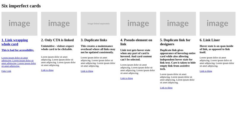
Here's a Pen demonstrating some common card component patterns, but all are problematic to some degree, either for the visitor, the developer, or both.
20 Replies
your goal is as vague as saying "i want an ocean", because there's that many possibilities of doing this
you can check some in #Challenge #3: HTML is Hard
and even kevin made a video about this challenge: https://www.youtube.com/watch?v=PGvgdZuQu6w
Kevin Powell
YouTube
Is HTML the hardest language?
✅ Join the Discord: https://css.community
✉ Keep up to date with everything I'm up to https://www.kevinpowell.co/newsletter
💬 Come hang out with other devs in my Discord Community https://discord.gg/nTYCvrK
⭐ Are you a beginner? HTML & CSS for absolute beginners is for you: https://learn.kevinpowell.co
🎓 Start writing CSS with conf...
unless you're specific about what you want in your card, the possibilities are endless
Perfect! Taking a look now. Thanks!
TL/DR: KP recommends the fourth approach I demo'd in my CodePen above.
I assumed there'd be a better way, but perhaps this is the best we have right now 🤷
for that html and that intent, yes, it is the best approach
but for something you want, maybe it would need changes
I think anytime clicking anywhere takes you to the location, the pseudo on the link is the way to go. Making the entire thing a link sucks for accessibility and, secondarily, styling.
The issue is the text in the card not being selectable, but I can't think of any way to avoid that. From a technical point of view, if the link covers the entire thing, it'll have to block the text from being clicked on.
The only things I could think of that could potentially be added to html/css to overcome it would way to easily be misused, and with it being a kind of niche use case, I doubt we'll see any alternatives anytime soon.
i think i have an horrible idea to make the text selectable
meh, doesnt work
was trying something horrible too, but it registers the active just before its able to open the link

🤣 that is indeed horrible
hoped a single click could open, and a longer click could select
that would be awesome, if it worked
horrible, but awesome
maybe try something with
:focus instead?same effect i think
Thanks for thinking it through with me. Good advice, and solid attempts at a work-around.
The pseudo element is already my preferred method, however I've recently been getting pushback that the client only wants to the link to have a hover effect when the link text is hovered, not the whole card. I couldn't think of a way to make that happen, and you've reassured me it's not possible, so it gives me more confidence to push back.
I like it when clickable areas are as big as possible but it really depends on your situation. I find it quite nice when a call to action card can be clicked anywhere. Less need to aim
you can also bs a little and say that you did some tests and it pointed out that the tap space is too small
@ἔρως that would be 100% valid if the design as implemented was like my demo, but they actually have a button, not a text link. I'm not averse to some BS in the name of a good cause (or good UX) 😄
buttons can be too small too 🤣
What they want would be possible if we could do something like ::after:hover, but without that, I can't think of a good workaround.
if you play around with pointer events, maybe it's possible to do something?
maybe even some js?