How to make the text in the list good and the bullet point on the right place
Hello,
Still struggeling with the recipe page
So far I have this : https://roelofwobben.github.io/recipe_page/
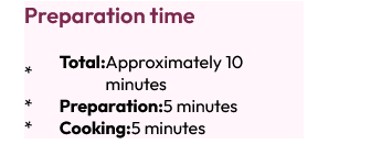
but the text on the list does still not good and I cannot move the bullet point to the right place
like this :

47 Replies
Anyone who can me some hints to achieve this ?
look up padding
In this case I would suggest absolute positioning for this as the bullet needs to be at 50% height of the container.
oke
so the
li:before absolute and then the li relative ?
@Chris Bolsonyes
Thanks, I will try it soon
without abs position
@MarkBoots thanks
but still the word "minutes" is under de bullet and not under the other text
i would need to see the code then.
your page is not updated to what i suggested.
moment
im busy with updating the github repo
you can also make a codepen demo
oh, i do see you have a strong element. so multiple elements within the li. so with flex it wont flow nicely. in that scenario. i would suggest wrapping all text in a span
page is updated with your code
??
I needed that because some parts needed to be bold
just as there is a big space between the bullet point and the text
o, you removed all margins and paddings, ok.
well you can add the spacing with a margin-right on the :before and use list-style-position: inline.
and for the text content (including strong) wrap everything inside the li into a span.
maybe now it is easier to use abs position
Umm, I think I found the issue:
You're nuking the padding on all elements, which is what list items rely on to properly place the markers. Then you're making your
lis a flex container, for some reason. And then adding in an empty ::before that's taking up space.i suggested the flex for the vertical position of the marker tbh (not realizing there were more elements like strong in the li)
Slightly also, you should set
max-width: 100%; on your img tag and not width: 100%; That way if the container width is larger than your image you won't get it streatched/pixelated.
Honestly most of the issues can be fixed by removing the margin/padding nuke on the * selector. I really have no idea why that's "the thing to do". It's so dumb and causes more issues than it solvesThis is how I would have done it (bearing in mind the content of the li elements):
yea thats the way in this scenario
With just turning off a few things (copy/paste from the website CSS):
And I get this:
Though I do question this:
Do you not use the strong tag elsewhere? Do you need to save a few keystrokes while typing to hard-code the
:?yep, and I need this on mobile :
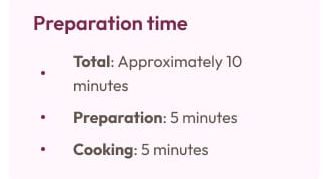
The bullet in the middle of the text? Why?
no idea. that is what the design wanted
Personally I'd push back and ask why. That's not how bullet lists work and to me it looks, well, painful. Then again, I bet your design person likes center-aligned text. Which is also painful to look at but for different reasons
its a frontend mentor
yep. it is a front-end mentor challenge for "beginners"
It's a frontend mentor challenge? Challenging you to learn bad habits? Uhh… 😒
Well, if they're looking for that I guess I can't help any more. Best of luck ✌️
thanks
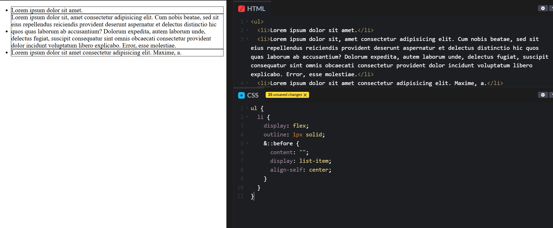
@MarkBoots can I change the font-family and the gap between the text and the bullet like this :
this is very near what I want :
the only thing im missing now is some spacing around the ":"
yea, but because you can use gap to space, as it is a flex box
where do I need to use gap here ?
on the li
Thanks
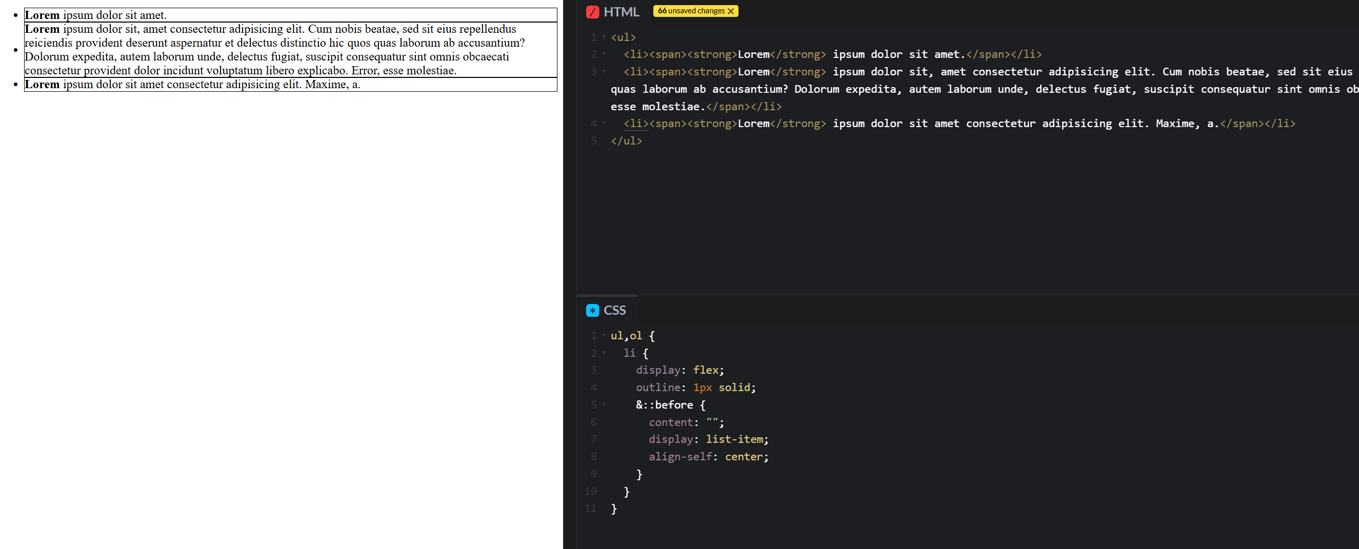
I have now this :
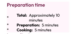
and that looks more and more like what I ask for :

yea, but you dont need flex. the flex will shove everything next to eachoter. or you have to wrap the <strong> and text all in a span
<li><span><strong>Total</strong> Approximately 10 minutes</span></li>
that is what i said before. maybe abs position is betteroke
very thanks
this was bugging me for weeks
its to bad we can not control the vertical position of the default marker.
that is FE , we cannot control everything
Chips, found another problem with your code
The div seems to have some margin or padding where it not schould have
the whole div is too small now for the width
you have a
article div { } rule. that is cascading to divs in divs
article > div { } found it
padding on the div was too high
but i would suggest not removing the margin and padding at the root. as what Beck noticed before. I know it is a quick reset. but doing that makes you put everything back again
It's easier to adjust when needed
oke
Thanks
still some work to do
good luck