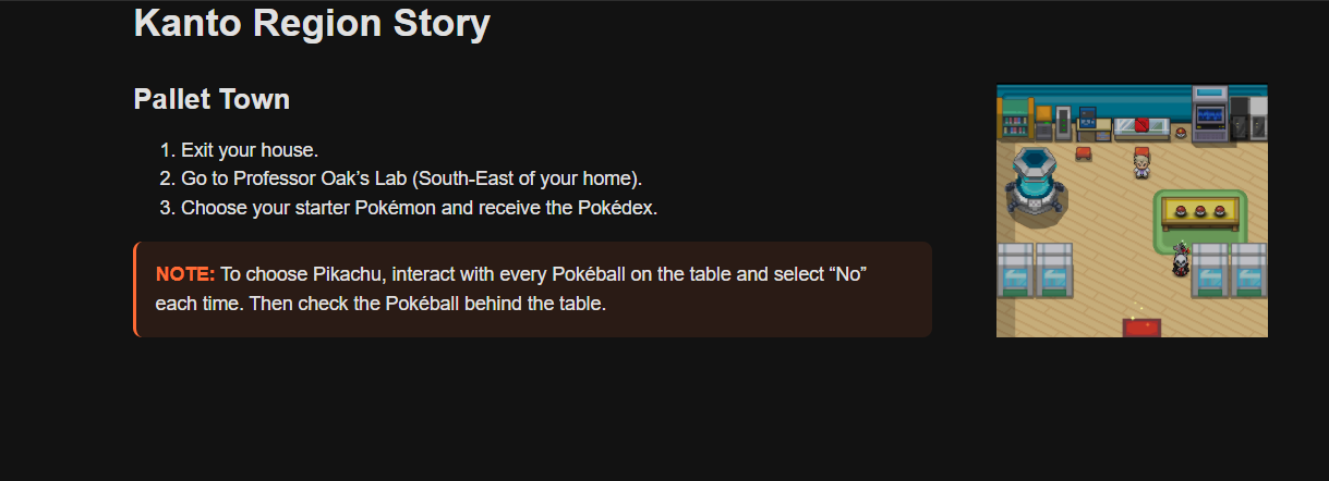
Confusion about Aligning Image Height with Text & Proper Use of <figure><figcaption>
Hey there. hope you're having a great day, and apologies in advance if this is a bit of a beginner or stressful question.
I just completed the Absolute Beginner Course yesterday and have been experimenting with what I learned. I’m also exploring things closely related to the course to take it step by step. I’m not even sure if what I’m trying to do makes sense in terms of practice, so please let me know if it doesn’t.
Goal:
I want an image on the right side of the text block to automatically match the height of the text. For example, if the text height is 300px, the image should also be 300px. My idea is that this would look clean and organized, especially since I plan to list multiple cities or towns below and images+texts of varying heights would feel inconsistent or ugly.
* https://codepen.io/NotNegative/pen/bNVKzmY
I did my own research and played a bit with FLEX, just to drop it immediately cause GRID seemed a much more friendly and comfortable option to achieve what I wanted.
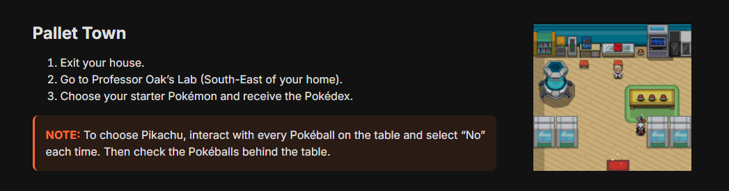
I then tried with align-items: stretch; and got very close to the desired result but the code was starting to get very messy and I am sure there's a much better and faster way to achieve it.
Questions about <figure> and <figcaption>:
Regardless the fact my semantic is still horrible since I just started, and I swear I am working on it, <figure> confuses me.
I think this is an ideal scenario for <figure> since the image is clearly tied to the main content on the left. Am I correct, or is that a misuse?
* Since both <figcaption> and alt="" can be read by Screen Readers, which is the main goal, can I simply skip adding a figcaption or is it bad practice?
12 Replies
Uhm, after some research, I believe I was able to find out how to deal with that.
However this works only on large screens, because the "position" makes the image disappear on smaller.
Is there a better approach or this is the right one and a media query is simply the next step to solve the mobile one?
What do you think the small view has to look like?
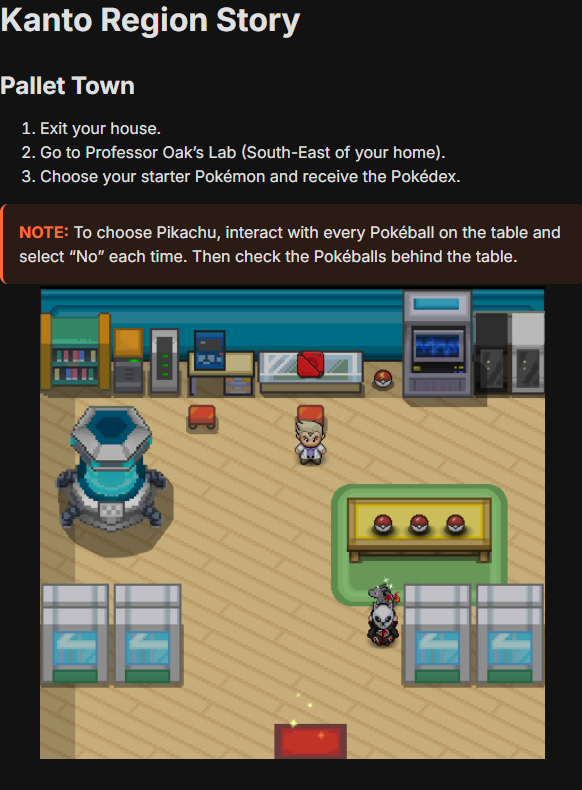
On a smaller view, the image would simply go below the text. Like this: (but without the left margin which I'll address later)
However, with the setup mentioned above (https://discord.com/channels/436251713830125568/1409532130710782122/1409548753177935944)
It's not responsive since the position absolute/relative
So I am trying to figure out if there's a better approach to achieve this:
Without breaking the responsiveness
Maybe a media query is right for you, this is my opinion, just a media query for larger views
something like: "@media (width > 860px){/your styles/}", i don't remebemer the sintax well 😅
Yeah, that's what I went for right now
Seems to work fine enough; We'll see if anything breaks later
Seems to work correctly with some extra adjustments I made.
Not sure if there's a better way to deal with it than the one I picked, but I'll figure it out eventually