CSS Grid: Intrinsically wrapping grid items in groups of two or three?
I have a series of grid items that I'd like to wrap cleanly so that I don't get hanging card “orphans”. Currently I have 4 items, but there could be 3 or 6 or 8 items (let's ignore 5 and 7 for now).
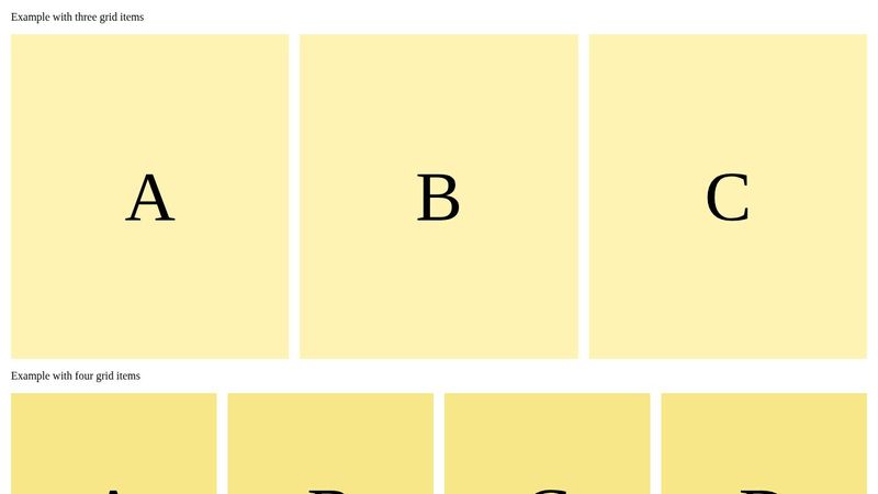
With four items, I'd like to have either:
1 × 4, 2 × 2, or 4 × 1 layouts
(but not 3 + 1)
With six items, I'd like to have either:
1 × 6, 3 × 2, 2 × 3, or 6 × 1 layouts
(but not 4 + 2 or 5 + 1)
I know I can hard-code this using manually set breakpoints and media queries, or that I could wrap the list of items into groups of two or three, but I'd like to avoid that (not least because the divs would interleave each other). Can this be done intrinsically, for example using auto-fit or some other method?
Starting from Kevin's short on even pairs: https://www.youtube.com/shorts/scaiYZISGpk I prepared a codepen:
https://codepen.io/jools-r/pen/yyYRBJV
This works well for 2 × 2 or 4 × 1 but not for 1 × 4, 2 × 3, or 3 × 2. As a mobile MQ is likely, the single-column case can be solved that way.
Maybe there's a way of combining Kevin's "How to set max-columns using auto-fit" (https://www.youtube.com/watch?v=CHULPvkXIRo) with "modular queries" (https://alistapart.com/article/using-css-mod-queries-with-range-selectors/) to test for item lengths divisible by two and three?
Thanks for any ideas ...
YouTubeKevin Powell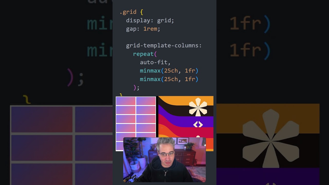
Grid's auto-fit is awesome, but it can do more than I initially realized! If you add more grid tracks, they get included in the columns that are being made, which means you can enforce having even numbers of columns if you need to.
#css #grid #tipsandtricks
#css #grid #tipsandtricks
YouTubeKevin Powell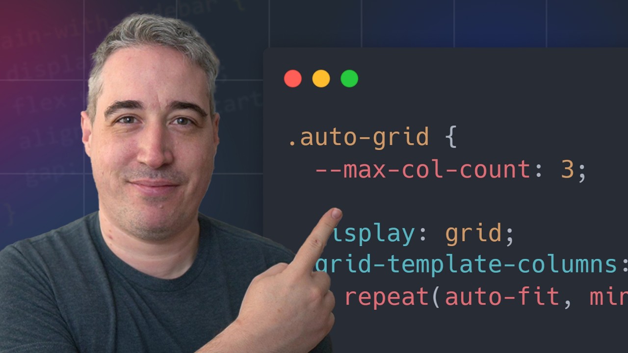
It takes a little bit of work, but we can relatively easily take control of CSS Grid’s auto-fit (or auto-fill) by using a
 Links
Links
 The code from this video: https://codepen.io/kevinpowell/pen/GgRwqxJ
The second version using attr(): https://codepen.io/kevinpowell/pe...
calc()A List Aparterinlynch
When you distractedly agree to do something that you then realize you don’t actually know how to do, what do you do? Briefly panic, and get down to work. Patrick Clancey comes up with a little arse…

A friendly place for developers to meet other devs, ask questions, get help, and just have a good time 🙂.
36,263Members
Resources
Was this page helpful?