help me fit this in the viewport
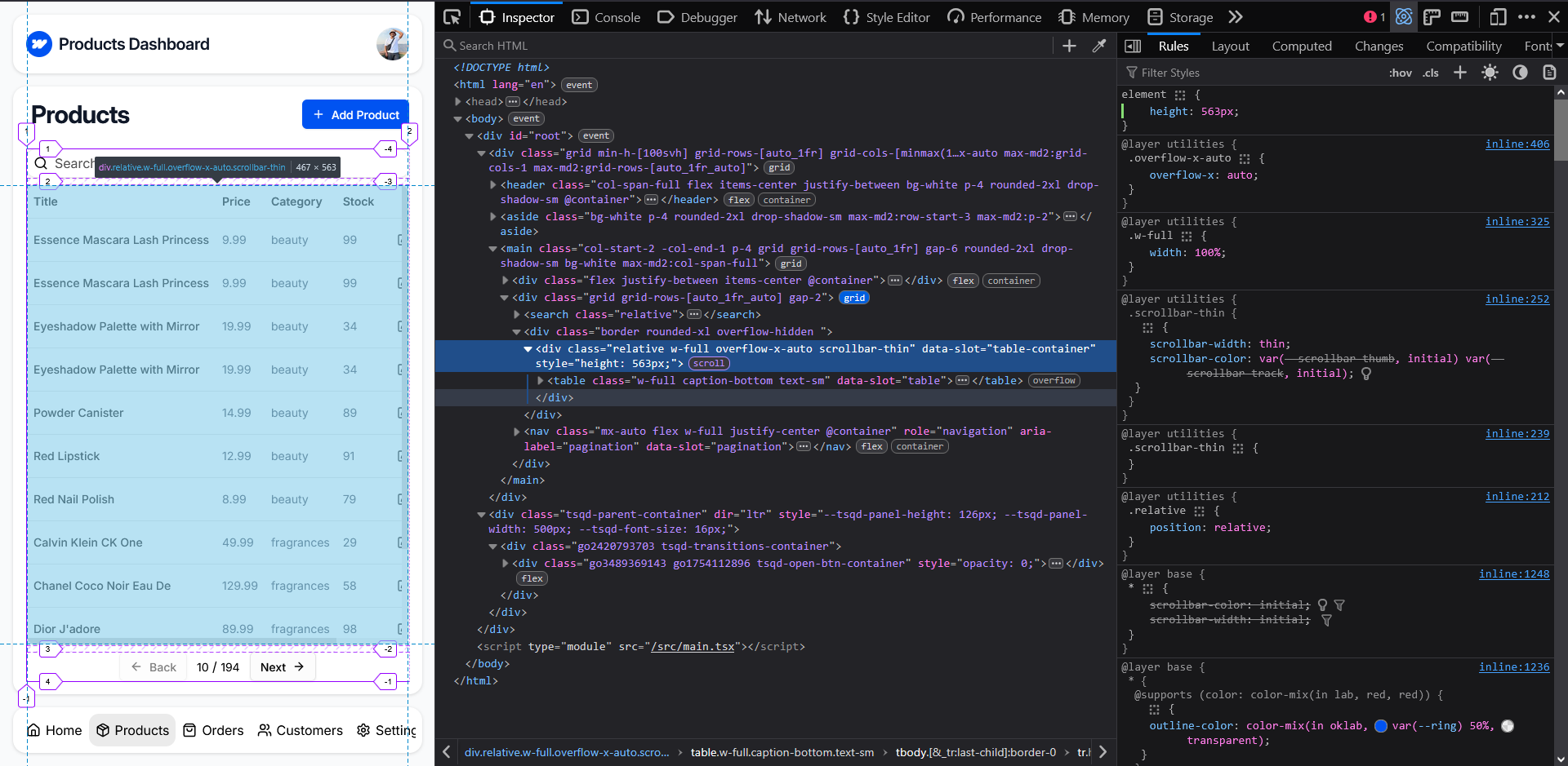
Hey guys, I need help making the table container (the highlighted) element make use of the available height, and not grow, so it doesn't cause any overflow. Unless and until I give the container a fixed height, the
overflow auto wouldn't work. I was thinking it would implicitly treat the 1fr as the max height, but it continues to grow.

8 Replies
@whatanerd as per #📝rules , please don't "page" anyone. People will help if and when they can
#📝rules 5 to be precise
my bad, will remove the mention.
That grid pattern works well to ensure that if there isn't enough content, that it will stretch to fill the space, but
fr is about taking the leftover space and adding it somewhere. In this case, when that middle row gets taller, there is no more space to distribute, which just means it won't add any extra. It's additive only. Think of it like using flex-grow.
You have a min-height on the parent that's creating the main layout (which is why the big layout works if the content is short, the parent is the full height, and the fr uses that extra space). If this is the layout and it it's always going to be that size, you could just set it as a height instead of min-heighthmm... makes sense, but can't set a hard-coded height, then it might overflow in mobile screens. thsnk though.
You could try doing a
contain: size; on the element you want the scrolling on... Might cause issues, and if needed you might need a height: 100% on it.
The would mean the layout of ignoring the size of that element, do the 1fr would be the leftover part only.
I haven't tested this, so not sure if it works.contain: size, and height: 100% worked like a charm! thank you so much, Kevin!
the final product, thanks to you Kevin!
https://weecom-dashboard.netlify.app
Glad that worked! One of those "why would I ever use this?" features that you end up being very happy exists 😄
that certainly is the case! haha.