Help me figure the container size.

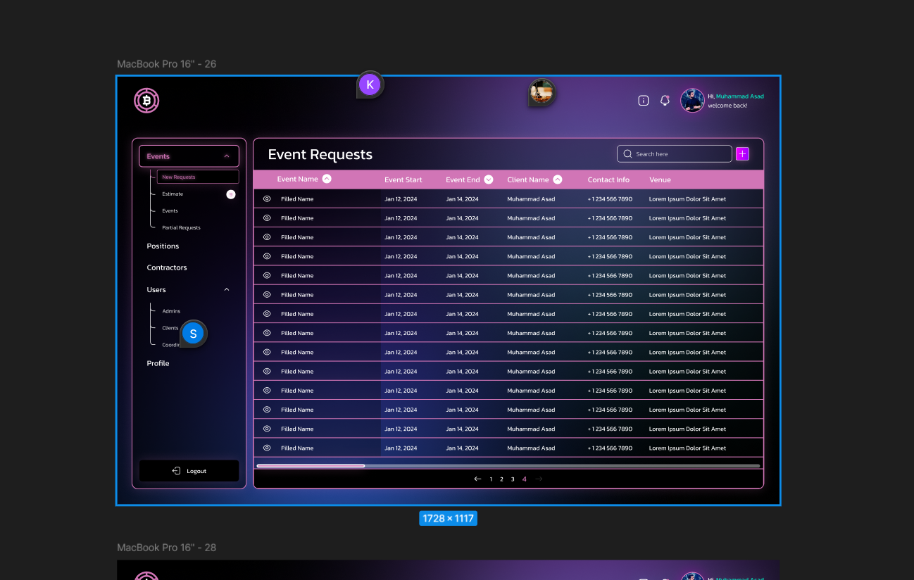
Should I give the container a max width of 1728px or what should it be ? Please help
No description
29 Replies
ἔρως
ἔρως3mo ago
you are asking us to decide for you what you should do based on what we feel like that you should do, with no context what-so-ever besides a "random" screenshot
13eck
13eck3mo ago
i_lost_to_loba_kreygasm
i thought the screenshot should give you enough context, no ? You can tell me what else do you need from me 🙂
13eck
13eck3mo ago
1. Where did you come up with the 1728px? 1. What is the point of the container? 1. Have you tried it at other max widths? 1. Is it being used on a screen that's wide enough to require that wide of a max width? 1. Why not max-width: min-content and have the content determine the size of the container?
i_lost_to_loba_kreygasm
hi , in the screenshot the figma design is 1728px wide
ἔρως
ἔρως3mo ago
so, that's a random ass number taken from chance because who designed that just rolled the dice and it landed on that
i_lost_to_loba_kreygasm
ok I am thinking not to use any max width at all
ἔρως
ἔρως3mo ago
made an artboard and it happened to be that size, correct?
i_lost_to_loba_kreygasm
here is the figma if it helps
ἔρως
ἔρως3mo ago
can you make it not look empty at 4k?
i_lost_to_loba_kreygasm
you mean without a max width , it would look too white spacey ? aat 4k
13eck
13eck3mo ago
Considering there's a scrollbar on the Event Requests container I don't think a max width is needed since there's more to see
i_lost_to_loba_kreygasm
thats what I was thinking
ἔρως
ἔρως3mo ago
that is a very good point, i didnt notice the scrollbar
13eck
13eck3mo ago
Max width is usually used to truncate excessive white space or force a line break for textual elements. Our eyes can only scan so many characters from one size of text to another before they get lost and reading becomes difficult In this case your container suffers from neither issue
ἔρως
ἔρως3mo ago
it does suffer from other issues there are parts with pretty low contrast
13eck
13eck3mo ago
Yes, but not one that I mentioned :p
ἔρως
ἔρως3mo ago
nope
i_lost_to_loba_kreygasm
ok I wont use a container at all 🙂
13eck
13eck3mo ago
I'm focusing on the width issue. contrast is another post for another time, methinks
ἔρως
ἔρως3mo ago
but still, this desperately needs that the rows have zebra stripes
i_lost_to_loba_kreygasm
i mean max width
ἔρως
ἔρως3mo ago
i agree i wouldnt put a max width for other reasons a backend with stuff limited in width feels like absolute crap and super tight and cramped and then you waste so much potential space
i_lost_to_loba_kreygasm
hi , I am having second thoughts now , i saw that the header has a max width of 1648px , now I am thinking of giving a max width to the table , i mean it has horizontal overflow anyway
No description
ἔρως
ἔρως3mo ago
maybe the max-width is just because the designer was just throwing a design and limited the width to the container, and not as a strict specification you can't deviate from designers love to do this sort of thing or, just ask the designer to adjust the design to real resolutions that real people use on real devices, like 1920 of width (it's usually 1903px on windows because the fugly scrollbar takes 17 pixels)
i_lost_to_loba_kreygasm
can anybody tell me what to do with the th in 4k ?
No description
ἔρως
ἔρως3mo ago
your options are: - nothing - limit the width - limit the width but centered - don't limit the width
vince
vince3mo ago
So here I would add a container to the whole page and give it a max width of something like 1920px (for desktop), or even like 1536px (Tailwind thingy) and put everything in that You could alternatively just put it on the rightmost container and see how that looks being max-width'd and then have the sidebar on the side of the screen Really the only issue I see is on large screens like 4k but that's not really a huge issue, I have a 4k screen and I'm used to a lot of white space. I imagine most widescreen people are At least that's what I would do. I treat Figmas mostly as a suggestion. Try to get it as close as possible but you'll always have to change some stuff around when it's actually in the browser. Just try to capture the essence of it but that's my 2 cents Honestly though this is a pretty bad design because it really doesn't take into account what happens on large screens so that's why you have to fill in the gap. If it was a more traditional layout with the sidebar spanning the full height of the page it would make a lot more sense, but people try to be fancy Let it span the whole container but limit the container width

Did you find this page helpful?