Layout/aligning problem
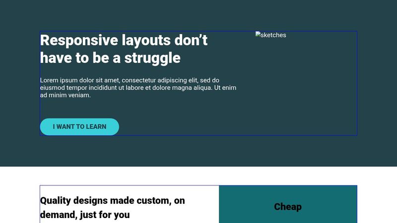
Everything(layout) seems to align perfectly well but the elements inside the flexbox do not really match kevin solution image. i have tried to adjust it several times but no avail.
https://codepen.io/Collins-Cypher/pen/KwdrMmy
14 Replies
This is kevins image solution. please can anyone help me out?
https://cdn.discordapp.com/attachments/1412101047543009380/1412101241248419922/02-05-challenge.pdf?ex=68b71143&is=68b5bfc3&hm=9b286da0364a10bd10309a9cdab3567d87e4c2d0ec7ae2f32704419c9d73344c&
Which lesson in CRL is this for ? I can’t open the PDF , can you screenshot
Okay will do

So can you explain the issue youre having or what youre wanting to achieve ? the broken image makes it hard to see, you need to host it somewhere or use a placeholder
<img src="https://placehold.co/400x300" alt="" />looking at this pattern may help
https://codepen.io/kevinpowell/pen/MWxEjMx
instead of setting magic numbers like
width: 32% , using ratios and setting the point where it should wrap
there is a youtube video that accompanies but cannot find it at the moment. this is worth watching too
https://youtu.be/I4gUvhG7uFU?feature=sharedKevin Powell
YouTube
The problem with percentages in CSS
We used to have to rely a lot on percentages for our layouts in CSS, but with modern CSS layouts using Flexbox and Grid, they can often be avoided.
✅ What unit to use in what situation: https://youtu.be/N5wpD9Ov_To
✅ How to decide when to use Flexbox or Grid: https://youtu.be/3elGSZSWTbM
⌚ Timestamps
00:00 - Introduction
00:37 - Very sim...
aha this is the accompanying video!
https://youtu.be/LEkFckg7sfw?feature=shared
Kevin Powell
YouTube
Use this instead of media queries or container queries
Media queries are a bit limited in how they work, and while container queries go a really long way in solving a lot of those limitations, there are intrinsic patterns that we can follow that allow us to do things that neither one of them can do.
The setup is a bit strange and can look complex, but, in my opinion, it's also 100% worth it!
🔗 ...
Well I just want everything to align just like the solution Kevin provided especially the quality design…. And also the cheap, quality that a background color was added on them as well.
I honestly just want it to start of the same line and end on the same line like Kevin’s solution in the image provided
so the problem is the width of the columns isnt the same as his solution? honestly css grid would be the tool you would want to use for this in the real world but if i remember correctly this course is about using flex. look into flex-basis, flex-grow, and flex-shrink. and think ratios.
It’s majorly about flex and also setting the right widths
if you can master the flex shorthand (or its longhand properties) , youll be in good shape when using flexbox
https://youtu.be/vQAvjof1oe4?feature=shared
https://youtu.be/fm3dSg4cxRI?feature=shared
Kevin Powell
YouTube
Flexbox design patterns you can use in your projects
Get your cheatsheet: https://flexbox-pattern-cheatsheet.kevinpowell.co/
Want to learn more about flexbox? https://flexboxsimplified.com
Flexbox is amazing, and I honestly feel like sometimes we're just stratching the surface with what we can do with it! In this video I explore three design patterns that you can use in your sites using flexbox....
Kevin Powell
YouTube
Flexbox is more complicated than you thought
🎓 - I have a 4+ hour course that focuses only on understanding and using Flexbox: https://flexboxsimplified.com
Article on CSS-Tricks: https://css-tricks.com/equal-columns-with-flexbox-its-more-complicated-than-you-might-think/
Flex is a little strange in how it works, and I only recently dove deep enough into it to really understand what w...
Okay I’ll look into it and adjust whatever and get back to you. Thank you
Sounds good, Kevin’s channel is an amazing resource. Everything you need to solve this and learn has been linked. Also recommend using a placeholder image for visualizing. And <img/> is what’s called a “replaced element” so it works a little differently then say a div with a bg as a placeholder
Okay will do