Problem with responsive image layout
Hi everyone,
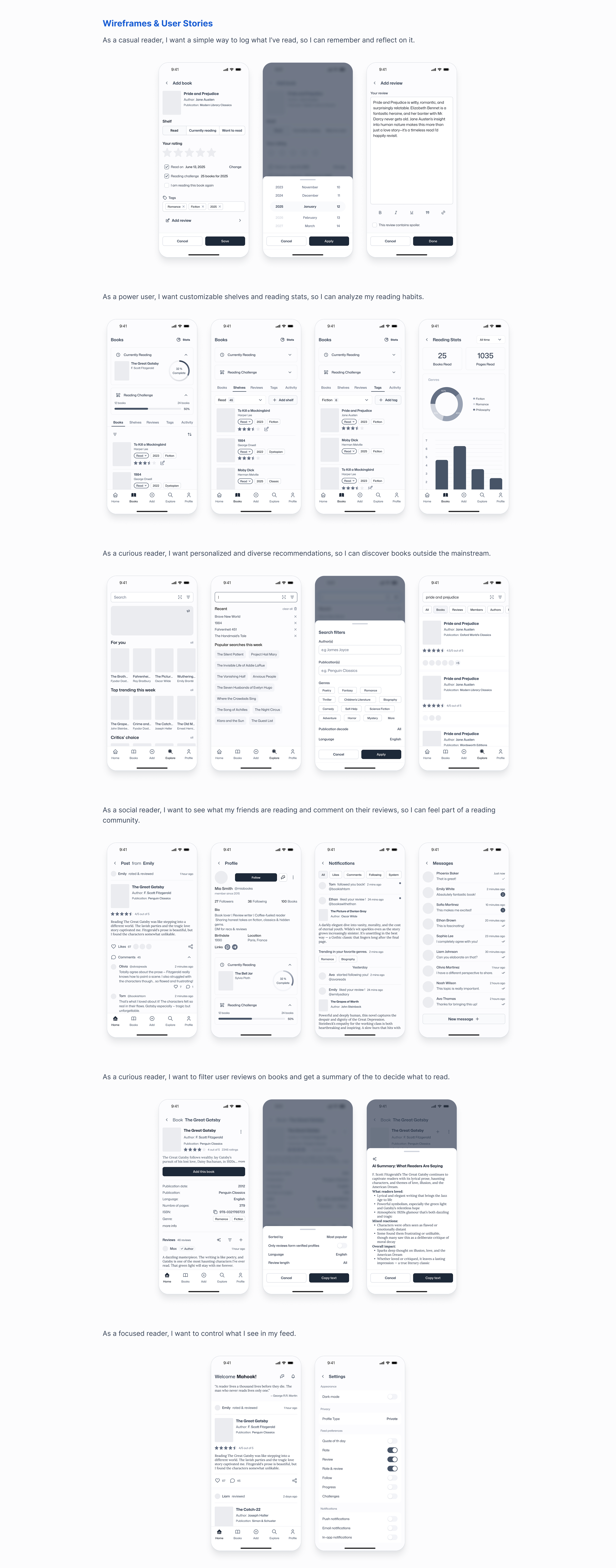
I’ve attached 2 pictures from a larger landing page that looks like a blog post. I’m coding this with vanilla CSS and I’m having trouble with the image layout.
Here’s what I want:
On large screens: 4 columns
As the screen gets smaller: columns should reduce naturally
On the smallest screens: still keep 2 columns (never drop to 1)
The problem is that when I use Flex or Grid, the layout breaks into a single column on small screens. If I try to force 2 columns, it often causes overflow and a horizontal scrollbar.
Do you have any suggestions for achieving this? Ideally, I’d like to do it without breakpoints if possible.
Thanks in advance!


