Use grid for this card component layout with tricky logo positioning
Hi there. I have been trying to convert a small component I use currently to use grid and wondered if people could help.
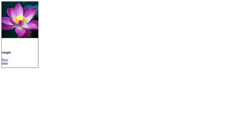
Basically I ahve a small card, it contains an image at the top, and some text content underneath. I also have a logo which needs to be positioned 50% on and 50% the bottom of the image vertically with spacing left and right. The middle line of the logo should always sit on the bottom of the image.
The image should be square and there should be enough space to each side of the logo. Approx 25% of the width of the component. In my demo codepen here : https://codepen.io/rctneil/pen/zxvbodx?editors=1100 - the logo should be approx 100px but it needs to all be flexible so it can flex if placed in slightly wider containers.
My version linked above sort of works but just wondering if others can do it better with grid and ensure the logo always sits correctly. I don;t think I quite have the grid-template-rows set correctly.
Thanks

A friendly place for developers to meet other devs, ask questions, get help, and just have a good time 🙂.
36,263Members
Resources
Similar Threads
Was this page helpful?