Search
Star
Feedback
Setup for Free
© 2026 Hedgehog Software, LLC
Twitter
GitHub
Discord
System
Light
Dark
More
Communities
Docs
About
Terms
Privacy
Is it better use flex or grid or other approaches for this type of layout ? - Kevin Powell - Community
KP-C
Kevin Powell - Community
•
4mo ago
•
14 replies
kamekameha
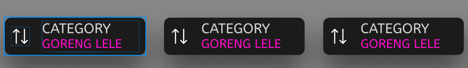
Is it better use flex or grid or other approaches for this type of layout ?
Kevin Powell - Community
Join
A friendly place for developers to meet other devs, ask questions, get help, and just have a good time 🙂.
36,263
Members
View on Discord
Resources
ModelContextProtocol
ModelContextProtocol
MCP Server
Recent Announcements
Similar Threads
Was this page helpful?
Yes
No
Similar Threads
is it possible to make this layout with grid?
KP-C
Kevin Powell - Community / help
8mo ago
Use grid for this card component layout with tricky logo positioning
KP-C
Kevin Powell - Community / help
7mo ago
Grid or Flex when building Sponsor Page
KP-C
Kevin Powell - Community / help
10mo ago
How to approach this type of layout
KP-C
Kevin Powell - Community / help
5mo ago