how to add a max width for td and th?
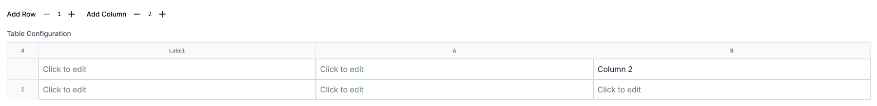
Hi everyone, I have a table like the image, I want to add max-width to label column, but it does not work. Is there any solution to solve this problem?

18 Replies
I don't want to set a fixed width for the
<td>. I want to define a range of widths, like 200 to 400px, but only the min-width works properlyI don't think that tables can have max-widths defined on the cells 🤔
I couldn’t find a solution, so I switched to using CSS Grid. However, I ran into another problem. My row layout is defined as
grid-template-columns: 60px minmax(240px, 320px) repeat(auto-fit, minmax(240px, 1fr));. I want the columns to overflow horizontally instead of wrapping onto a new line. How can I achieve this?dont use auto-fit
if you dont know how many columns you will have, use
grid-auto-columns and set the value to whatever you want the new columns to be likeSorry, I don’t understand. From what I know,
grid-auto-columns is used to set the width for every column. However, in my case, the first column needs a fixed width, the second column should have a range of widths, and the rest should expand as needed. How can I achieve this with grid-auto-columns?it's actually meant for all the new columns you create outside of
grid-template-columns
also, you need to set grid-auto-flow: column
https://jsfiddle.net/yqe8nhoj/
like thisIf you want the rest of the columns to expand as needed you don't even need to define the
grid-auto-columns. You just define your first 2 template columns and let grid work out the rest, however, as Epic states, the grid-auto-flow: column; is needed.
but that will set the columns to
auto
which is not what's in the posta couple of messages ago noob said this:
However, in my case, the first column needs a fixed width, the second column should have a range of widths, and the rest should expand as needed.I understand "expand as needed" to have any added columns to have flexible widths (ie based on content). Anyway, there is enough info there to be able to achieve what they need in either case.
but if you see the grid declaration, it has
auto-fit
which is meant to fit as many columns as possiblegrid-auto-flow and grid-auto-columns work well in my case. I want to add a min-width to the new columns, so I think I need to use grid-auto-columns for that. Thanks, guys!you're welcome
Hi, I wonder if it is possible to make cells in the same column but different rows grow to the same size. For example, if the third cell in the first row expands to
300px because the content is too large, then the third cells in the other rows should also expand to 300px. Here is my current table structure. Should I use table element instead of grid layout?
maybe something with subgrid should do the trick?
It seems to work, but in my case, users can add a new column to rows. I tried this, but it didn't work.
The issue you are having is due to the way that the subgrid is spanning the columns in the parent grid.
In Marks code he has defined
grid-column: 1/-1; This means that the element will span all the columns from the first to the last declared (explicit) column. However, as you are allowing your users to add more columns this will no longer work as any columns added are no "implicit".
How are they adding more columns?
If it is via JS you could also use JS to modify the grid-colum declaration to specifically span the number of columns that you currently have defined, eg grid-column: 1/4; or grid-column: 1/5; ie adding (or removing) 1 as the columns are added.I see. It seems to work well when I declare end column explicitly. Thank you again