Having a hard time positioning image
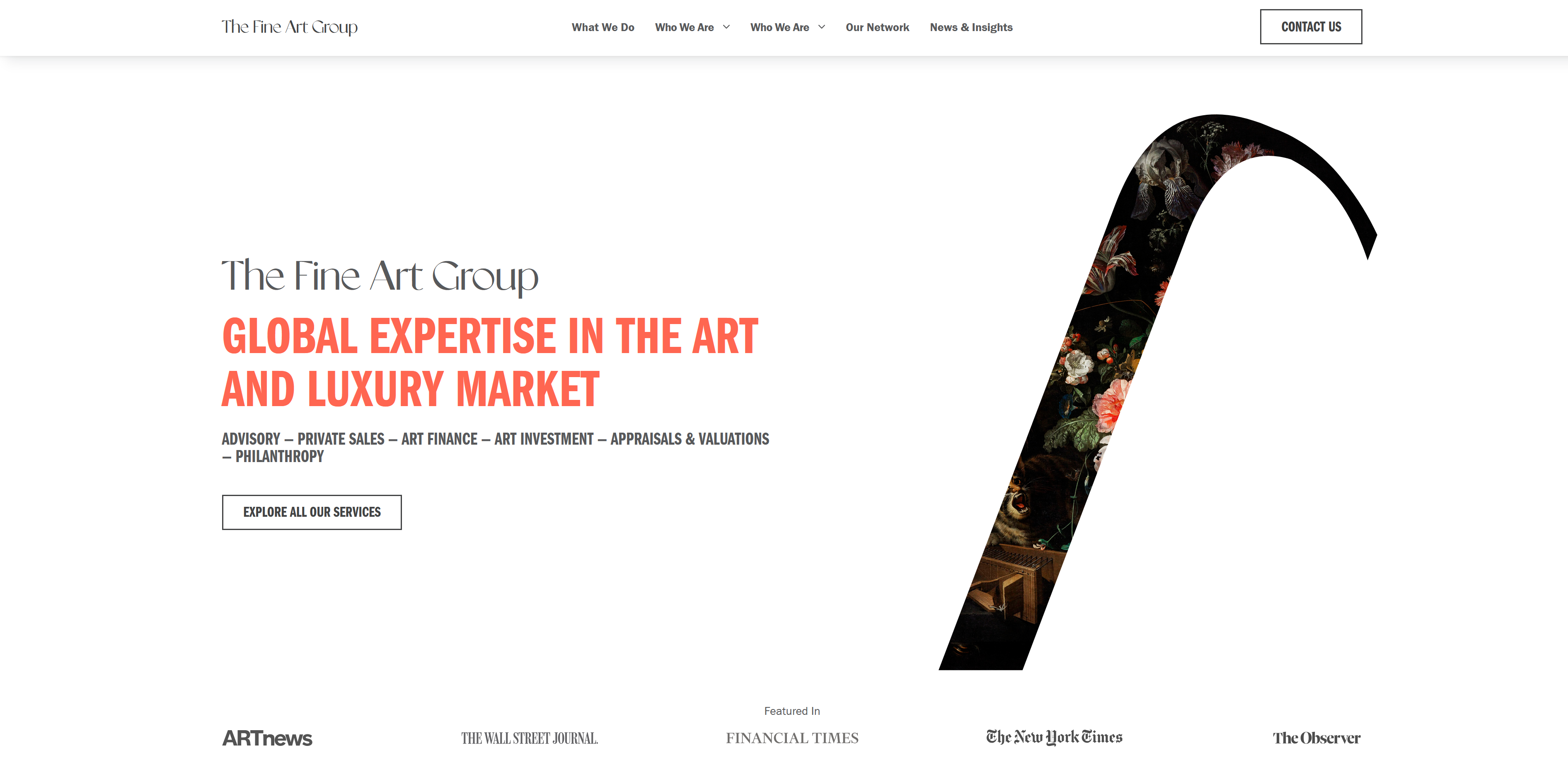
I have the following layout (first picture is actual, second is Figma). I want the image to bleed to the edge of the screen.
I'm having trouble making this image look good when I do that. It's an svg with a clip path. I've made a grid element that 'breaks out' of the container.
grid-template-columns: 1fr 800px 800px 1fr
The 2 1fr are so the container is centered, and 800px x 2 = 1600px which is my .container width.
I had my image span 2 columns, grid-column: 3 / span 2; but this causes the image to grow very large, and trying to put a max-width / height on it distorts the aspect ratio. I can't do aspect-ratio: 1 since it's not a square... any ideas? Is there an easy way to find the aspect ratio of an svg or should I try to make this a background image or absolute position it?
Live site: https://the-fine-art-group.webflow.io/
5 Replies
If I understand what you're looking for . . .
This is a first step: your image is placed with
Which translates to from [row-line 1, column-line 3] to [row-line 2, column-line 4]. Column-line 4 is actually the right side of your third column. (The end of the grid is actually column-line 5). Try changing it to:
-1 will expand the area to the right side of the grid (no matter how many columns), effectively bleeding the image off the right side. You could even replace the 2 with -1 if you always wanted it to go to the bottom of the grid rather than just the bottom of the first row.
When you do this, the image gets larger as well pushing the bottom of the grid down. You may want to work with the image to get it to clip or whatever you had in mind for it to do as the viewport gets larger.Hi Tim! Sorry I may have worded it poorly:
When you do this, the image gets larger as well pushing the bottom of the grid down. You may want to work with the image to get it to clip or whatever you had in mind for it to do as the viewport gets larger.This was my issue. On larger viewports, the image gets huge, and I'm not sure how to fit it well (see image). Trying to add a max-width and max-height only distorts the image. Not sure if I can really get it to style to bleed across the screen and have a max-width without it distorting with the grid approach. Might have to use a background image?

What do you want it to do when as the viewport width grows? Stay the same size and just hug the side or get bigger to fill the space and clip off the bottom?
To make it stick to the side and stay the same size, try:
You will need to make adjustments when it jumps down to what I assume is the mobile size. However, it's stopping when the left edge hits the
hero copy, even if you extend the grid-area for the image over to column-line 2. I ran out of time to play with that.
You might try it as a background image on section.hero. Then you could get it to slide behind the hero text, if that's what you're going for. I started to play with that some, but it was just to kludgy to do in the dev tools. Especially wrangling the SVG mask.Ohhh that's a really good shoutout! I definitely have to think more about how exactly I want this to look on larger desktop screensizes. Really good callout on the
margin-left/inline: auto -- I didn't even think about thatLet me know what you figure out. Looks like an interesting site.