How to increase hover region of mega menu
I have a three-tiered mega menu - one level across the top, then beneath that, there's a wide grid with ~30% being a left-hand menu and, when hovering over the left items, the right side shows content. This might be a lot, yes, but, it's what we've got.
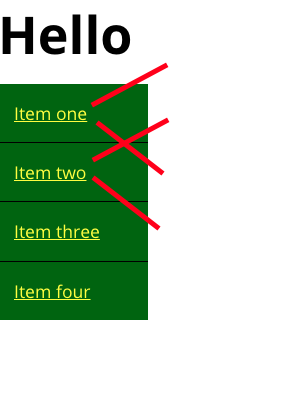
The "hoverable" area of the items on the left is very annoying. When moving from left to right, people frequently move their mouse just over the edges, either up or down. I really want to do something I learned years ago and have completely forgotten how to do. There's a thing people do to add an invisible triangle shape at the end to increase the hover area, right?? I've tried to mock it up here, I don't fully understand how it works, but I know I've seen it in the past.
Any thoughts??

12 Replies
What does your code look like? Can you make a minimal-version in Codepen to share?
I'm pretty sure of what the problem is but without code it's impossible to know for sure.
Our code is terrible. It's a Drupal site, so it's like....
the :hover action is on the [li] elements
Can you show the HTML and relevant CSS?
It's honestly a nightmare lol. I can DM you if you don't mind?
I don't do DMs for things that aren't server-moderation related sorry
Understandable.
But what I can say is that my guess is that there is some odd interaction between the
span and the li, since the :hover is on the li
Usually it's that people put the interaction on the span and since it's an inline element there's no padding/margin to grow and thus the interactive bits are literally only on the text
Try making the span into a div (so it's a block-level element) and put the interaction on the div. Make sure the li has no padding. See if that does anything
And if you could even share a quick video of what it's doing so I can see it, that could be helpfulthe span is a block, well, actually, it's flex, and has its own
::before element to be the same as the text but in bold so it doesn't push the width wider on hover when we make it bold. The parent li also has a ::before element as a left "border" aka width that transitions from 0 to 5px.So that's a lot of info that's kinda important to share. And just one more reason why the code is important to share. I won't be able to do much more without being able to muck around with the code. Even if it's a simplified version on codepen. Just the HTML you're talking about and the CSS that affects it
the
li does have padding, you're right that I could put the padding on the span instead.
Oh yeah, the elements are messing with me too because if I do try to do some sort of triangle, I'm already down one pseudo-element being used for other reasons.
I'll do my best to put it in a codepen 🙂 Honestly, that exercise in and of itself will help because it'll force me to simplify it.
Okay, this is a very stripped-down and partial version of how our menu works. (on desktop.)
It's not great! I didn't build it, I inherited it...
https://codepen.io/jennypns/pen/myVeqyjIf I am reading what you are looking for correctly. Then you do want to apply the padding to the span tag and remove it from the li tag. You also want to remove the gap from the ul.menu as well. Then declare the span tag to be a block element, not a flex element. Once you do that then you can either use text-align center for the text or do the above and keep the pseudo decoration and text left aligned. Now with the padding and gap removed when the cursor hovers over any of the span areas the submenu stays up. You lose that ackward jump between nav element hovers.

It's actually not the top I'm having hover troubles with (but thank you I'll also look into that!) but moreso the left side. If I make the padding larger it ends up spacing them out too far, but at this size it feels too small. Wondering if I can make use of an
:after element somehow to apply some diagonal room for mouse movements.
My other option is to change it from a sidebar to a button to require a click instead.......