Grid cropping image?
https://www.mottandbow.com/pages/the-best-relaxed-fit-t-shirt-for-womens?_ab=0&_fd=0&_sc=1&preview_theme_id=148521779388
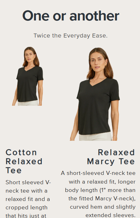
In this page, in the component "One or Another" in mobile view the main images are not having the same size, even thought they are the same image, they have the same grid column fraction
In this page, in the component "One or Another" in mobile view the main images are not having the same size, even thought they are the same image, they have the same grid column fraction
Mott & Bow
Explore premium denim, tees, polos, loungewear, jackets & more—luxuriously soft, expertly crafted, and always stylish. Free shipping over $150.

A friendly place for developers to meet other devs, ask questions, get help, and just have a good time 🙂.
36,263Members
Resources
Similar Threads
Was this page helpful?