Grid auto-fit layout getting messed up around new column breakpoints
I'm trying to create a grid layout (Just for fun as after a question on reddit got me wondering if it's possible) The criteria I'm trying to achieve are:
1) The grid is always 'full', as in regardless of number of children the last row is always full.
2) The columns never exceed a specific width.
3) All happens automatically with no need for media or container queries.
4) A purely CSS solution.
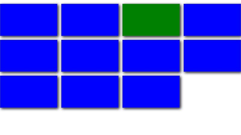
For the 'fullness' I have a 'highlight' element that will span multiple columns as needed to push subsequent children to fill the last row (In the event no 'highlight' element is selected the first element takes this role.
For the width capping I am increasing padding on the parent when there isn't room for the next column to be added but current columns would be exceeding max-width.
I roughly have it working here: https://codepen.io/NeilSchulz/pen/JoGapRj (In Chrome at least, and I believe it should work in Safari, but not in Firefox - I think there are Firefox work-arounds but I haven't added as it gets complex and I only wanted a bare-bones version until it was working)
But I shrink/grow the window it works as intended for most widths, but there is a short point above/below each breakpoint where is glitches. The previous column layout is maintained for a few px, or the increased padding doesn't work, but jumps back in with a slightly greater screensize change.
Just wondering (hoping) if anyone can see where I'm going wrong! (I've added notes to the CSS in the codepen to hopefully explain what I was trying to do!)
1) The grid is always 'full', as in regardless of number of children the last row is always full.
2) The columns never exceed a specific width.
3) All happens automatically with no need for media or container queries.
4) A purely CSS solution.
For the 'fullness' I have a 'highlight' element that will span multiple columns as needed to push subsequent children to fill the last row (In the event no 'highlight' element is selected the first element takes this role.
For the width capping I am increasing padding on the parent when there isn't room for the next column to be added but current columns would be exceeding max-width.
I roughly have it working here: https://codepen.io/NeilSchulz/pen/JoGapRj (In Chrome at least, and I believe it should work in Safari, but not in Firefox - I think there are Firefox work-arounds but I haven't added as it gets complex and I only wanted a bare-bones version until it was working)
But I shrink/grow the window it works as intended for most widths, but there is a short point above/below each breakpoint where is glitches. The previous column layout is maintained for a few px, or the increased padding doesn't work, but jumps back in with a slightly greater screensize change.
Just wondering (hoping) if anyone can see where I'm going wrong! (I've added notes to the CSS in the codepen to hopefully explain what I was trying to do!)

A friendly place for developers to meet other devs, ask questions, get help, and just have a good time 🙂.
36,263Members
Resources
Was this page helpful?