Different preview of same code in Chromium vs. Mozilla

Hello, I've started learning responsive design and have come across this issue where my code "works" (behave as I want it to) in Mozilla, while not in Chrome (chromium actually, but same thing). 
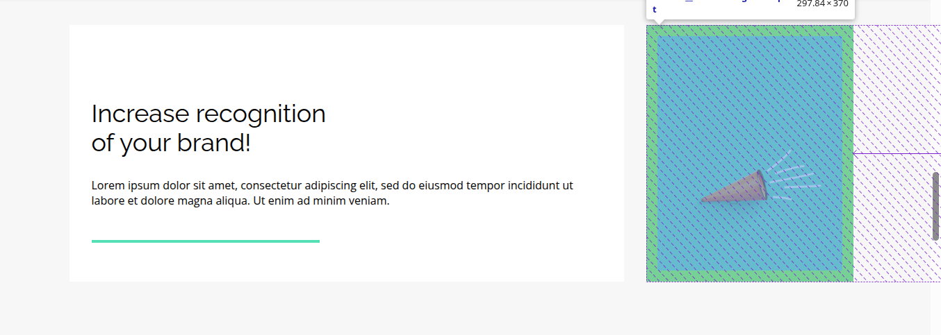
I'm including pictures - I'm talking about the div with green background with a trumpet in the center. I used flexbox. 
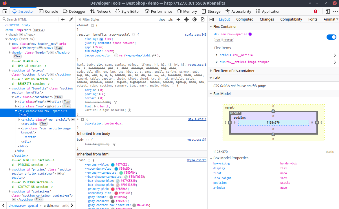
In dev tools I noticed a strange purple square with an arrow (that I don't think I've seen before) and don't really know what it means. I'm including pictures of the previews, as well as CSS code of - the green element child in question, the only sibling of this green element ,and the parent flex of the children. Ther element in question:
<div class="row__article-image trumpet">
Sorry, I just read the "Asking Good Questions" after posting (shame on me xD) - so per instruction's I'm including the code:
<div class="row row--special">
<article class="row__article">
<h3 class="row__article-title">Increase recognition<br>of your brand!</h3>
<p class="row__article-subtitle">
Lorem ipsum
</p>
</article>
<div class="row__article-image trumpet">
</div>
</div>
<div class="row row--special">
<article class="row__article">
<h3 class="row__article-title">Increase recognition<br>of your brand!</h3>
<p class="row__article-subtitle">
Lorem ipsum
</p>
</article>
<div class="row__article-image trumpet">
</div>
</div>
.section__benefits .row--special {
display: flex;
justify-content: space-between;
gap: 2rem;
min-height: 370px;
background-color: var(--grey-bg-light);
}

.row--special .row__article {
display: flex;
flex-direction: column;
justify-content: center;
background-color: var(--white-bg);
padding: 2rem;
}
.row__article-image.trumpet {
flex-basis: 440px;
aspect-ratio: 440 / 370;
background-color: var(--primary-turquoise);
background-image: url("../images/Trumpet.png");
background-size: 70%;
background-repeat: no-repeat;
background-position: 50% 80%;
}
Preview in Chrome with the weird area on the right with an arrow - What does it mean?
Preview in Mozilla (layout I am after - of the green element)
CSS of the second flex child - "the green-element div"
CSS of the parent of "the green element"
CSS for the first child of flex - sibling of the green bg div
1 Reply
Yoda
YodaOP•3w ago
Okay, so I figured out the purple area represents flex-basis and the arrow shows either the length the element grew or shrunk. Though I'm confused why it shows it being shrunk from the right instead of left side? So my div has a basis of 440px, but it shrunk. The thing is - I want the green div to be 440px and the left sibling to take the remaining space - while keeping responsiveness, so it cant be fixed width. I wonder if chromium calculates sizes in a different order than Firefox.... thats why the inconsistencies with the same code? I tried setting flex-basis to the left sibling (440px) and was left with bigger gap in between. Only after I set flex-grow:1 to the left child, it occupied the remaining space without shrinking the green div.... Which I don't quite understand still.. So flex-basis gives your children the desired widths ONLY if you set flex-basis to all of them? Since at first when I only set flex-basis to my green div - it shrunk in chromium (while remained 440px wide in firefox)🤔 And just when I started to think I understand flexbox🥴 ..

Did you find this page helpful?