HTML/CSS vertical/horizontal lines across the page
Hi there. I'm lowkey stuck with what seems a simple task, so I'll be quite glad if anyone can help with it :ragsdot:
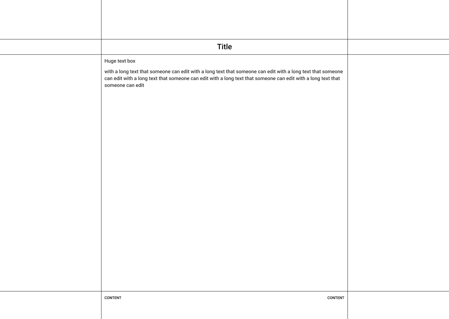
I attached the example of a layout I wanna make. My problem is that I cannot properly make the lines, both horizontal and vertical.
I figured I can have a div container for the whole center part, so I can place vertical lines before and after and it works, but that ain't a thing for horizontal ones. Whatever I do, they end up being the same width as the center block (lines are also never intersect)
If that's okay, maybe someone can give a brief idea what would the layout look like html/css-vise?

33 Replies
I would probably do that with grid

then you could use subgrid inside the nav and footer if you would want it
my only addition would be to consider a different unit for the grid-template property, setting them with a fixed value isn't going to be responsive
in reality, for the columns, you'd probably want to set the sides to 1fr and then use clamp or min to set the width for the center
that's correct yeah, but that could be solved inside a media query, i am not sure if he wants these sides to shrink in size as the viewport shrinks, if he wants that, it would be easy to fix 🙂
yeah, fair
i paste my CSS here so you can just copy/paste
Thanks a bunch! Gonna try it real quick. The HTML confuses a bit though, just 3 lines 😳
That's just because i use codepen, codepen already has
<!DOCTYPE html> and <html> tag and all that
But it's liek "behind the scenes"
So should be like
Random fact for lines in pure html you can use
<hr>I would much rather just use border
You can use border-block or border-inline as i did and you get 2 borders immediately
rather than having 5 hr tags xD
Prolly best, in combination with grid like what was suggested before.
Yeah 🙂
you shouldn't use hr unless there is a semantic reason to use hr
hr is used to indicate a thematic break in the content and should not be abused for pure layout reasons
as for how there's only three elements: They're stretched across the full height or width of the grid. The
main tag goes from the top to the bottom, so you'd have to use subgrid to limit the contents inside to just the block you'd want to usehere you can see the borders, nav is yellow, main is red, footer is blue:

Yuh, thanks for explanation and examples! I got it working
I've been designing things for quite awhile, but tbh didn't imagined that design tools aren't sharing the same flow with coding, heh
I really expected that there's a way to just glue the <div>-created lines to a text and tell them something like- uh, you'll be on the right side of the div, and the second be on the left side, and you'll stretch to the 100% screen without breaking the whole layout.
Naive a bit
For the reference, that's what I'm tryin' to do

the main concern now is that they won't be as adaptive as I want but ig I just need to lock in
Yeah, use subgrid
Here you have an example using subgrid for the footer

subgrid basicly borrows grid-rows/grid-columns from the main grid
kevin have a few vids about subgrid 🙂
Appreciate your help! Gotta try to get it all together
Sure, let us know if you need more help 🙂 But yeah, definitely learn subgrid, it's amazing
Welp! I made some progress, not too much though. A bit more familiar with grids now and they're actually very good.
https://codepen.io/Danya-Hedwy/pen/xbVKMoG
I only need to draw these borders now. Since they're gradient, can I somehow apply a single gradient to the whole edge, not going by each section manually?

You know, there is no need to set padding:0; on body, check the user agent stylesheet, there is no padding to begin with, no need to remove something which isn't even there xD
Oh yeah, I just didn't cleaned up that line. It meant to be margin 🥀
But you could simplify the layout a log by doing what i did, you don't need a grid for every grid cell. You can just create what you need, navbar, main and footer. Then move them in to the grid-cells that you want them in
you can move an element to a grid cell using grid-column property and grid-row property
That's what just seemed a bit easier for now. Many values I've seen for the first time tbh, and when I edited them some of the sections were non-interactable and unselectable
You can just use this
https://codepen.io/tok124/pen/gbrYere
I like using grid-template-areas for that myself
and then
I find the column lines a little hard to decode sometimes
(though lots of people swear by them, and you do have more flexibility. I don't think you could quite achieve Tok124's solution with grid-areas)
I personally really don't like grid areas, i feel like you need to write so incredibly much more code, code that doesnt actually need to be there. But i guess it's a personal preference 🙂
basically, grid areas let you lay it out like a bento box, where using grid lines means you can selectively and flexibly overlap elements
my main reason for using the names areas is that you can overwrite just grid-template-areas in a media query and move things all over the place
Hold onnn x)
I just wrapped my head around the basic grid stuff so I might not catch all that up now. Thanks for y'all patience though, really
Among all these ways, is it harder to add border to the code I've made?
Idk about "harder" but it would require to add border to those empty elements that doesn't really do anything. you would need to add a border to these elements, but this would get messed up if you would add gap later on, on the grid-container.
So yeah, it's just a lot easier for you if you go with my updated codepen, in my updated pen that i linked above, you have 3 content divs, one for navbar, one for main content, one for footer, and they have been moved to the correct place. So all you would have to do is to place your content inside the content divs.