CSS Full-bleed effect stacking issue

I was using this CSS full-bleed approach for having background on contained elements: https://www.youtube.com/watch?v=81pnuZFarRw
.full-bleed-bg {
box-shadow: 0 0 0 100vmax var(--full-bleed-bg-color);
clip-path: inset(0 -100vmax);
background-color: var(--full-bleed-bg-color);
}
.full-bleed-bg {
box-shadow: 0 0 0 100vmax var(--full-bleed-bg-color);
clip-path: inset(0 -100vmax);
background-color: var(--full-bleed-bg-color);
}
It worked all well until I got one of the children with position: fixed applied to it (pop up menu). I can't restructure HTML by taking out such child outside of parent element. I guess it's because clip-path property is creating a new stacking context. So the child is positioned fixed relative to it's containment parent instead of viewport. I had to resort back to using pseudo element on parent instead to apply such full-bleed background effect. Did anyone overcome such edge case in any better way by a chance?
<main class="full-bleed-bg">
<div class="my-popup-content" style="position: fixed; and other sytles">
</div>
</main>
<main class="full-bleed-bg">
<div class="my-popup-content" style="position: fixed; and other sytles">
</div>
</main>
Kevin Powell
YouTube
Full-width background inside a container
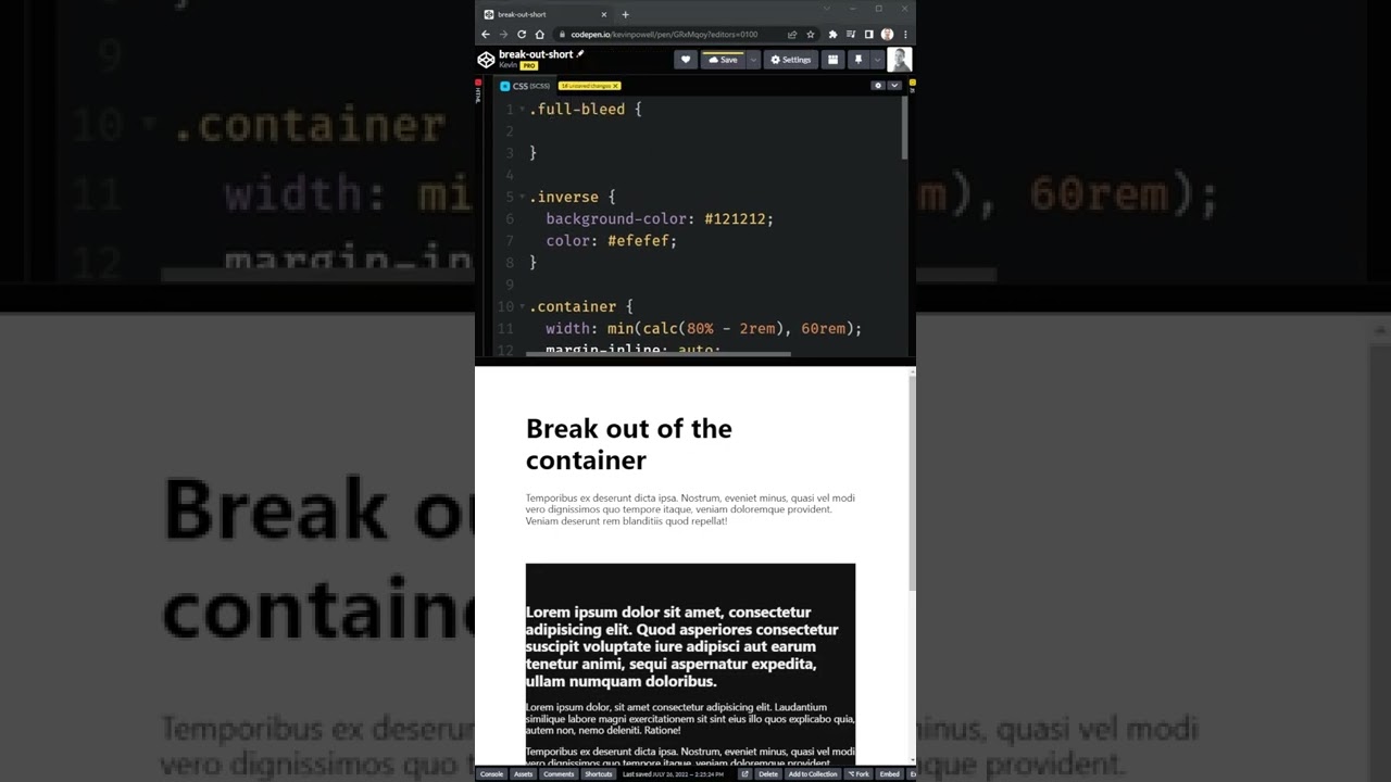
Give CSS Challenges a follow: https://twitter.com/ChallengesCss #css #shorts -- Come hang out with other dev's in my Discord Community πŸ’¬ https://discord.gg/nTYCvrK Keep up to date with everything I'm up to βœ‰ https://www.kevinpowell.co/newsletter Come hang out with me live every Monday on Twitch! πŸ“Ί https://www.twitch.tv/kevinpowell...
8 Replies
MarkBoots
MarkBootsβ€’2w ago
without an example its hard to say, but you could also do a it as a pseudo element behind the full-bleed-bg. that should prevent clipping other content
.full-bleed-bg {
background-color: var(--full-bleed-bg-color);
position: relative;
&::after{
content: "";
position: absolute;
inset: 0;
box-shadow: 0 0 0 100vmax var(--full-bleed-bg-color);
clip-path: inset(0 -100vmax);
}
}
.full-bleed-bg {
background-color: var(--full-bleed-bg-color);
position: relative;
&::after{
content: "";
position: absolute;
inset: 0;
box-shadow: 0 0 0 100vmax var(--full-bleed-bg-color);
clip-path: inset(0 -100vmax);
}
}
--edit. i just read the last 2 lines of your question more carefully, you already done that. sorry only other option i can think of is repeating the box-shadow a bunch of time with only x-offset (no spread). then you wouldn't need a clip-path
/* i use 400px as the min width of the container, can be a variable */
box-shadow:
400px 0 0 0 var(--full-bleed-bg-color),
800px 0 0 0 var(--full-bleed-bg-color),
1200px 0 0 0 var(--full-bleed-bg-color),
1600px 0 0 0 var(--full-bleed-bg-color),
-400px 0 0 0 var(--full-bleed-bg-color),
-800px 0 0 0 var(--full-bleed-bg-color),
-1200px 0 0 0 var(--full-bleed-bg-color),
-1600px 0 0 0 var(--full-bleed-bg-color);
Web Maverick
Web MaverickOPβ€’2w ago
Thank you for your suggestion! I actually ended up using a more classical approach with pseudo element:
.full-bleed-bg {
background-color: var(--full-bleed-bg-color);
position: relative;
&::after{
content: "";
position: absolute;
top: 0;
bottom: 0;
left: 50%;
transform: translateX(-50%);
width: 100vw;
background-color: var(--full-bleed-bg-color);
z-index: -1;
pointer-events: none;
}
}
.full-bleed-bg {
background-color: var(--full-bleed-bg-color);
position: relative;
&::after{
content: "";
position: absolute;
top: 0;
bottom: 0;
left: 50%;
transform: translateX(-50%);
width: 100vw;
background-color: var(--full-bleed-bg-color);
z-index: -1;
pointer-events: none;
}
}
But I liked your approach way more as sticks to this more neat and short declaration according to the video provided πŸ™‚ I use this class as a utility across various projects. So I guess I will stick to its modified version by you πŸ™‚ Here is the updated utility class with documentation in case anyone stumbles upon the same issue:
/**
** FULL BLEED BACKGROUND
*
* See https://frontendmasters.com/blog/full-bleed-layout-with-modern-css/
* and https://www.youtube.com/watch?v=81pnuZFarRw
*
* MODIFICATION:
*
* Originally used as a single utility class:
*
* .wm-full-bleed-bg {
* box-shadow: 0 0 0 100vmax var(--full-bleed-bg-color);
* clip-path: inset(0 -100vmax);
* background-color: var(--full-bleed-bg-color);
* }
*
* However, the 'clip-path' property creates a new stacking context. This
* might conflict with any child elements that are positioned as 'fixed'.
* Instead of positioning relative to the viewport, such children will
* position themselves fixed relative to the parent element.
*/
.wm-full-bleed-bg {
position: relative;
background-color: var(--full-bleed-bg-color);
}

.wm-full-bleed-bg::before {
content: "";
position: absolute;
inset: 0;
box-shadow: 0 0 0 100vmax var(--full-bleed-bg-color);
clip-path: inset(0 -100vmax);
z-index: -1;
}
/* -------------- END OF FULL BLEED BACKGROUND ------------- */
MarkBoots
MarkBootsβ€’2w ago
There are pro's and cons for both. the classical approach doesn't even need a custom property, it can just inherit the background color. So it all depends
Web Maverick
Web MaverickOPβ€’2w ago
As with everything, at least in web dev, there is no silver bulletπŸ₯²
MarkBoots
MarkBootsβ€’2w ago
btw, maybe for future things, if you do use that approach
top: 0;
bottom: 0;
left: 50%;
transform: translateX(-50%);
width: 100vw;
top: 0;
bottom: 0;
left: 50%;
transform: translateX(-50%);
width: 100vw;
is same as (i dont like transform)
inset: 0 calc(50% - 50vw)
Web Maverick
Web MaverickOPβ€’7d ago
I do appreciate your suggestion! P.S. May I ask about your preference? Were there any side effects you ran into when using transform as opposed to inset?
MarkBoots
MarkBootsβ€’7d ago
well, the transform way adds an unnessesary extra step that first places it a 50% and then moves it back. so i try to avoid it where possible. With the current hardware and browsers you wont notice it, but if something prevents speedy calculation, you could see it jump
Web Maverick
Web MaverickOPβ€’7d ago
I see your point

Did you find this page helpful?