Positioning Header, Main and Footer
I was following along some courses and I got lost with positioning, here is my problem https://codepen.io/username55fda/pen/jEqmwyz .
Lets say you have a three main sections for simplicity, Header main and footer. I was using flex column which works perfectly but I started to add disappearing mobile button and tried to put a transparent header above the main section and i lost track.
Instead I used position sticky for the header position absolute for the button, its kinda working but I don't understand why, I watched kevins deep dive into position video.
And when I try to add like a main button at the bottom of the main section its all over the place when I try positions, you those buttons that are in the bottom center of some big websites eg. enroll now or Get.......... I'm also aware the z-index number from most front to back.
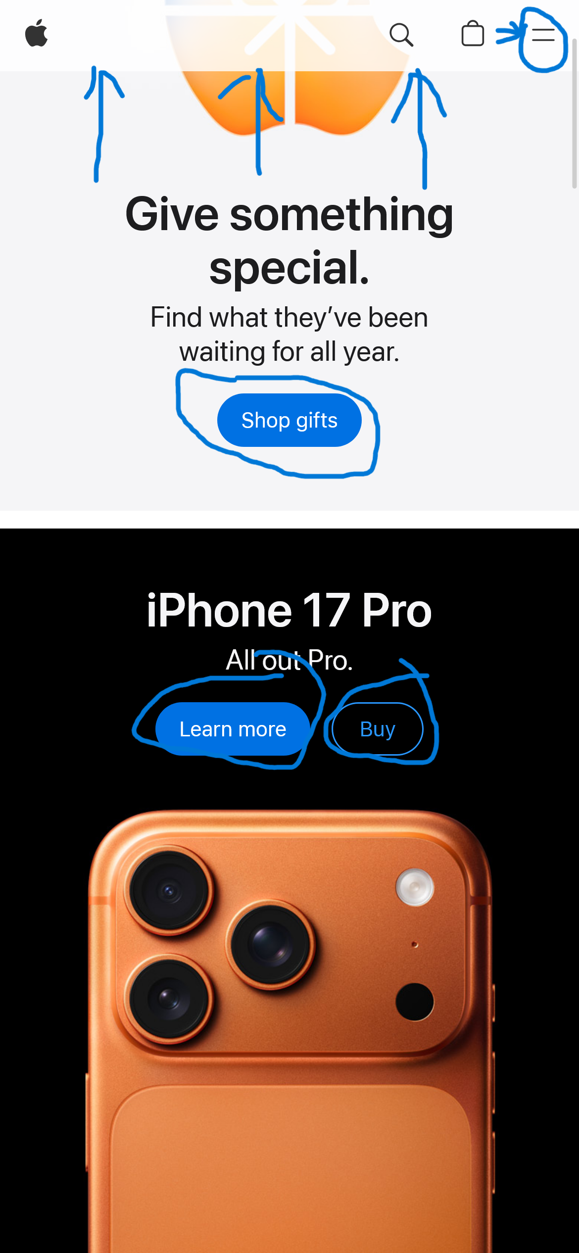
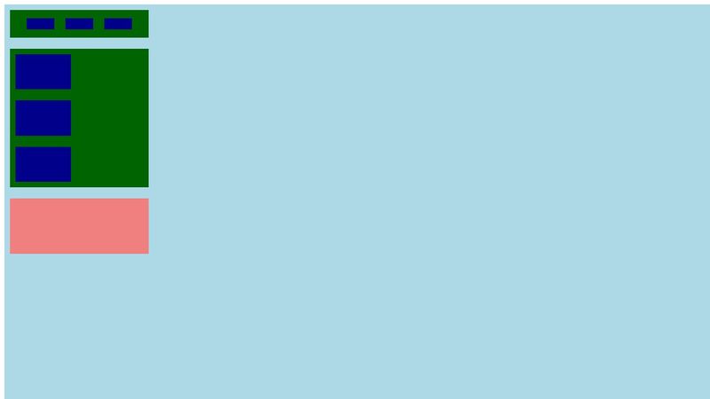
So I'm trying to make the header at the top and above the main section of cards and the mobile button next the header on the far right, and footer all the way in the end. Apple website kinda has what I want and I provided an image.
Thank you in advance

9 Replies
Not directly related to your question but you have nothing but
divs. Even your "header" and "footer" are not actually a header or footer, they're just a div. Even your main section isn't a main. You should be using semantically correct elements. While divs are fine for things like containers and whatnot you should at least know about the important HTML elements.
Secondly, you have set a fixed height/width on many of your elements. Also bad form. THough you have width: 100dw; for the your .container class…which is pointless because that's the default of any div: 100% of available space. For any container (or directly on the body if that's what you do) that you want full-screen you should give serious thought to min-height: 100%; (or 100dvh; if you prefer). That way it won't be any smaller than full viewport height, but if there's enough content to make it larger it can grow as needed. Right now you don't even have any overflow on your .main so if there's more content than screen size it'll allow for scrolling.
I'm assuming that most of your fixed heights/widths on the cards and whatnot are there for display purpose and not something you plan on doing in production, so I'll not nit pick those 😉
But I have to ask: why position: absolute for the button? What purpose is there to have it all the way to the side like that? And I'm not entirely sure what you mean by "transparent header". Can you elaborate a bit as to your end goal?00010001?
First I want to say thank understanding me, you're the goat. For your first point I get the importance of semantics I use it on my main code. I'll edit the code pen.
For the button I'm doing a media only for Phones, iPads and those foldable phones, of a disappearing nav bar, so when its a width of a phone (~390px), The button is in the header but fixed in the far corner and display none if its on desktop, I see the apple website using a flex for the header and padding to the right to leave room for the button and fit the button there but I don't know how it works.
Also I want to make the nav bar on top of the website and transparent (technically its working on my real website but I'm afraid idk why) ill provide an image. On the topic of putting navs, divs on top of one another, I'm confused about the parent div because if I want to put a shop now button on my main section how do I make the button above it but at the bottom of the main section and when you scroll to another parent it doesn't stay at the bottom like the gucci website which I will provide and image. I just want to say thank you for helping me.


the gucci website with the shop now button

Dangit, that was meant for #dev-memes 🙄
For the button I'm doing a media only for Phones, iPads and those foldable phones, of a disappearing nav bar, so when its a width of a phone (~390px), The button is in the header but fixed in the far corner and display none if its on desktop….Sounds like absolute position is probably the simplest solution to this, yeah. Though I'm still wondering what the button does.
Also I want to make the nav bar on top of the website and transparent (technically its working on my real website but I'm afraid idk why) ill provide an image. On the topic of putting navs, divs on top of one another, I'm confused about the parent div because if I want to put a shop now button on my main section how do I make the button above it but at the bottom of the main section and when you scroll to another parent it doesn't stay at the bottom like the gucci website which I will provide and image.Ok, so this is a z-index issue. Basically
z-index tells the browser the "draw order" of things. Higher values are drawn last, so a z-index of, say, 40 will draw "on top of" anything that's 39 or lower. To have it be on top of the main content you could do a few things. Absolute position is the easiest, but not the best, IMO. If you're using grid then you can easily tell the browser to put the elements in the same grid area and BOOM! "stacking" elements. Or having the nav be an inline-block and next to the main content, then on interaction (I'm assuming that's what the button does) have it slide over the main content…which probably requires some positioning shenanigans… 🤔https://codepen.io/username55fda/pen/jEqmwyz something like this?
Is it called "grid stacking"? I think it works well for the button on the main section and for like hover transform functions is still reliable? but for the nav bar mobile only button would it work, I will attach a small screen recording on what I mean.
UPDATE: I thik i figured out grid stacking by
but now I want to know how to flex stack it