CSS issue on mobile screen
 front-end
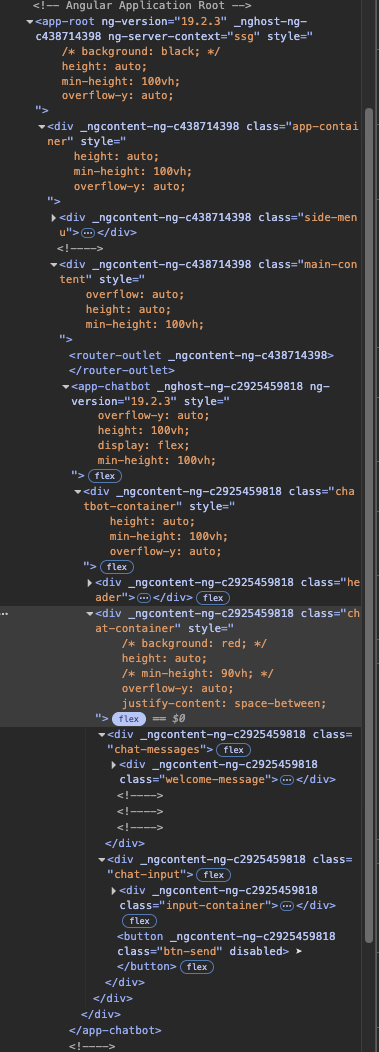
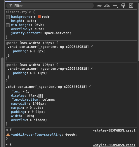
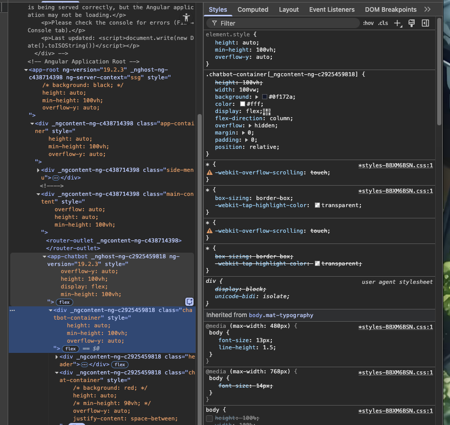
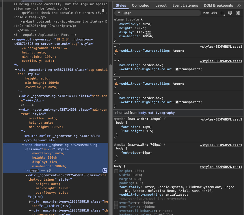
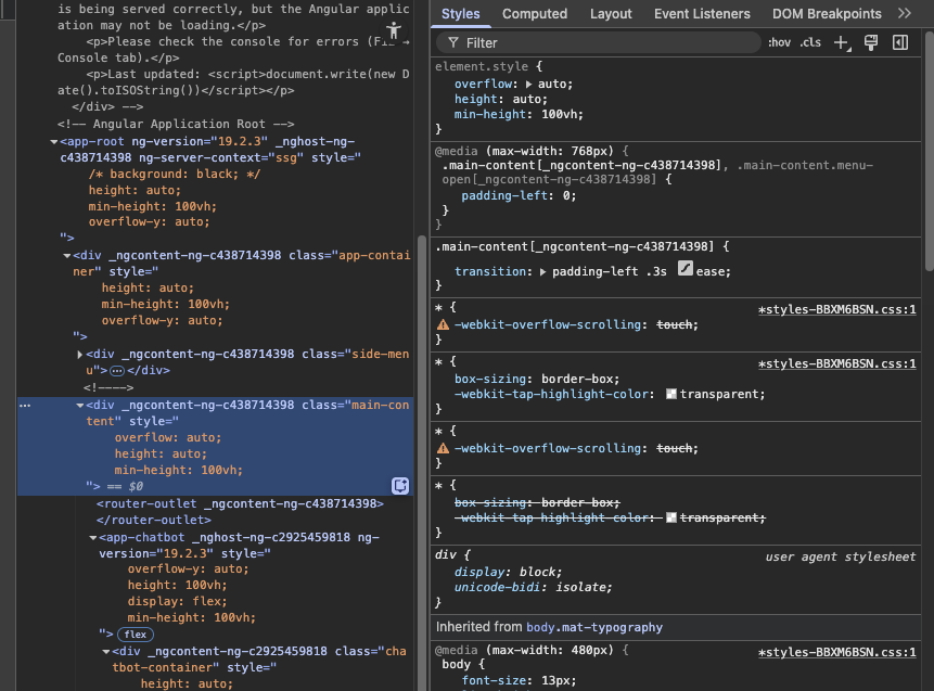
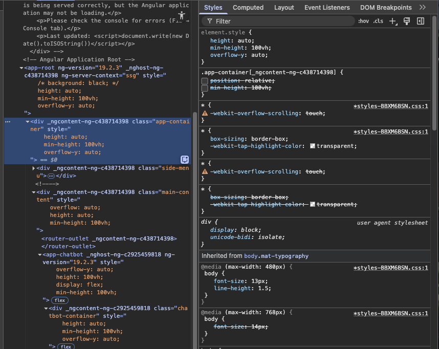
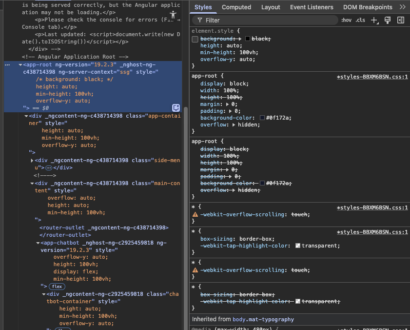
This is my page for my project, when I deploy it and run on my phone, the bottom part where the input area is goes out of screen and this can be replicated on desktop by changing the zoom. I tried many things as I thought its an issue of height for this div or parent div but I am not able to fix it. Whenever I change the zoom, the area goes below the visible area and I cant scroll to it. My desktop is big so the zoom is around 150-200% but on smaller screens its not visible even on 100% of certain mobile devices


A friendly place for developers to meet other devs, ask questions, get help, and just have a good time 🙂.
36,263Members
Resources
Recent Announcements
Similar Threads
Was this page helpful?