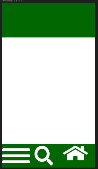
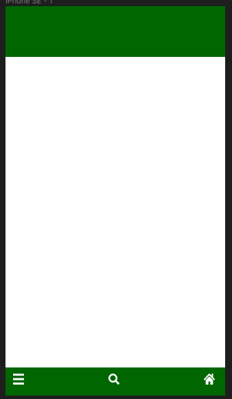
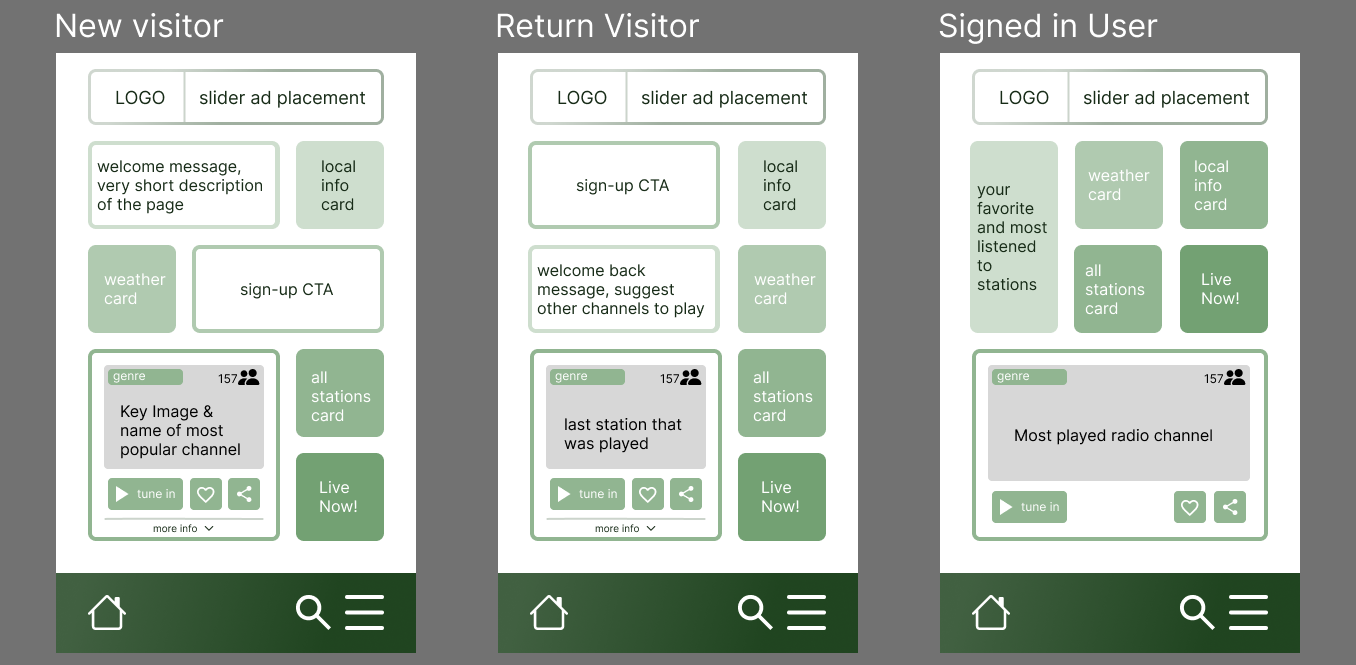
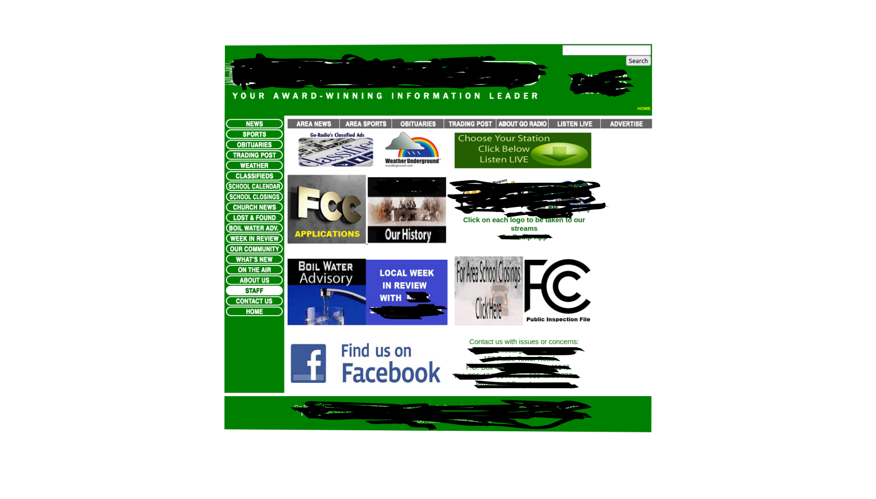
Design tips for a thumb driven mobile layout
Need some help getting this to look better in terms of appealing on the eyes and easy to navigate. I feel like this could be made to look better in figma but im new. Any tips on colors and maybe crisp looking rectangles and such are welcome. I'm aiming for minimal design with good functionality