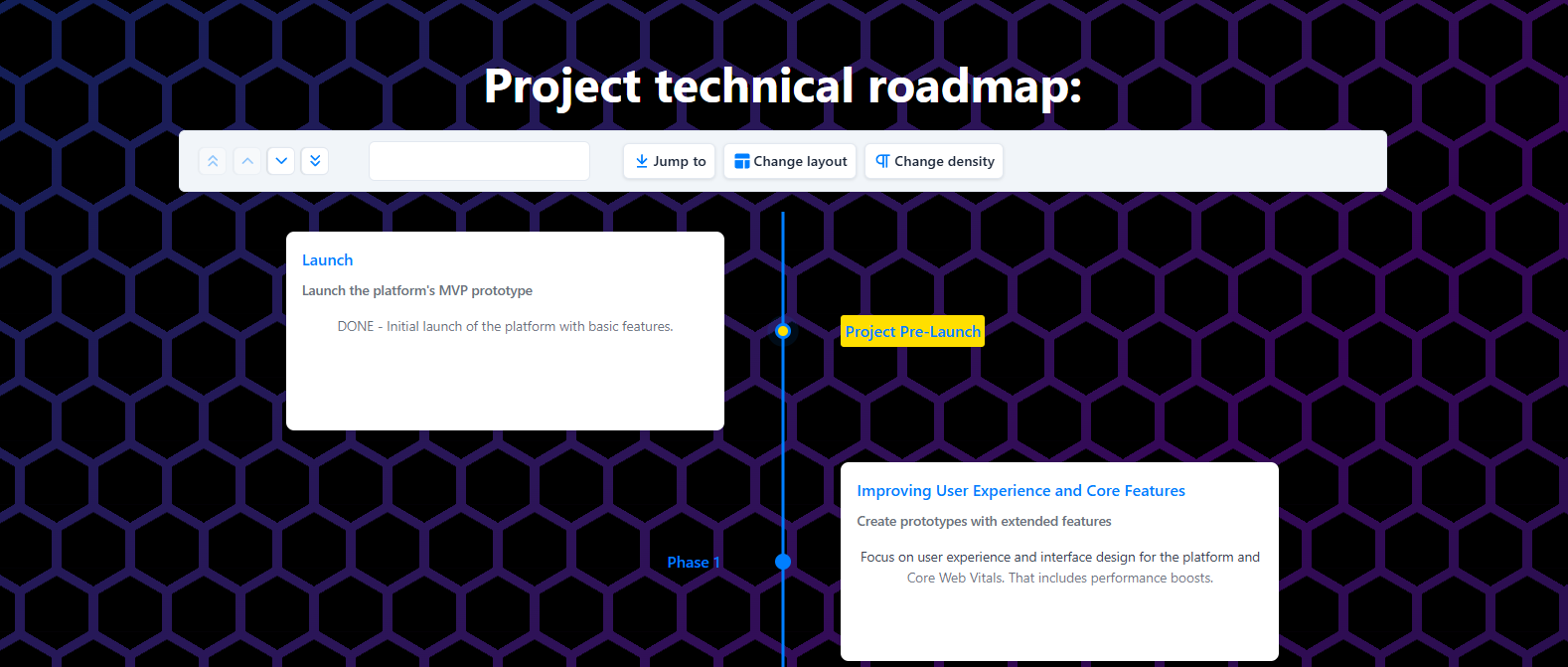
Is this design OK?
I'm playing around with styles but do not really know what are the design guidelines. I want someone experienced to give me some criticism on what I can improve and why.

12 Replies
i am a terrible designer, so, i can't tell you what to do better
however, i can tell you that the background, right now, is a bit too busy
and purple and black with that blue doesn't work well, as the text is effectively invisible
so there's like too many colors and not enough contrast on text, do I understand this correctly?
the blue doesn't have enough contrast and the background seems too busy to me
it has 5.47 of contrast, which is fine but not ideal
but this is very painful to look at

the yellow + blue just hurts my eyes
i don't know why
maybe there's too much different colours in one place
no, it's a very very bright color with anothe bright color
the contrast is really poor as well: 2.88
'Cause it's the around the same saturation so the contrast is only in hue, which is bad for legibility
that makes sense
As Epyc already pointed out, the background is too much. Aside from the project and phase labels your contrasts are ok... But not on the right elements.
There's wayyyyy too much cpntrast between the cards and the background and not enough between the card and their contents.
The distance between your elements are also too big which make them feel disconnected when they should form a whole.
For the things you should change:
- turn down the saturation and up the lightness on the background, bring it closer to the color of the cards (or the other way around doesn't matter)
- reduce the gap between elements of the same group (card dot label)
- improve the hierarchy inside the cards, you can double the title font-size and up that of the sub headings
- use icons for your cards if possible that would make the UI more inviting and easier to skim
Your elements are not using the same space on both side of the timeline yet they are still spaced as if it was the case, you can try to bring them a bit closer together to reinforce the feeling of cohesion
For the top bar :
- your disabled icons are too low contrast, they would not pass AA
- the bar itself is not balanced there's a bunch of stuff on the left and basically nothing on the right, you can balance them out by having the search box span the whole gap or by grouping your elements better
- never use a colon ":" in a title it's implied that what follows... well follows
There are other smaller issues with padding a bit everywhere:
- the cards have a lot of empty space at the bottom and not enough on the sides
- the title sits too close to the top bar
- the top bar has too much vertical padding
- the project label doesn't have enough padding all over
That's the most important remarks I would make. Feel free to ask if you have any questions :)
TIL too much contrast is also bad, thank you for the advice!
oh, yeah, too much contrast can cause halation - specially for people with astigmatism
there's other issues with it