vertically position floated element
a element appear at the bottom line of the div not the top while staying on the rightCan't center title - horizontally + vertically

Override Default Border on Input
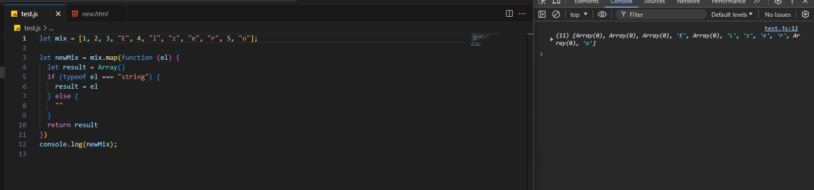
Not getting informations from a form

Calculation of hypothetical main size and flex base size with paddings
flex:1, he mentions that since content-size of all items is 0, we only have 600-32 = 568px to distribute cuz of the padding on the middle element. So, after the padding is added back, middle element is wider. And padding isn't included in that flex-basis even though we used border-box
In the 2nd case, using flex-basis: 100%, he mentions that now the padding is included in the flex-basis and now the content-size of the middle item is 600-32 = 568px and of the others is 600px only. So, the middle one shrinks slightly less....API returning error and also CORS error

margin-top and flow utility clash
flow utility class which uses margin-top. Setting the flow-space on the buttons to auto does what i'd like however removes the space between the paragraph and button on the card holding the most content (and certain cards when the grid items start stacking when the viewport shrinks) due to the way auto behaves and the fact it's overriding the default property in the utility of course. I can't set this on just the first two cards in the example as i'm looking for a more flexible solution as you may not know which card has the most content or how many cards there could be. So from this i have two questions.
1. What sort of workaround/fix could i do here?
2. Why must the container (in this case .card) have to be a flex container for margin-top: auto; to work? If i remove it it stops working.
...Parent container with child elements position: absolute does not size properly to fit the children
Positioning within a grid
mt-[10%] on the element to have something a bit more reponsive to the page height, have a nested element with another grid covering all 3 rows, or something more silly, like using flex and a flex-basis of 90% and pushing the content to the end....
I want to create an effect and i dont know how
CSS list-style-type not being applied on <details><summary> on safari

How can I make the handle which resizes content bigger. It's too small.
resize: both;
overflow: auto;
resize: both;
overflow: auto;

Problem with transition height
Need Help identifying different Semantic Sections

justify-self and align-self flexbox?
prefers-reduced-motion is a text color animation ok?
Wating for player to join indicator when you join the room and it has a wave animation, but I'd also like to take into consideration users with prefers-reduced-motion setting on so I made an alternative for it, where text "shines" through.
I'm not sure if it's a good alternative or if it's still too much for users who prefer reduced motion, does anybody know anything about it? First gif is original, second is reduced motion version...
grid-template-columns vs grid-auto-columns
grid-template-columns, when using auto-fill or auto-fit these both seem like they would achieve the same thing to me? Any explanation would be appreciated, Thanks in advance.
grid-template-columns: repeat(auto-fit, minmax(16rem, 1fr));
grid-auto-columns: minmax(16rem, 1fr);
grid-template-columns: repeat(auto-fit, minmax(16rem, 1fr));
grid-auto-columns: minmax(16rem, 1fr);
svelte logic (if else) - can you write this in the js? (potential very dumb question)
Where should I use the clamp() function and what to use for responsive design overall
clamp() function, I've been using it everywhere so I can avoid media queries, should I keep doing that? I've been using that for padding, margin, position, everything overall, here is a sample of my code:
```css
#logo {
font-size: clamp(0.94rem, 1.56vw, 3.75rem);
color: #fff;...array doesn't want to go away