Where should I use the clamp() function and what to use for responsive design overall
clamp() function, I've been using it everywhere so I can avoid media queries, should I keep doing that? I've been using that for padding, margin, position, everything overall, here is a sample of my code:
```css
#logo {
font-size: clamp(0.94rem, 1.56vw, 3.75rem);
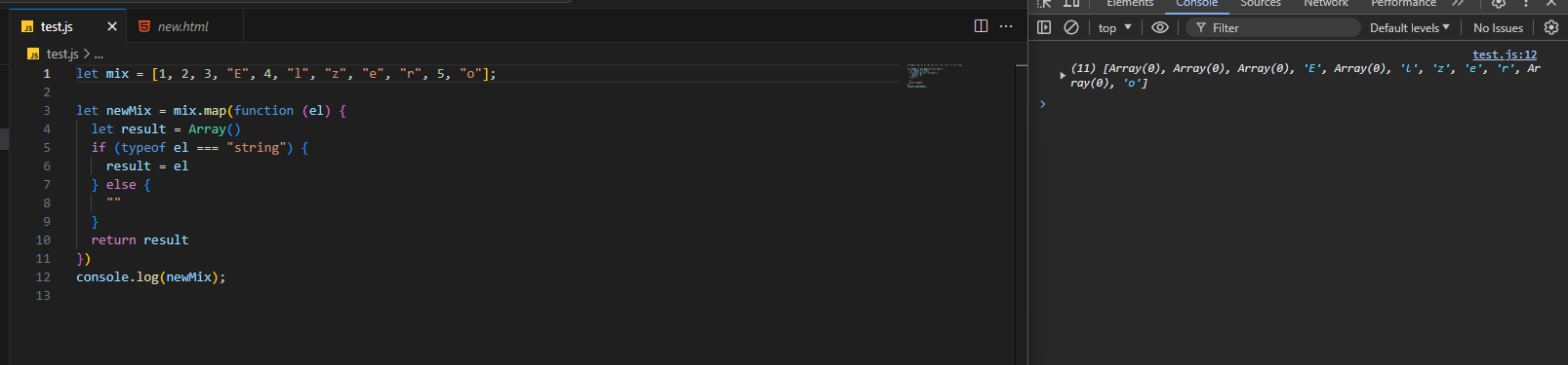
color: #fff;...array doesn't want to go away
I need help with media-queries for Responsive Web layout
@font-face practices
@font-face? Perhaps some properties that are a must? I currently use it like this, i'd appreciate any pointers, things i've missed or clarification that i've got it down. Thanks in advance.
```css
@font-face {
font-family: 'xyz';
font-style: normal;...how to get heading section button on shopify to be responsive
focus-visible not properly working on inputs
Help removing horizontal scroll

Any idea how to achieve these animation?
Trying to make a website for tracking student attendance and behaviour

What is node js and why do we need it
Math.round()
overlapping fixed navbar caused the space at the right

Sticky footer
Line chart in react
Unwanted clipboard behavior flex inline table
Container with image bleeding out while text stays in.

html/css optimization
preconnect attribute for font sites etc. Thanks in advance.what should be made into a variable?
why is my html/css layout behaving this way?
What is the best practice for responsive font resizing?
rem unit for fonts to not interfere with users preferences. But what should I use for dynamic font resizing? Like there will be a difference between the size of the font on desktop and on a mobile phone. AI suggested to do something like this: font-size: calc(! * @)
Where:
! - default size like 1.5rem etc.
@ - scale factor determined by the vw unit. Something like 0.5vw etc....